TabView
TabView[{lbl1expr1, lbl2expr2, …}]
represents an object in which clicking the tab with label lbli displays expri.
TabView[{lbl1expr1,lbl2expr2,…},i]
makes the i![]() tab be the one currently selected.
tab be the one currently selected.
TabView[{{v1,lbl1expr1},{v2,lbl2expr2},…},v]
associates values vi with successive tabs, and makes the tab with value v be the one currently selected.
TabView[{expr1,expr2,…}]
takes the tab labels to be successive integers.
Details and Options


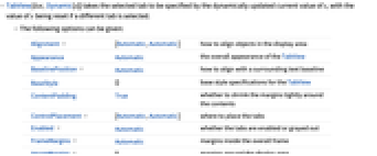
- TabView[list,Dynamic[s]] takes the selected tab to be specified by the dynamically updated current value of s, with the value of s being reset if a different tab is selected.
- The following options can be given:
-
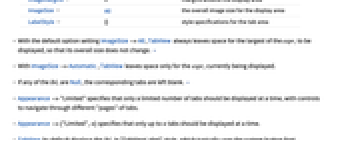
Alignment {Automatic,Automatic} how to align objects in the display area Appearance Automatic the overall appearance of the TabView BaselinePosition Automatic how to align with a surrounding text baseline BaseStyle {} base style specifications for the TabView ContentPadding True whether to shrink the margins tightly around the contents ControlPlacement {Automatic,Automatic} where to place the tabs Enabled Automatic whether the tabs are enabled or grayed out FrameMargins Automatic margins inside the overall frame ImageMargins 0 margins around the display area ImageSize All the overall image size for the display area LabelStyle {} style specifications for the tab area - With the default option setting ImageSize->All, TabView always leaves space for the largest of the expri to be displayed, so that its overall size does not change. »
- With ImageSize->Automatic, TabView leaves space only for the expri currently being displayed.
- If any of the lbli are Null, the corresponding tabs are left blank. »
- Appearance->"Limited" specifies that only a limited number of tabs should be displayed at a time, with controls to navigate through different "pages" of tabs.
- Appearance->{"Limited",n} specifies that only up to n tabs should be displayed at a time.
- TabView by default displays the lbli in "TabViewLabel" style, which typically uses the system button font.
- The settings for BaseStyle and LabelStyle are appended to the default styles typically given by the "TabView" and "TabViewLabel" styles in the current stylesheet.
Examples
open allclose allScope (11)
TabView Content (7)
Options (9)
Applications (4)
Properties & Relations (2)
Possible Issues (2)
Text
Wolfram Research (2007), TabView, Wolfram Language function, https://reference.wolfram.com/language/ref/TabView.html (updated 2008).
CMS
Wolfram Language. 2007. "TabView." Wolfram Language & System Documentation Center. Wolfram Research. Last Modified 2008. https://reference.wolfram.com/language/ref/TabView.html.
APA
Wolfram Language. (2007). TabView. Wolfram Language & System Documentation Center. Retrieved from https://reference.wolfram.com/language/ref/TabView.html