Alter the axes on a plot to better represent the data.
Explore the relationship between the pressure and temperature of mercury vapor by adjusting the scales of the axes of a plot.
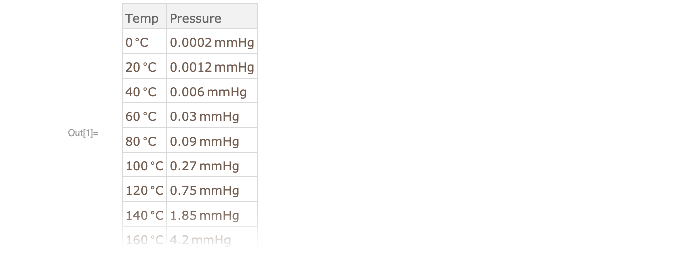
Import the data
Retrieve sample data from the Wolfram Data Repository:
Visualize the data
Plot the data to visualize the relationship using linear scales on both axes:

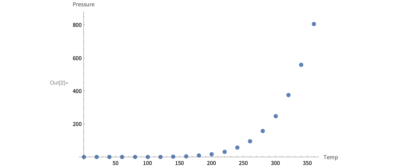
The relationship between temperature and pressure appears to be nonlinear, so a different scale can be used to get a better visualization.
Change the plot to log scale
Add the ScalingFunctions option as an argument of ListPlot to switch the ![]() axis to a log scale:
axis to a log scale:

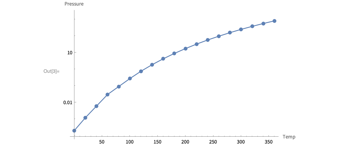
This visualization more clearly shows the relationship between pressure and temperature, but it does not show the whole picture.
Change the plot to log-log scale
Use scaling functions for both axes:

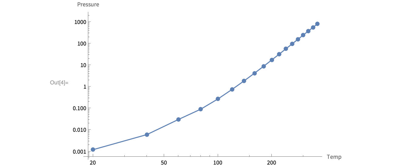
This visualization more clearly shows the general relationship between temperature and pressure.