ActionMenu[name,{lbl1:>act1,lbl2:>act2,…}]
represents an action menu with label name and with items labeled lbli that evaluates the expression acti if the corresponding item is chosen.
ActionMenu[name,{…,lbli{sublbl1:>subact1,sublbl2:>subact2,…},…}]
represents an action menu containing a submenu with label lbli containing items sublbli with actions subacti.


ActionMenu
ActionMenu[name,{lbl1:>act1,lbl2:>act2,…}]
represents an action menu with label name and with items labeled lbli that evaluates the expression acti if the corresponding item is chosen.
ActionMenu[name,{…,lbli{sublbl1:>subact1,sublbl2:>subact2,…},…}]
represents an action menu containing a submenu with label lbli containing items sublbli with actions subacti.
Details and Options


- name and the submenu and item labels can be any expression.
- ActionMenu by default displays name and the lbli in "ActionMenu" style, which typically uses the system menu font.
- In ActionMenu[name,list], Delimiter can appear as an element of list, specifying a horizontal delimiter in the displayed menu.
- Submenus can contain delimiters and other submenus.
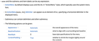
- The following options can be given:
-
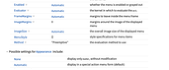
Appearance Automatic the overall appearance of the menu BaselinePosition Automatic what to align with a surrounding text baseline BaseStyle {} base style specifications for the menu ContentPadding True whether to shrink the margins tightly around the contents Enabled Automatic whether the menu is enabled or grayed out Evaluator Automatic the kernel in which to evaluate the acti FrameMargins Automatic margins to leave inside the menu frame ImageMargins 0 margins around the image of the displayed menu ImageSize Automatic the overall image size of the displayed menu MenuStyle {} style specifications for menu items Method "Preemptive" the evaluation method to use - Possible settings for Appearance include:
-
None display only name, without modification Automatic display in a special action menu form (default) "PopupMenu" display like a popup menu with initial value name "Button" display like a button - Typical possible settings for the Method option include "Preemptive" and "Queued".
- The settings for BaseStyle are appended to the default style typically given by the "ActionMenu" style in the current stylesheet.
Examples
open all close allBasic Examples (3)
Scope (3)
Use Delimiter to separate menu items:
The labels can be any expression:
Use lists to create a nested menu structure:
Options (10)
Enabled (2)
Evaluator (2)
By default, the button function is sent to the kernel for evaluation:
By setting Evaluator, the button function can be evalauted in another kernel:
Method (1)
By default, action menu functions are evaluated on a preemptive link, which times out after five seconds:
Use Method->"Queued" to evaluate button functions on the main link, which never times out:
Properties & Relations (1)
ActionMenu has the same effect as a Button series:
Neat Examples (1)
Get the main menus from the system layout:
Convert the menus to a form that can be deployed in an ActionMenu:
Tech Notes
Related Guides
History
Introduced in 2007 (6.0) | Updated in 2008 (7.0) ▪ 2010 (8.0) ▪ 2023 (13.3)
Text
Wolfram Research (2007), ActionMenu, Wolfram Language function, https://reference.wolfram.com/language/ref/ActionMenu.html (updated 2023).
CMS
Wolfram Language. 2007. "ActionMenu." Wolfram Language & System Documentation Center. Wolfram Research. Last Modified 2023. https://reference.wolfram.com/language/ref/ActionMenu.html.
APA
Wolfram Language. (2007). ActionMenu. Wolfram Language & System Documentation Center. Retrieved from https://reference.wolfram.com/language/ref/ActionMenu.html
BibTeX
@misc{reference.wolfram_2025_actionmenu, author="Wolfram Research", title="{ActionMenu}", year="2023", howpublished="\url{https://reference.wolfram.com/language/ref/ActionMenu.html}", note=[Accessed: 06-May-2026]}
BibLaTeX
@online{reference.wolfram_2025_actionmenu, organization={Wolfram Research}, title={ActionMenu}, year={2023}, url={https://reference.wolfram.com/language/ref/ActionMenu.html}, note=[Accessed: 06-May-2026]}