takes the setting to be the dynamically updated current value of x, with the value of x being toggled if the checkbox is clicked.
Checkbox[x,{val1,val2}]
represents a checkbox that toggles between values val1 and val2 and displays as ![]() and
and ![]() , respectively.
, respectively.
Checkbox[x,{val1,val2,val3,…}]
represents a checkbox that cycles through values vali and displays as ![]() for all vali with i>2.
for all vali with i>2.


Checkbox
takes the setting to be the dynamically updated current value of x, with the value of x being toggled if the checkbox is clicked.
Checkbox[x,{val1,val2}]
represents a checkbox that toggles between values val1 and val2 and displays as ![]() and
and ![]() , respectively.
, respectively.
Checkbox[x,{val1,val2,val3,…}]
represents a checkbox that cycles through values vali and displays as ![]() for all vali with i>2.
for all vali with i>2.
Details and Options

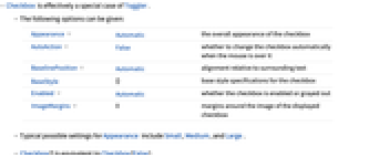
- Checkbox is effectively a special case of Toggler.
- The following options can be given:
-
Appearance Automatic the overall appearance of the checkbox AutoAction False whether to change the checkbox automatically when the mouse is over it BaselinePosition Automatic alignment relative to surrounding text BaseStyle {} base style specifications for the checkbox Enabled Automatic whether the checkbox is enabled or grayed out ImageMargins 0 margins around the image of the displayed checkbox - Typical possible settings for Appearance include Small, Medium, and Large.
- Checkbox[] is equivalent to Checkbox[False].
Examples
open all close allBasic Examples (2)
Scope (3)
Options (8)
AutoAction (2)
By default, the checkbox does not change state until it is clicked:
By setting AutoAction, the checkbox changes state when the mouse moves over it:
Values will change as the cursor is moved over the clickable area:
Enabled (2)
Applications (4)
See Also
Toggler Opener Setter Panel RadioButton Control CheckboxBar
Function Repository: CheckboxLegended OnOffToggle
Tech Notes
Related Workflows
- Build a Manipulate
History
Text
Wolfram Research (2007), Checkbox, Wolfram Language function, https://reference.wolfram.com/language/ref/Checkbox.html.
CMS
Wolfram Language. 2007. "Checkbox." Wolfram Language & System Documentation Center. Wolfram Research. https://reference.wolfram.com/language/ref/Checkbox.html.
APA
Wolfram Language. (2007). Checkbox. Wolfram Language & System Documentation Center. Retrieved from https://reference.wolfram.com/language/ref/Checkbox.html
BibTeX
@misc{reference.wolfram_2025_checkbox, author="Wolfram Research", title="{Checkbox}", year="2007", howpublished="\url{https://reference.wolfram.com/language/ref/Checkbox.html}", note=[Accessed: 05-May-2026]}
BibLaTeX
@online{reference.wolfram_2025_checkbox, organization={Wolfram Research}, title={Checkbox}, year={2007}, url={https://reference.wolfram.com/language/ref/Checkbox.html}, note=[Accessed: 05-May-2026]}