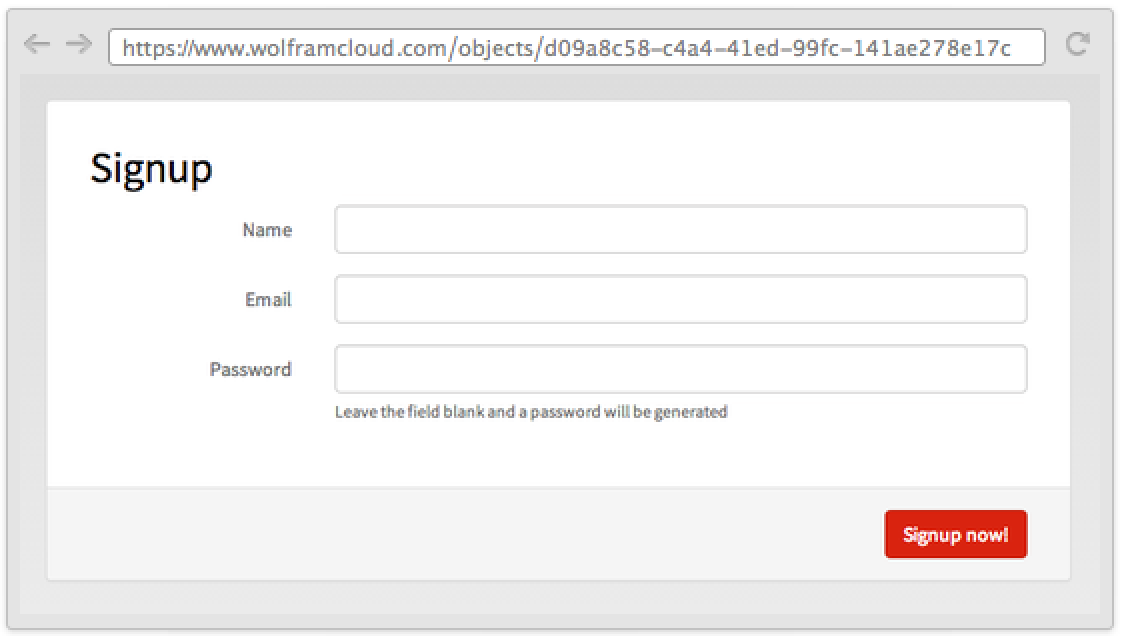
FormObject[{"name1"type1,"name2"type2,…}]
represents a form with fields having names namei that take data of type typei.
FormObject[{{"name1",label1}type1,…}]
uses labeli as the label for the field named namei.
FormObject[{"name1"assoc1,…,objj,…}]
uses full specification associ for a field, and objj as part of the layout of the form.


FormObject
Listing of Field Types »FormObject[{"name1"type1,"name2"type2,…}]
represents a form with fields having names namei that take data of type typei.
FormObject[{{"name1",label1}type1,…}]
uses labeli as the label for the field named namei.
FormObject[{"name1"assoc1,…,objj,…}]
uses full specification associ for a field, and objj as part of the layout of the form.
Details and Options
- FormObject[…] displays in a notebook interface as a form with fields that can be filled in, either by entering text or using other controls.
- FormObject can be used to specify the structure of a form in FormFunction.
- When evaluated, FormObject[…] is converted to FormObject[fields], in which each entry in fields has a full specification of the form "namei"->associ. The elements of the full specification associ include:
-
"Input" the raw input, if any, for the field (often a string) "Interpreter" the interpreter to be used for the field "Required" whether input is required for the field "Default" a default value, if any, for the field "Control" the type of control to provide for the field "AutoSubmitting" whether entering the field automatically submits the form "Disambiguation" whether to ask for disambiguation of interpretations "Label" a label to display for the field "Hint" hint to display inside an input field "Masked" whether to mask input given in an input field "Help" help to associate with the field - Setting[FormObject[…]] gives an association of the form <|"name1"->val1,…|>, where the vali are the values obtained by interpreting the "Input" element associated with each "namei" according to the "Interpreter" associated with the "namei".
- If "Input" is missing, or "Interpreter" fails, then the value of "Value" is a Failure object.
- FormObject[…][<|"name1"->input1,…|>] yields a FormObject[…] in which the "Input" corresponding to each of the namei included has been replaced with inputi.
- In FormObject[{…,objj,…}], the objj can be Delimiter, representing a horizontal delimiter.
- They can also be expressions with heads Style, Row, Item, Text, ExpressionCell, and TextCell, as well as views and layout constructs such as TabView and Grid.
- In FormObject[{"name1"->type1,…}], the typei are used to give values for "Interpreter" in the full specification.
- Possible forms of type specifications are:
-
"form" any form supported by Interpreter Restricted[…],etc. any restricted form etc. supported by Interpreter Interpreter[…] any complete Interpreter object tfun any function to be applied to the raw input - If only "namei" is given, without a rule giving typei, then the interpreter is assumed to be Identity, so that the value is exactly whatever is given as the corresponding "Input" element.
- By default, the control used for each field is determined by the type of input specified. For type "String", a single line of input is by default expected on the web; typing "Text" yields a multiline text field.
- Possible controls explicitly given as the value associated with "Control" include InputField, PopupMenu, Slider, and RadioButtonBar.
- The specification "namei"->AutoSubmitting[typei] indicates that when the field associated with namei is entered, the whole form should automatically be submitted.
- FormObject[AutoSubmitting[spec]] indicates that a form should automatically be submitted whenever any of its fields are entered.
- Overall options for FormObject include:
-
AppearanceRules Automatic association giving overall appearance rules FormLayoutFunction Automatic function to generate final layout for the form PageTheme Automatic overall theme to use when the page is deployed - Typical elements in the setting for AppearanceRules include:
-
"Title" None overall title for the form "Description" None description to include at the top of the form "RequiredFieldIndicator" None indicator to show required fields "SubmitLabel" "Submit" text for the submit button of the form "AddLabel" "+" text of the add button for repeating elements "DeleteLabel" "-" text of the delete button "AddTooltip" "Add" tooltip for the add button "DeleteTooltip" "Remove" tooltip for the delete button "NextLabel" "Next" text of the "next" button for multipage forms "ItemLayout" "Horizontal" layout of field labels and messages - Possible settings for "ItemLayout" include "Horizontal", "Vertical", and "Inline".
Examples
open all close allBasic Examples (3)
Scope (17)
FormObject Structure (1)
A valid FormObject evaluates to an object with an Association with all meta-information:
Form Submit (1)
Form metadata (3)
You can extract form meta with subvalues:
You can extract "Help", "Control", "Interpreter", etc.:
"Control" gives you the default formatted controller:
Use "Failure" to get the failure:
If you do not specify a part to extract, the whole controller (with label and help) is returned:
You can extract AppearanceRules in the same way:
Use Setting to extract the cleaned data:
You can perform several submissions with partial data:
Using a form with defaults is considered valid even if not submitted:
Interpreter Specifications (3)
Use rich Interpreter specifications:
A list can be used to create a menu:
Defaults (1)
Specify a default for a field; fields that have a default are not required:
Use RuleDelayed to defer evaluation:
Input (1)
Specify an initial value for a field:
Use RuleDelayed to force a fresh evaluation every time the form is rendered:
Controls (2)
Label (1)
You can use RuleDelayed and return any expression:
Use None to remove the label:
Help (1)
You can use RuleDelayed and return any expression:
Generalizations & Extensions (1)
You can use a form inside an XMLTemplate; HTML code will be generated:
Options (2)
Applications (1)
Use FormObject to validate data:
Properties & Relations (2)
You can use a FormObject as the first argument of APIFunction and FormFunction:
The single fields of a FormObject use Interpreter to transform the input in Wolfram Language expressions:
This is effectively the same as:
And the same as applying Interpreter directly:
Possible Issues (4)
"Hint" and "Masked" are supported only by InputField:
"Hint" and "Masked" are ignored by other controllers:
When using Alternatives in the Interpreter type, one might get the wrong controller:
Explicitly setting the "Control" field can fix the problem:
FormObject is an inert representation of the form specification; as such, buttons in it do not work:
When the Interpreter type is not of a form that supports lists, only the last element will be kept:
See Also
Setting FormFunction Grid XMLTemplate Manipulate RepeatingElement CompoundElement FormControl FormProtectionMethod
Function Repository: ValidatedInputField PersistentCloudForm
Tech Notes
History
Text
Wolfram Research (2014), FormObject, Wolfram Language function, https://reference.wolfram.com/language/ref/FormObject.html.
CMS
Wolfram Language. 2014. "FormObject." Wolfram Language & System Documentation Center. Wolfram Research. https://reference.wolfram.com/language/ref/FormObject.html.
APA
Wolfram Language. (2014). FormObject. Wolfram Language & System Documentation Center. Retrieved from https://reference.wolfram.com/language/ref/FormObject.html
BibTeX
@misc{reference.wolfram_2025_formobject, author="Wolfram Research", title="{FormObject}", year="2014", howpublished="\url{https://reference.wolfram.com/language/ref/FormObject.html}", note=[Accessed: 09-May-2026]}
BibLaTeX
@online{reference.wolfram_2025_formobject, organization={Wolfram Research}, title={FormObject}, year={2014}, url={https://reference.wolfram.com/language/ref/FormObject.html}, note=[Accessed: 09-May-2026]}
