ListPicker[list,{val1,val2,…}]
represents a list pane with setting list that can contain possible values vali.
ListPicker[Dynamic[list],{val1,…}]
takes the setting to be the dynamically updated current value of list, with members added or removed each time an item is selected or deselected.
ListPicker[list,{val1lbl1,val2lbl2,…}]
represents a list pane in which the possible value vali is indicated by lbli.


ListPicker
ListPicker[list,{val1,val2,…}]
represents a list pane with setting list that can contain possible values vali.
ListPicker[Dynamic[list],{val1,…}]
takes the setting to be the dynamically updated current value of list, with members added or removed each time an item is selected or deselected.
ListPicker[list,{val1lbl1,val2lbl2,…}]
represents a list pane in which the possible value vali is indicated by lbli.
Details and Options


- ListPicker displays as a vertical list of items. By default, it displays using the default system appearance of a list box or list view.
- Holding the
 key while clicking on a ListPicker will add a range of items to the selection. Holding the
  or
or  key will toggle the selection of an individual item.
 - list contains all of the selected values. If no values are selected, then list will be an empty list.
- The vali and lbli can be strings, boxes, graphics, or any other expressions, including dynamic expressions.
- Delimiter can be used in the list of vali to specify a horizontal delimiter in the displayed list pane.
- The following options can be given:
-
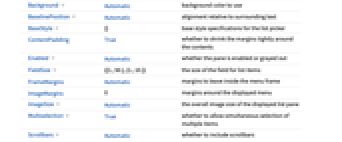
Appearance Automatic the overall appearance of the pane AppearanceElements Automatic overall control elements to include in the displayed output Background Automatic background color to use BaselinePosition Automatic alignment relative to surrounding text BaseStyle {} base style specifications for the list picker ContentPadding True whether to shrink the margins tightly around the contents Enabled Automatic whether the pane is enabled or grayed out FieldSize {{1.,50.},{1.,10.}} - the size of the field for list items
FrameMargins Automatic margins to leave inside the menu frame ImageMargins 0 margins around the displayed menu ImageSize Automatic the overall image size of the displayed list pane Multiselection True whether to allow simultaneous selection of multiple items Scrollbars Automatic whether to include scrollbars ScrollPosition {0,0} scroll position if scrolling is enabled Spacings Automatic vertical spacings - The settings for Background can be given as follows to apply separately to successive items in the control:
-
{s1,s2,…,sn} use s1 through sn, then use defaults {{c}} use c in all cases {{c1,c2}} alternate between c1 and c2 {{c1,c2,…}} cycle through all ci {s,{c}} use s, then repeatedly use c {s1,{c},sn} use s1, then repeatedly use c, but use sn at the end {s1,s2,…,{c1,c2,…}, sm,…,sn} use the first sequence of si at the beginning, then cyclically use the ci, then use the last sequence of si at the end {s1,s2,…,{},sm,…,sn} use the first sequence of si at the beginning and the last sequence at the end {i1->v1,i2->v2,…} specify what to use at positions ik {spec,rules} use rules to override specifications in spec - With settings of the form {s1,s2,…,{…},sm,…,sn}, if there are more si specified than items across the list picker, si from the beginning are used for the first items, and ones from the end are used for the last items.
- Possible settings for Appearance include "Framed" and "Frameless".
- Possible elements for AppearanceElements include "ResizeArea".
- The BaselinePosition is by default taken to be Center->Axis.
- The settings for BaseStyle are appended to the default style typically given by the "ListPane" style in the current stylesheet.
Examples
open all close allBasic Examples (3)
Select values from a list pane:
Initialize given values to be selected:
Connect ListPicker to a dynamic state:
Scope (3)
Options (13)
Appearance (1)
Display ListPicker without a frame:
Display a customized frame around the frameless ListPicker:
AppearanceElements (1)
Create a resizable ListPicker:
BaselinePosition (1)
Align ListPicker with text:
Enabled (1)
Create a disabled ListPicker:
Multiselection (1)
Prevent more than one value from being selected in a ListPicker:
Scrollbars (1)
Create a ListPicker that always displays scrollbars, even if they are not necessary:
See Also
TogglerBar PopupMenu Column Pane Control InputField AnySubset
Function Repository: GridPicker InteractiveListSelector
Related Guides
History
Text
Wolfram Research (2012), ListPicker, Wolfram Language function, https://reference.wolfram.com/language/ref/ListPicker.html.
CMS
Wolfram Language. 2012. "ListPicker." Wolfram Language & System Documentation Center. Wolfram Research. https://reference.wolfram.com/language/ref/ListPicker.html.
APA
Wolfram Language. (2012). ListPicker. Wolfram Language & System Documentation Center. Retrieved from https://reference.wolfram.com/language/ref/ListPicker.html
BibTeX
@misc{reference.wolfram_2025_listpicker, author="Wolfram Research", title="{ListPicker}", year="2012", howpublished="\url{https://reference.wolfram.com/language/ref/ListPicker.html}", note=[Accessed: 09-May-2026]}
BibLaTeX
@online{reference.wolfram_2025_listpicker, organization={Wolfram Research}, title={ListPicker}, year={2012}, url={https://reference.wolfram.com/language/ref/ListPicker.html}, note=[Accessed: 09-May-2026]}