SetterBar[x,{val1,val2,…}]
represents a setter bar with setting x and with setter buttons for values vali.
SetterBar[Dynamic[x],{val1,val2,…}]
takes the setting to be the dynamically updated current value of x, with the value of x being reset every time a setter button is clicked.
SetterBar[x,{val1lbl1,val2lbl2,…}]
represents a setter bar in which the setter button giving value vali has label lbli.


SetterBar
SetterBar[x,{val1,val2,…}]
represents a setter bar with setting x and with setter buttons for values vali.
SetterBar[Dynamic[x],{val1,val2,…}]
takes the setting to be the dynamically updated current value of x, with the value of x being reset every time a setter button is clicked.
SetterBar[x,{val1lbl1,val2lbl2,…}]
represents a setter bar in which the setter button giving value vali has label lbli.
Details and Options

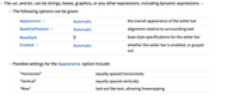
- The vali and lbli can be strings, boxes, graphics, or any other expressions, including dynamic expressions. »
- The following options can be given:
-
Appearance Automatic the overall appearance of the setter bar BaselinePosition Automatic alignment relative to surrounding text BaseStyle {} base style specifications for the setter bar Enabled Automatic whether the setter bar is enabled, or grayed out - Possible settings for the Appearance option include:
-
"Horizontal" equally spaced horizontally "Vertical" equally spaced vertically "Row" laid out like text, allowing linewrapping - Appearance->"Vertical"->{h,w} will display the controls in a grid with the specified number of columns and rows, vertically filling each column in turn. Appearance->"Horizontal"->{h,w} horizontally fills the rows instead.
- If one of h or w is Automatic, it is taken to be the smallest number so that all the controls will fit in the resulting grid. If both h and w are Automatic, they are calculated so the grid has roughly the same number of rows as columns.
- The settings for BaseStyle are appended to the default style typically given by the "SetterBar" style in the current stylesheet.
Examples
open all close allOptions (6)
Appearance (3)
Change the orientation of SetterBar:
The Appearance option "Row" allows line wrapping, while "Horizontal" does not:
Specify a three-column layout, with elements ordered vertically:
Properties & Relations (1)
RadioButtonBar is a special case of SetterBar:
See Also
RadioButtonBar TogglerBar PopupMenu Setter Manipulate Control
Tech Notes
Related Guides
Related Workflows
- Build a Manipulate
History
Text
Wolfram Research (2007), SetterBar, Wolfram Language function, https://reference.wolfram.com/language/ref/SetterBar.html.
CMS
Wolfram Language. 2007. "SetterBar." Wolfram Language & System Documentation Center. Wolfram Research. https://reference.wolfram.com/language/ref/SetterBar.html.
APA
Wolfram Language. (2007). SetterBar. Wolfram Language & System Documentation Center. Retrieved from https://reference.wolfram.com/language/ref/SetterBar.html
BibTeX
@misc{reference.wolfram_2025_setterbar, author="Wolfram Research", title="{SetterBar}", year="2007", howpublished="\url{https://reference.wolfram.com/language/ref/SetterBar.html}", note=[Accessed: 04-May-2026]}
BibLaTeX
@online{reference.wolfram_2025_setterbar, organization={Wolfram Research}, title={SetterBar}, year={2007}, url={https://reference.wolfram.com/language/ref/SetterBar.html}, note=[Accessed: 04-May-2026]}