Setter
Setter[x,val]
represents a setter button whose setting x is set to val when the button is clicked. The button is labeled with val, and appears pressed if the value of x is val, and unpressed otherwise.
takes the setting to be the dynamically updated current value of x, with the value of x being reset if the button is clicked.
Setter[x,val,label]
labels the setter button with label.
Setter[x,{val1,val2,…},label]
represents a setter button that sets x to valn if multiclicked n times.
Details and Options

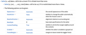
- Setter[x,val] takes x still to be val even if it is clicked more than once.
- Setter[x,{val1,…,valn},label] takes x still to be valn if it is multiclicked more than n times.
- The following options can be given:
-
Appearance Automatic the overall appearance of the setter AutoAction False whether to change the setter automatically when the mouse is over it BaselinePosition Automatic alignment relative to surrounding text BaseStyle {} base style specifications for the setter ContentPadding True whether to shrink the margins tightly around the contents Enabled Automatic whether the setter is enabled or grayed out FrameMargins Automatic margins to leave inside the toggler frame ImageMargins 0 margins around the image of the displayed setter ImageSize All the overall image size of the displayed setter - Typical possible settings for the Appearance option include "Frameless" and "Palette". In some cases, "AbuttingLeftRight", "AbuttingRight", etc. are also supported.
- With Appearance->None, label is displayed literally, without being placed in a button.
- The settings for BaseStyle are appended to the default style typically given by the "Setter" style in the current stylesheet.
Examples
open allclose allBasic Examples (1)
Scope (2)
Options (9)
AutoAction (1)
By default, Setter must be clicked to change the setting:
By setting AutoAction->True, moving the mouse over the setter changes the setting:
Enabled (1)
Properties & Relations (1)
RadioButton is a special case of Setter:
Text
Wolfram Research (2007), Setter, Wolfram Language function, https://reference.wolfram.com/language/ref/Setter.html.
CMS
Wolfram Language. 2007. "Setter." Wolfram Language & System Documentation Center. Wolfram Research. https://reference.wolfram.com/language/ref/Setter.html.
APA
Wolfram Language. (2007). Setter. Wolfram Language & System Documentation Center. Retrieved from https://reference.wolfram.com/language/ref/Setter.html