表格可视化
Visualizing tabular data is typically the first step to discovery and insight that will prompt additional questions. Different aspects of data can be visualized, such as summaries, distributions, clustering, correlation and dependence and many more. The visual insights are typically further refined by transformation and modeling. The Wolfram Language provides a rich palette of visualization functions, and Tabular data can easily be visualized by using the columns as data variables in most visualization functions.
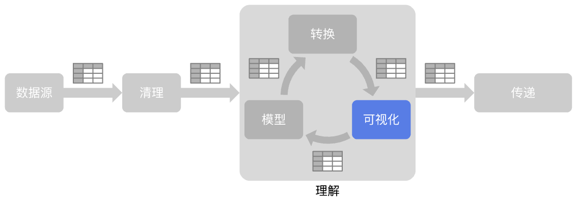
Statistical Visualization »
 ListPlot — scatter plot of values
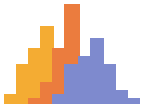 Histogram — visualize a distribution of values as a histogram
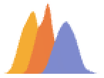 SmoothHistogram — visualize a distribution of values as a smooth curve
 DensityHistogram ▪
  SmoothDensityHistogram ▪
  QuantilePlot ▪
 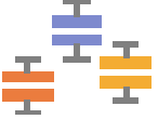 BoxWhiskerChart ▪
  DistributionChart ▪ ...
Information Visualization »
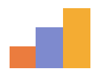 BarChart — plot a summary for each category value as a bar
 PieChart ▪
 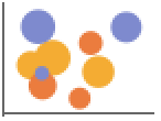 BubbleChart ▪
  SectorChart ▪ ...
日期和时间可视化 »
 DateListPlot — plot a time series
 TimelinePlot ▪
 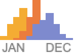 DateHistogram ▪
  StackedDateListPlot ▪ ...
High-Dimensional Visualization »
 PairwiseListPlot — pairwise scatter plot
 ParallelAxisPlot ▪
  RadialAxisPlot ▪
  PairwiseDensityHistogram ▪ ...
Scientific Visualization »
 ListDensityPlot — plot values as functions of spatial values using color
 ListPlot3D — plot values as functions of spatial values using height
 ListLinePlot ▪
  ListContourPlot ▪
  ListPointPlot3D ▪
  ListLinePlot3D ▪
  ListSurfacePlot3D ▪
  ListContourPlot3D ▪
  ListDensityPlot3D ▪
  ListSliceContourPlot3D ▪
  ListSliceDensityPlot3D ▪
  NumberLinePlot ▪
  TernaryListPlot ▪ ...