

BarChart
Details and Options
- BarChart is also known as a bar graph or column graph.
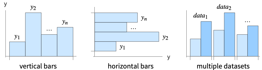
- A bar chart shows the values in a dataset as equal-width rectangular bars with lengths corresponding to the values. By default, the bars are vertical, but horizontal bars can also be used. Bar charts are typically used when the data is relatively small.
- Data elements for BarChart can be given in the following forms:
-
yi a pure bar value Quantity[yi,unit] bar value with a unit wi[yi,…] a bar with value yi and wrapper wi formi->mi a bar form with metadata mi Around[xi,ei] value xi with uncertainty ei - Data not given in these forms is taken to be missing, and typically yields a gap in the bar chart.
- Datasets for BarChart can be given in the following forms:
-
{e1,e2,…} list of elements with or without wrappers <k1e1,k2e2,…> association of keys and lengths TimeSeries[…],EventSeries[…],TemporalData[…] time series, event series, and temporal data WeightedData[…],EventData[…] augmented datasets w[{e1,e2,…},…] wrapper applied to a whole dataset w[{data1,data2,…},…] wrapper applied to all datasets - BarChart[objcspec] extracts and plots values from the Tabular, TimeSeries or EventSeries object obj using the column specification cspec.
- The following forms of column specifications cspec are allowed for plotting tabular data:
-
col plot values from column col {col1,col2,…,coln} plot columns {col1, …, coln} as a group of values - The following wrappers can be used for chart elements:
-
Annotation[e,label] provide an annotation Button[e,action] define an action to execute when the element is clicked Callout[e,label] display the element with a callout EventHandler[e,…] define a general event handler for the element Hyperlink[e,uri] make the element act as a hyperlink Labeled[e,…] display the element with labeling Legended[e,…] include features of the element in a chart legend Mouseover[e,over] make the element show a mouseover form PopupWindow[e,cont] attach a popup window to the element StatusArea[e,label] display in the status area when the element is moused over Style[e,opts] show the element using the specified styles Tooltip[e,label] attach an arbitrary tooltip to the element - In BarChart, Labeled, Callout and Placed allow the following positions:
-
Top inside the top edge of the bar 
Bottom inside the bottom edge of the bar 
Above outside the top edge of the bar 
Below outside the bottom edge of the bar 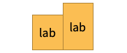
Center centered in the bar 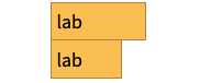
Left inside the left edge of the bar 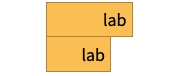
Right inside the right edge of the bar 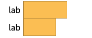
Before outside the left edge of the bar 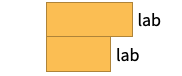
After outside the right edge of the bar 
Axis on the axis 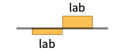
"Outside" outside the bar 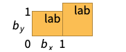
{{bx,by},{lx,ly}} scaled position {lx,ly} in the label at scaled position {bx,by} in the bar - BarChart has the same options as Graphics, with the following additions and changes: [List of all options]
-
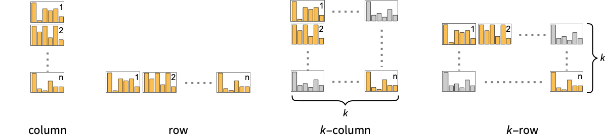
AspectRatio 1/GoldenRatio ratio of height to width Axes True whether to draw axes BarOrigin Bottom origin placement for bars BarSpacing Automatic fractional spacing between bars ChartElementFunction Automatic how to generate raw graphics for bars ChartElements Automatic graphics to use in each of the bars ColorFunction Automatic how to color bars ColorFunctionScaling True whether to normalize arguments to ColorFunction IntervalMarkers Automatic how to render uncertainties IntervalMarkersStyle Automatic style for uncertainty elements Joined False whether to join bars LabelingFunction Automatic how to label bars LabelingSize Automatic maximum size of callouts and labels LegendAppearance Automatic overall appearance of legends PerformanceGoal $PerformanceGoal aspects of performance to try to optimize PlotInteractivity $PlotInteractivity whether to allow interactive elements PlotLabels None category labels for bars PlotLayout Automatic overall layout to use PlotLegends None legends for data elements and datasets PlotStyle Automatic style for bars PlotTheme $PlotTheme overall theme for the chart ScalingFunctions None how to scale individual coordinates TargetUnits Automatic units to display in the chart - Possible settings for PlotLayout that show multiple datasets in a single display panel include:
-
"Grouped" separate the data for each dataset 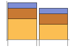
"Stacked" accumulate the data for each dataset 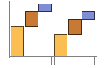
"Stepped" accumulate and separate the data for each dataset 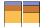
"Percentile" accumulate and normalize the data for each dataset 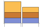
"Overlapped" overlap the data for each dataset - Possible settings for PlotLayout that show individual datasets in different panels include:
-
"Column" use separate charts in a column of panels "Row" use separate charts in a row of panels {"Column",k},{"Row",k} use k columns or rows {"Column",UpTo[k]},{"Row",UpTo[k]} use at most k columns or rows - Typical settings for PlotLegends include:
-
None no legend Automatic automatically determine legend {lbl1,lbl2,…} use lbl1, lbl2, … as legend labels Placed[lspec,…] specify placement for legend - PlotStylesty specifies the styles to use for each curve. Possible settings include:
-
{sty1,sty2,…} sequence of styles for the data <"key"val,…> styling elements for different levels of data - The accepted keys are:
-
"Base" overall style for all the bars "Elements" list of styles for the elements yi in each group "Groups" list of styles of each group of values datai - ColorData["DefaultChartColors"] gives the default sequence of colors used by PlotStyle.
- The arguments supplied to ChartElementFunction are the bar region {{xmin,xmax},{ymin,ymax}}, the data value yi, and metadata {m1,m2,…} from each level in a nested list of datasets.
- A list of built-in settings for ChartElementFunction can be obtained from ChartElementData["BarChart"].
- The argument supplied to ColorFunction is yi.
- Style and other specifications from options and other constructs in BarChart are effectively applied in the order PlotStyle, ColorFunction, Style and other wrappers, ChartElements, and ChartElementFunction, with later specifications overriding earlier ones.
List of all options
Examples
open all close allBasic Examples (4)
Generate a bar chart for a list of heights:
BarChart[{1, 2, 3}]BarChart[{{1, 2, 3}, {1, 3, 2}}]BarChart[{{1, 2, 3}, {1, 3, 2}, {5, 2}}, PlotLabels -> {"a", "b", "c"}]BarChart[{{1, 2, 3}, {1, 3, 2}, {5, 2}}, PlotLegends -> <|"Elements" -> {"a", "b", "c"}|>]BarChart[Range[8], PlotStyle -> {RGBColor[0.24, 0.6, 0.8], RGBColor[0.95, 0.627, 0.1425], RGBColor[0.455, 0.7, 0.21], RGBColor[0.922526, 0.385626, 0.209179], RGBColor[0.578, 0.51, 0.85], RGBColor[0.772079, 0.431554, 0.102387], RGBColor[0.4, 0.64, 1.], RGBColor[1., 0.75, 0.]}]BarChart[{Range[4], Range[5]}, PlotStyle -> {RGBColor[0.455, 0.7, 0.21], RGBColor[0.4, 0.64, 1.]}]BarChart[Range[5], ChartElements -> [image]]Scope (45)
Data and Layouts (15)
Items in a dataset are grouped together:
BarChart[{{1, 1, 1}, {2, 2, 2}, {3, 3, 3}}]Datasets do not need to have the same number of items:
BarChart[{{1, 2}, {1, 2, 3}, {1, 2, 3, 4}}]Nonreal data is taken to be missing and typically yields a gap in the bar chart:
BarChart[{{1, Missing[], 3}, {4, 2, 1 + I, 2}, {foo, 2, 4}}]BarChart[{Quantity[1, "Meters"], Quantity[1, "Meters"], Quantity[2, "Meters"], Quantity[3, "Meters"], Quantity[5, "Meters"], Quantity[8, "Meters"]}, AxesLabel -> Automatic]BarChart[{Quantity[1, "Meters"], Quantity[1, "Meters"], Quantity[2, "Meters"], Quantity[3, "Meters"], Quantity[5, "Meters"], Quantity[8, "Meters"]}, AxesLabel -> Automatic, TargetUnits -> "Feet"]The time stamps in TimeSeries, EventSeries, and TemporalData are ignored:
BarChart[TimeSeries[{19, 16, 9, 3, 7, 2, 17}, {"May 24, 1982"}]]The values in associations are taken as the heights of the bars:
BarChart[<|"a" -> 1, "b" -> 2, "c" -> 5, "d" -> 3|>]BarChart[<|"a" -> 1, "b" -> 2, "c" -> 5, "d" -> 3|>, PlotLabels -> Automatic]BarChart[<|"a" -> 1, "b" -> 2, "c" -> 5, "d" -> 3|>, PlotLabels -> Callout[Automatic, Above]]BarChart[<|"a" -> 1, "b" -> 2, "c" -> 5, "d" -> 3|>, PlotStyle -> {Hue[0.61, 0.7, 1], Hue[0.17, 0.4, 0.65], Hue[0.64, 0.5, 0.75], Hue[0.45, 0.4, 0.7]}, PlotLegends -> Automatic]BarChart[<|"group a" -> <|"a" -> 1, "b" -> 2, "c" -> 5, "d" -> 3|>, "group b" -> <|"a" -> 4, "b" -> 1, "c" -> 3, "d" -> 2|>|>, PlotLegends -> Automatic]The weights in WeightedData are ignored:
BarChart[WeightedData[{1, 2, 3, 4, 5}, {0.5, 0.2, 0.1, 0.2, 0.3}]]The censoring and truncation information in EventData is ignored:
BarChart[EventData[{8, 3, 5, 4, 9}, {0, 1, 1, 0, 0}]]Use different layouts to display multiple datasets:
Table[BarChart[{{1, 2, 3}, {1, 3, 2}}, PlotLayout -> l], {l, {"Grouped", "Stepped"}}]Stacked layouts are more compact in the horizontal direction:
Table[BarChart[IconizedObject[«data»], PlotLayout -> l], {l, {"Stacked", "Percentile"}}]Use Joined to indicate connections between data points:
BarChart[IconizedObject[«data»], PlotLayout -> "Stacked", Joined -> True, BarSpacing -> Medium]Show a list of datasets in a row of charts by specifying PlotLayout:
BarChart[IconizedObject[«data»], PlotLayout -> "Row"]Use a column of charts instead:
BarChart[IconizedObject[«data»], PlotLayout -> "Column"]BarChart[IconizedObject[«data»], PlotLayout -> {"Row", 2}]Table[BarChart[Range[5], BarOrigin -> o, PlotLabel -> o], {o, {Bottom, Left, Top, Right}}]Adjust the spacing between bars and groups of bars:
Table[BarChart[{Range[4], Range[4]}, BarSpacing -> s, PlotLabel -> s, PlotStyle -> <|"Base" -> Opacity[0.8]|>], {s, {Automatic, {0, 1}, {-0.3, 1}}}]BarChart[Table[Around[RandomReal[5], RandomReal[0.5]], 12]]Tabular Data (3)
Get tabular data, counted by the "class" and "survived" columns:
titanic = ResourceData["Sample Tabular Data: Titanic"]Create a chart of how many passengers were in each ticket class:
AggregateRows[titanic, "count" -> Function[Length[#class]], "class"]BarChart[% -> "count", PlotLabels -> {"1st", "2nd", "3rd"}]Show how many passengers survived and how many perished:
AggregateRows[titanic, "count" -> Function[Length[#class]], "survived"]BarChart[% -> "count", PlotLabels -> {"survived", "perished"}]Display the number of passengers who survived by ticket class:
pivot = PivotToColumns[AggregateRows[titanic, "count" -> Function[Length[#class]], {"class", "survived"}], "class" -> "count"]BarChart[pivot -> {"1st", "2nd", "3rd"}, PlotLabels -> <|"Groups" -> {"survived", "perished"}, "Elements" -> {"1st", "2nd", "3rd"}|>]Use stacked bars for the display:
BarChart[pivot -> {"1st", "2nd", "3rd"}, PlotLayout -> "Stacked", PlotLabels -> <|"Groups" -> {"survived", "perished"}, "Elements" -> {"1st", "2nd", "3rd"}|>]Plot the values for all the components in TimeSeries or EventSeries:
BarChart[TimeSeries[TimeEventSeries`TimestampData[Association["UniformlySpacedQ" -> True, "Count" -> 5,
   "Endpoints" -> TabularColumn[Association[
      "Data" -> {2, {{NumericArray[{20551, -2147483648}, "Integer32"], {},
          DataStructure["BitVec ... rColumn[Association[
           "Data" -> {{2, 3, 4, 5, 9}, {}, None}, "ElementType" -> "Integer64"]],
         TabularColumn[Association["Data" -> {{15, 15, 13, 11, 10}, {}, None},
           "ElementType" -> "Integer64"]]}}]]]], Association[]]]
Plot the values for a component of a TimeSeries or EventSeries:
ts = TimeSeries[TimeEventSeries`TimestampData[Association["UniformlySpacedQ" -> True, "Count" -> 5,
   "Endpoints" -> TabularColumn[Association[
      "Data" -> {2, {{NumericArray[{20551, -2147483648}, "Integer32"], {},
          DataStructure["BitVec ... rColumn[Association[
           "Data" -> {{2, 3, 4, 5, 9}, {}, None}, "ElementType" -> "Integer64"]],
         TabularColumn[Association["Data" -> {{15, 15, 13, 11, 10}, {}, None},
"ElementType" -> "Integer64"]]}}]]]], Association[]];BarChart[ts -> "fish"]Plot values from multiple components:
BarChart[ts -> {"cats", "dogs"}]Wrappers (5)
Use wrappers on individual data, datasets, or collections of datasets:
{BarChart[{{1, Style[2, RGBColor[0.93, 0.27, 0.27]], 3}, {4, 5, 6}}], BarChart[{Style[{1, 2, 3}, RGBColor[0.14, 0.8, 0.14]], {4, 5, 6}}], BarChart[Style[{{1, 2, 3}, {4, 5, 6}}, RGBColor[0.4, 0.6, 1]]]}{BarChart[{{1, Style[2, RGBColor[0.93, 0.27, 0.27]], 3}, {4, 5, 6}}], BarChart[{Style[{1, Style[2, RGBColor[0.93, 0.27, 0.27]], 3}, RGBColor[0.14, 0.8, 0.14]], {4, 5, 6}}], BarChart[Style[{Style[{1, Style[2, RGBColor[0.93, 0.27, 0.27]], 3}, RGBColor[0.14, 0.8, 0.14]], {4, 5, 6}}, RGBColor[0.4, 0.6, 1]]]}Override the default tooltips:
BarChart[{1, Tooltip[2, "median"], 3}]Use any object in the tooltip:
BarChart[Table[Tooltip[CountryData[c, "Population"], CountryData[c, "Flag"]], {c, CountryData["G7"]}]]Use PopupWindow to provide additional drilldown information:
BarChart[{1, PopupWindow[2, DateListPlot[FinancialData["IBM", "Jan. 1, 2004"]]], 3}]Button can be used to trigger any action:
BarChart[{1, Button[2, Speak[2]], 3}]Styling and Appearance (8)
Use an explicit list of styles for the bars:
BarChart[{1, 2, 3, 4}, PlotStyle -> {RGBColor[0.93, 0.27, 0.27], RGBColor[0.14, 0.8, 0.14], RGBColor[0.4, 0.6, 1], RGBColor[1, 0.75, 0]}]Use any gradient or indexed color schemes from ColorData:
{BarChart[{1, 2, 3, 4}, ColorFunction -> "Pastel"], BarChart[{1, 2, 3, 4}, ColorFunction -> ColorData[12], ColorFunctionScaling -> False]}Use color schemes designed for charting:
ColorData["Charting"]Table[BarChart[Range[12], ColorFunction -> ColorData[i], ColorFunctionScaling -> False, Axes -> None], {i, RandomSample[ColorData["Charting"], 4]}]PlotStyle can be used to set an initial style for all chart elements:
BarChart[Range[5], PlotStyle -> <|"Base" -> EdgeForm[Dashed]|>]Style can be used to override styles:
BarChart[{1, 2, Style[3, RGBColor[0.93, 0.27, 0.27]], 4, 5}, PlotStyle -> {RGBColor[0.797253, 0.904982, 0.410498], RGBColor[0.934691, 0.945708, 0.75346], RGBColor[0.769879, 0.92369, 0.977371], RGBColor[1, 0.566415, 0.0386511], RGBColor[1, 1, 0.4]}]Use any graphic for pictorial bars:
{BarChart[{1, 2, 3}, ChartElements -> Graphics[Disk[]]], BarChart[{1, 2, 3}, ChartElements -> ExampleData[{"TestImage", "House"}]]}Use built-in programmatically generated bars:
ChartElementData["BarChart"]Table[BarChart[{1, 2, 3, 4, 5}, ChartElementFunction -> f, PlotStyle -> {RGBColor[0.761959, 0.470832, 0.940597], RGBColor[0.898695, 0.686452, 0.6785475], RGBColor[0.9584254999999999, 0.877884, 0.5906629999999999], RGBColor[0.86116075, 0.930182, 0.758764], RGBColor[0.431296, 0.709773, 0.927077]}], {f, {"FadingRectangle", "GlassRectangle"}}]For detailed settings use Palettes ▶ ChartElementSchemes:
BarChart[{1, 2, 3, 4, 5}, ChartElementFunction -> ChartElementDataFunction["SegmentScaleRectangle", "Segments" -> 7, "ColorScheme" -> "SolarColors"]]Use a theme with detailed frame ticks and grid lines:
BarChart[{{16, 8, 4}, {5, 3, 2}}, PlotTheme -> "Detailed"]Use a theme with a high-contrast color scheme and edge-fading rectangles:
BarChart[{{16, 8, 4}, {5, 3, 2}}, PlotTheme -> "Marketing"]Labeling and Legending (14)
Use Labeled to add a label to a bar:
BarChart[{1, Labeled[2, "label"], 3}]Use symbolic positions for label placement:
Table[BarChart[{1, Labeled[2, "label", p], 3}, PlotLabel -> p, Ticks -> None], {p, {Bottom, Center, Top}}]Table[BarChart[{1, Labeled[2, "label", p], 3}, PlotLabel -> p, Ticks -> None], {p, {Left, Center, Right}}]Specify categorical labels for data elements:
BarChart[{{1, 2, 3}, {4, 5}}, PlotLabels -> <|"Elements" -> {"c1", "c2", "c3"}|>]BarChart[{{1, 2, 3}, {4, 5}}, PlotLabels -> <|"Groups" -> {"r1", "r2"}|>]BarChart[{{1, 2, 3}, {4, 5}}, PlotLabels -> <|"Elements" -> {"c1", "c2", "c3"}, "Groups" -> {"r1", "r2"}|>]Use Placed to control the positioning of labels, using the same positions as for Labeled:
BarChart[{{1, 2, 3}, {4, 5}}, PlotLabels -> <|"Elements" -> Placed[{"c1", "c2", "c3"}, Center], "Groups" -> Placed[{"r1", "r2"}, Above]|>]Use Callout to add a label to a bar:
BarChart[{1, 2, Callout[3, "label"]}]Change the appearance of the callout:
BarChart[{1, 2, Callout[3, "label", Appearance -> "Balloon"]}]Automatically position callouts:
BarChart[Callout[#, Unique["text"]]& /@ RandomReal[{0, 1}, 5]]Use callouts with stacked bars:
BarChart[Table[Callout[RandomReal[{0, 1}], Unique["text"]], 2, 8], BarSpacing -> 2, PlotLayout -> "Stacked"]Provide value labels for bars by using LabelingFunction:
BarChart[{1, 2, 3}, LabelingFunction -> Above]Use Placed to control placement and formatting:
labeler[v_, {i_, j_}, {ri_, cj_}] := Placed[Row[{v, ri[[1]], cj[[1]]}, ","], Center]BarChart[{{1, 2, 3}, {4, 5}}, PlotLabels -> <|"Groups" -> {"r1", "r2"}, "Elements" -> {"c1", "c2", "c3"}|>, LabelingFunction -> labeler]Use Callout in LabelingFunction to customize callout labels:
BarChart[{5, 2, 3, 9, 2, 7}, LabelingFunction -> (Callout[Style[#, 10 + 5#], Above]&)]Add categorical legend entries for data elements:
BarChart[{{1, 2, 3}, {4, 5}}, PlotLegends -> <|"Elements" -> {"ccc1", "ccc2", "ccc3"}|>, PlotStyle -> <|"Elements" -> {RGBColor[0.761959, 0.470832, 0.940597], RGBColor[0.9584254999999999, 0.877884, 0.5906629999999999], RGBColor[0.431296, 0.709773, 0.927077]}|>]BarChart[{{1, 2, 3}, {4, 5}}, PlotLegends -> {"rr1", "rr2"}, PlotStyle -> <|"Groups" -> "Pastel"|>]Use Legended to add additional legend entries:
BarChart[{{1, Legended[2, "extra"], 3}, {4, 5}}, PlotStyle -> <|"Elements" -> {RGBColor[0.761959, 0.470832, 0.940597], RGBColor[0.9584254999999999, 0.877884, 0.5906629999999999], RGBColor[0.431296, 0.709773, 0.927077]}|>, PlotLegends -> <|"Elements" -> {"aaa", "bbb", "ccc"}|>]Use Placed to change the position of legends:
Table[BarChart[{{1, 2, 3}, {4, 5}}, PlotLegends -> <|"Elements" -> Placed[{"ccc1", "ccc2", "ccc3"}, p]|>, PlotStyle -> <|"Elements" -> {RGBColor[0.761959, 0.470832, 0.940597], RGBColor[0.9584254999999999, 0.877884, 0.5906629999999999], RGBColor[0.431296, 0.709773, 0.927077]}|>], {p, {Below, Above}}]Options (132)
AspectRatio (3)
By default, BarChart uses a fixed ratio of height to width for the chart:
BarChart[{1, 3, 4, 2, 5, 7}]The ratio is not affected when the bars are horizontal:
BarChart[{1, 3, 4, 2, 5, 7}, BarOrigin -> Left]Make the height the same as the width with AspectRatio1:
BarChart[{1, 3, 4, 2, 5, 7}, AspectRatio -> 1]AspectRatioFull adjusts the height and width to tightly fit inside other constructs:
plot = BarChart[{1, 3, 4, 2, 5, 7}, AspectRatio -> Full];{Framed[Pane[plot, {50, 100}]], Framed[Pane[plot, {100, 100}]], Framed[Pane[plot, {100, 50}]]}Axes (3)
BarChart[{1, 3, 4, 2, 5, 7}]Use AxesFalse to turn off axes:
BarChart[{1, 3, 4, 2, 5, 7}, Axes -> False]Use AxesOrigin to specify where the axes intersect:
BarChart[{1, -3, -4, 2, 5, -7}, Axes -> True, AxesOrigin -> {0, -8}]AxesLabel (4)
No axes labels are drawn by default:
BarChart[{1, 3, 4, 2, 5, 7}, Axes -> True]
BarChart[{1, 3, 4, 2, 5, 7}, Axes -> True, AxesLabel -> "data"]BarChart[{1, 3, 4, 2, 5, 7}, Axes -> True, AxesLabel -> {"Groups", "Total"}]BarChart[QuantityArray[{1, 3, 4, 2, 5, 7}, "Meters"], Axes -> True, AxesLabel -> Automatic]AxesOrigin (2)
AxesStyle (4)
Change the style for the axes:
BarChart[{1, 3, 4, 2, 5, 7}, AxesStyle -> RGBColor[0.93, 0.27, 0.27]]Specify the style of each axis:
BarChart[{1, 3, 4, 2, 5, 7}, AxesStyle -> {RGBColor[0.93, 0.27, 0.27], RGBColor[0.4, 0.6, 1]}]Use different styles for the ticks and the axes:
BarChart[{1, 3, 4, 2, 5, 7}, AxesStyle -> RGBColor[0.4, 0.6, 1], TicksStyle -> RGBColor[0.93, 0.27, 0.27]]Use different styles for the labels and the axes:
BarChart[{1, 3, 4, 2, 5, 7}, AxesStyle -> GrayLevel[0.62], LabelStyle -> RGBColor[0.93, 0.27, 0.27]]BarOrigin (1)
BarSpacing (5)
Use automatically determined spacing between bars:
BarChart[{{16, 8, 4}, {5, 3, 2}}, BarSpacing -> Automatic]BarChart[{{16, 8, 4}, {5, 3, 2}}, BarSpacing -> None]Table[BarChart[{{16, 8, 4}, {5, 3, 2}}, BarSpacing -> s, PlotLabel -> s], {s, {Tiny, Small, Medium, Large}}]Use explicit spacing between bars:
Table[BarChart[{{16, 8, 4}, {5, 3, 2}}, BarSpacing -> s, PlotLabel -> s], {s, {Automatic, 1, -0.3}}]Use explicit spacing between bars and groups of bars:
Table[BarChart[{{16, 8, 4}, {5, 3, 2}}, BarSpacing -> s, PlotLabel -> s], {s, {Automatic, {0, 1}, {0, 0.2}}}]ChartElementFunction (6)
Get a list of built-in settings for ChartElementFunction:
ChartElementData["BarChart"]For detailed settings, use Palettes ▶ ChartElementSchemes:
Table[BarChart[{1, 2, 3, 4, 5}, ChartElementFunction -> f, PlotStyle -> {RGBColor[0.761959, 0.470832, 0.940597], RGBColor[0.898695, 0.686452, 0.6785475], RGBColor[0.9584254999999999, 0.877884, 0.5906629999999999], RGBColor[0.86116075, 0.930182, 0.758764], RGBColor[0.431296, 0.709773, 0.927077]}, PlotLabel -> f], {f, {"Rectangle", "ObliqueRectangle"}}]Table[BarChart[{1, 2, 3, 4, 5}, ChartElementFunction -> f, PlotStyle -> {RGBColor[0.761959, 0.470832, 0.940597], RGBColor[0.898695, 0.686452, 0.6785475], RGBColor[0.9584254999999999, 0.877884, 0.5906629999999999], RGBColor[0.86116075, 0.930182, 0.758764], RGBColor[0.431296, 0.709773, 0.927077]}, PlotLabel -> f], {f, {"FadingRectangle", "GlassRectangle"}}]This ChartElementFunction is appropriate to show the global scale:
Table[BarChart[{1, 2, 3, 4, 5}, ChartElementFunction -> f, PlotLabel -> f], {f, {"GradientScaleRectangle", "SegmentScaleRectangle"}}]Write a custom ChartElementFunction:
f[{{xmin_, xmax_}, {ymin_, ymax_}}, ___] := Rectangle[{xmin, ymin}, {xmax, ymax}]BarChart[{1, 2, 3, 4, 5}, ChartElementFunction -> f]g[{{xmin_, xmax_}, {ymin_, ymax_}}, ___] := Polygon[{{xmin, ymin}, {xmax, ymax}, {xmin, ymax}, {xmax, ymin}}]BarChart[{1, 2, 3, 4, 5}, ChartElementFunction -> g]Use metadata passed on from the input, in this case charting the data:
DataDrilldownBar[{{xmin_, xmax_}, {ymin_, ymax_}}, y_, {data_List}] :=
PopupWindow[Polygon[{{xmin, ymin}, {xmax, ymax}, {xmin, ymax}, {xmax, ymin}}], PieChart[data]]DataDrilldownBar[{{xmin_, xmax_}, {ymin_, ymax_}}, y_, _] :=
Rectangle[{xmin, ymin}, {xmax, ymax}]BarChart[{1 -> Range[5], 2, 3 -> RandomReal[1, 10]}, ChartElementFunction -> DataDrilldownBar]Built-in element functions may have options; use Palettes ▶ ChartElementSchemes to set them:
ChartElementData["GradientRectangle", "Options"]Table[BarChart[{1, 2, 3}, ChartElementFunction -> ChartElementData["GradientRectangle", "ColorScheme" -> "BeachColors", "GradientOrigin" -> dir]], {dir, {Left, Right, Top, Bottom}}]ChartElements (9)
Create a pictorial chart based on any Graphics object:
BarChart[{1, 2, 3, 4}, ChartElements -> Graphics[Disk[]]]BarChart[{1, 2, 3}, ChartElements -> Graphics3D[Sphere[]]]BarChart[{1, 2, 3}, ChartElements -> ExampleData[{"TestImage", "House"}]]Use a stretched version of the graphic:
BarChart[{1, 2, 3, 4}, ChartElements -> {[image], All}]Use explicit sizes for width and height:
Table[BarChart[{1, 2, 3, 4}, ChartElements -> {Graphics[Disk[], AspectRatio -> Full], s}, PlotLabel -> s], {s, {{1 / 2, 1}, {1, 1 / 2}}}]Without AspectRatio->Full, the original aspect ratio is preserved:
Table[BarChart[{1, 2, 3, 4}, ChartElements -> {Graphics[Disk[]], s}, PlotLabel -> s], {s, {{1 / 2, 1}, {1, 1 / 2}}}]Using All for width or height causes that direction to stretch to the full size of the bar:
Table[BarChart[{1, 2, 3, 4}, ChartElements -> {[image], s}, PlotLabel -> s], {s, {{1 / 2, All}, {All, 1 / 2}}}]Use a different graphic for each column of data:
BarChart[{{1, 2, 3}, {4, 5, 6}}, ChartElements -> {[image], [image], [image]}]Use a different graphic for each row of data:
BarChart[{{1, 2, 3}, {4, 5, 6}}, ChartElements -> {{[image], [image]}, None}]BarChart[{1, 2, 3, 4, 5, 6}, ChartElements -> {[image], [image]}]Styles are inherited from styles set through PlotStyle etc.:
BarChart[{1, 2, 3, 4, 5, 6}, ChartElements -> [image], PlotStyle -> {RGBColor[0.761959, 0.470832, 0.940597], RGBColor[0.8750956, 0.6580038, 0.746929], RGBColor[0.9440982, 0.7955892, 0.5942686], RGBColor[0.9537862, 0.937389, 0.6180996], RGBColor[0.7952328000000001, 0.8988539999999999, 0.8302508], RGBColor[0.431296, 0.709773, 0.927077]}]Explicit styles set in the graphic will override other style settings:
BarChart[{1, 2, 3, 4, 5, 6}, ChartElements -> [image], PlotStyle -> {RGBColor[0.761959, 0.470832, 0.940597], RGBColor[0.8750956, 0.6580038, 0.746929], RGBColor[0.9440982, 0.7955892, 0.5942686], RGBColor[0.9537862, 0.937389, 0.6180996], RGBColor[0.7952328000000001, 0.8988539999999999, 0.8302508], RGBColor[0.431296, 0.709773, 0.927077]}]The orientation of the pictorial graphic is unaffected by BarOrigin:
Table[BarChart[{1, 2, 3}, ChartElements -> [image], BarOrigin -> o], {o, {Bottom, Top, Left, Right}}]g = Graphics3D[{EdgeForm[], Specularity[White, 30], Cylinder[]}, ViewPoint -> {0, -Infinity, 0}, Boxed -> False, Lighting -> "Neutral", PlotRangePadding -> 0];BarChart[Range[5], ChartElements -> {g, All}, PlotStyle -> {RGBColor[0.761959, 0.470832, 0.940597], RGBColor[0.898695, 0.686452, 0.6785475], RGBColor[0.9584254999999999, 0.877884, 0.5906629999999999], RGBColor[0.86116075, 0.930182, 0.758764], RGBColor[0.431296, 0.709773, 0.927077]}]ColorFunction (3)
BarChart[Table[Exp[-t ^ 2], {t, -2, 2, 0.25}], ColorFunction -> Function[{height}, ColorData["Rainbow"][height]]]Use ColorFunctionScaling->False to get unscaled height values:
BarChart[{1, 2, 3}, ColorFunction -> (Switch[#, 1, RGBColor[1, 0.75, 0], 2, RGBColor[0.98, 0.56, 0.17], 3, RGBColor[0.93, 0.27, 0.27]]&), ColorFunctionScaling -> False]ColorFunction overrides styles in PlotStyle:
BarChart[{1, 2, 3}, PlotStyle -> {RGBColor[0.93, 0.27, 0.27], RGBColor[0.14, 0.8, 0.14], RGBColor[0.4, 0.6, 1]}, ColorFunction -> (Blend[{LightBlue, LightRed}, #]&)]Use ColorFunction to combine different style effects:
BarChart[Table[Exp[-t ^ 2], {t, -2, 2, 0.25}], ColorFunction -> Function[{height}, Opacity[height]], PlotStyle -> RGBColor[0.8, 0.3, 0.8]]ColorFunctionScaling (2)
By default, scaled height values are used:
BarChart[{1, 2, 3}, ColorFunction -> (Blend[{LightBlue, LightRed}, #]&)]Use ColorFunctionScaling->False to get unscaled height values:
BarChart[{1, 2, 3}, ColorFunction -> (Switch[#, 1, RGBColor[1, 0.75, 0], 2, RGBColor[0.98, 0.56, 0.17], 3, RGBColor[0.93, 0.27, 0.27]]&), ColorFunctionScaling -> False]Frame (4)
BarChart does not use a frame by default:
BarChart[{20, 5, 10, 35, 60, 75, 140}]Use FrameTrue to turn on the frame:
BarChart[{20, 5, 10, 35, 60, 75, 140}, Frame -> True]Draw a frame on the left and right edges:
BarChart[{20, 5, 10, 35, 60, 75, 140}, Frame -> {{True, True}, {False, False}}]Draw a frame on the left and top edges:
BarChart[{20, 5, 10, 35, 60, 75, 140}, Frame -> {{True, False}, {False, True}}]FrameLabel (3)
Place a label along the bottom of a chart:
BarChart[{20, 5, 10, 35, 60, 75, 140}, Frame -> True, FrameLabel -> {"label"}]Frame labels are placed on the bottom and left frame edges by default:
BarChart[{20, 5, 10, 35, 60, 75, 140}, Frame -> True, FrameLabel -> {"Bottom", "Left"}]Place labels on each of the edges in the frame:
BarChart[{20, 5, 10, 35, 60, 75, 140}, Frame -> True, FrameLabel -> {{"left", "right"}, {"bottom", "top"}}]FrameStyle (2)
Specify the style of the frame:
BarChart[{20, 5, 10, 35, 60, 75, 140}, Frame -> True, FrameStyle -> Directive[StandardGray, Thick]]Specify style for each frame edge:
BarChart[{20, 5, 10, 35, 60, 75, 140}, Frame -> True, FrameStyle -> {{Directive[RGBColor[0.14, 0.8, 0.14], Thick], Directive[RGBColor[0.93, 0.27, 0.27]]}, {Directive[GrayLevel[0.62], Thick], Directive[RGBColor[0.4, 0.6, 1]]}}]FrameTicks (8)
Frame ticks are placed automatically by default:
BarChart[{20, 5, 10, 35, 60, 75, 140}, Frame -> True]Use All to include tick labels on all edges:
BarChart[{20, 5, 10, 35, 60, 75, 140}, Frame -> True, FrameTicks -> All]Place tick marks at specified positions:
BarChart[{20, 5, 10, 35, 60, 75, 140}, Frame -> True, FrameTicks -> {{{60, 75, 140}, Automatic}, {Automatic, Automatic}}]Draw frame tick marks at the specified positions with specific labels:
BarChart[{20, 5, 10, 35, 60, 75, 140}, Frame -> True, FrameTicks -> {{{{60, a}, {75, b}, {140, c}}, Automatic}, {Automatic, Automatic}}]Specify the lengths for tick marks as a fraction of the graphics size:
BarChart[{20, 5, 10, 35, 60, 75, 140}, Frame -> True, FrameTicks -> {{{{60, a, .6}, {75, b, .8}, {140, c, .9}}, Automatic}, {Automatic, Automatic}}]Use different sizes in the positive and negative directions for each tick mark:
BarChart[{20, 5, 10, 35, 60, 75, 140}, Frame -> True, FrameTicks -> {{{{60, a, {.6, 0.05}}, {75, b, {.8, .1}}, {140, c, {.9, .15}}}, Automatic}, {Automatic, Automatic}}]Specify a style for each frame tick:
BarChart[{20, 5, 10, 35, 60, 75, 140}, Frame -> True, FrameTicks -> {{{{60, a, {.6, 0.05}, Directive[Thick, RGBColor[0.4, 0.6, 1]]}, {75, b, {.8, .1}, Directive[Thick, RGBColor[0.14, 0.8, 0.14]]}, {140, c, {.9, .15}, Directive[Thick, RGBColor[0.93, 0.27, 0.27], Dashed]}}, Automatic}, {Automatic, Automatic}}]Construct a function that places frame ticks at the midpoint and extremes of the frame edge:
minMeanMax[min_, max_] := {{min, min}, {(max + min) / 2, (max + min) / 2}, {max, max}}BarChart[{20, 5, 10, 35, 60, 75, 140}, Frame -> True, FrameTicks -> {{minMeanMax, None}, {Automatic, None}}, PlotRangePadding -> None]FrameTicksStyle (3)
By default, the frame ticks and frame tick labels use the same styles as the frame:
BarChart[{20, 5, 10, 35, 60, 75, 140}, Frame -> True, FrameStyle -> Directive[RGBColor[0.93, 0.27, 0.27]]]Specify an overall style for the ticks, including the labels:
BarChart[{20, 5, 10, 35, 60, 75, 140}, Frame -> True, FrameTicksStyle -> Directive[RGBColor[0.4, 0.6, 1], Thick]]Use different style for each frame edge:
BarChart[{20, 5, 10, 35, 60, 75, 140}, Frame -> True, FrameTicks -> All, FrameTicksStyle -> {{Directive[RGBColor[0.93, 0.27, 0.27], Thick], RGBColor[0.4, 0.6, 1]}, {Red, Darker@RGBColor[0.14, 0.8, 0.14]}}]ImageSize (7)
Use named sizes such as Tiny, Small, Medium and Large:
{BarChart[{1, 3, 4, 2, 5, 7}, ImageSize -> Tiny], BarChart[{1, 3, 4, 2, 5, 7}, ImageSize -> Small]}Specify the width of the plot:
{BarChart[{1, 3, 4, 2, 5, 7}, ImageSize -> 150], BarChart[{1, 3, 4, 2, 5, 7}, AspectRatio -> 1.5, ImageSize -> 150]}Specify the height of the plot:
{BarChart[{1, 3, 4, 2, 5, 7}, ImageSize -> {Automatic, 150}], BarChart[{1, 3, 4, 2, 5, 7}, AspectRatio -> 2, ImageSize -> {Automatic, 150}]}Allow the width and height to be up to a certain size:
{BarChart[{1, 3, 4, 2, 5, 7}, ImageSize -> UpTo[200]], BarChart[{1, 3, 4, 2, 5, 7}, AspectRatio -> 2, ImageSize -> UpTo[200]]}Specify the width and height for a graphic, padding with space if necessary:
BarChart[{1, 3, 4, 2, 5, 7}, ImageSize -> {200, 200}, Background -> GrayLevel[0.62]]Setting AspectRatioFull will fill the available space:
BarChart[{1, 3, 4, 2, 5, 7}, AspectRatio -> Full, ImageSize -> {200, 200}, Background -> GrayLevel[0.62]]Use maximum sizes for the width and height:
{BarChart[{1, 3, 4, 2, 5, 7}, ImageSize -> {UpTo[150], UpTo[100]}], BarChart[{1, 3, 4, 2, 5, 7}, AspectRatio -> 2, ImageSize -> {UpTo[150], UpTo[150]}]}Use ImageSizeFull to fill the available space in an object:
Framed[Pane[BarChart[{1, 3, 4, 2, 5, 7}, ImageSize -> Full, AspectRatio -> Full, Background -> GrayLevel[0.62]], {200, 100}]]Specify the image size as a fraction of the available space:
Framed[Pane[BarChart[{1, 3, 4, 2, 5, 7}, AspectRatio -> Full, ImageSize -> {Scaled[0.5], Scaled[0.5]}, Background -> GrayLevel[0.62]], {200, 100}]]IntervalMarkers (2)
IntervalMarkersStyle (2)
Interval markers contrast with the bars by default:
BarChart[Table[Around[RandomReal[20], 1], 10]]BarChart[Table[Around[RandomReal[20], 1], 5, 2]]Specify the style for uncertainties:
BarChart[Table[Around[RandomReal[20], 1], 10], IntervalMarkersStyle -> RGBColor[0.93, 0.27, 0.27]]Joined (3)
By default, bars are not joined:
BarChart[{3, 2, 4, 1}, Joined -> False]Join the centers of the tops of the bars:
BarChart[{3, 2, 4, 1}, Joined -> Automatic]BarChart[{3, 2, 4, 1}, Joined -> True]BarChart[{Range[1, 3], Range[6, 8], Range[4, 6]}, Joined -> True, PlotLayout -> "Stacked"]LabelingFunction (8)
Use automatic labeling by values through Tooltip and StatusArea:
BarChart[{1, 2, 3}, LabelingFunction -> Automatic]BarChart[{1, 2, 3}, LabelingFunction -> None]Use symbolic positions to control label placement:
Table[BarChart[{1, 2, 3}, LabelingFunction -> p, PlotLabel -> p, Ticks -> None], {p, {Bottom, Center, Top}}]Symbolic positions outside the bar:
Table[BarChart[{1, 2, 3}, LabelingFunction -> p, PlotLabel -> p, Ticks -> None], {p, {Below, Above}}]Table[BarChart[{1, 2, 3}, LabelingFunction -> p, BarOrigin -> Left, PlotLabel -> p, Ticks -> None], {p, {Before, After}}]Coordinate-based placement relative to a bar:
Table[BarChart[{1, 2, 3}, LabelingFunction -> p, BarSpacing -> 0.5, Ticks -> None, PlotLabel -> p], {p, {{0, 0}, {1 / 2, 1 / 2}, {1, 1}}}]Use Callout to place labels automatically:
BarChart[RandomReal[{1, 10}, 5], LabelingFunction -> (Callout[Row[{"$", NumberForm[#, {2, 2}]}], Automatic]&)]Use symbolic positions to place Callout labels:
Table[BarChart[{5, 4, 7}, LabelingFunction -> (Callout[#, p]&)], {p, {Below, Above}}]Control the formatting of labels:
BarChart[{1, 2, 3}, LabelingFunction -> (Placed[Row[{"$", #}], Above]&)]Use the given chart labels as arguments to the labeling function:
LabelingSize (4)
Textual labels are shown at their actual sizes:
BarChart[{1, 1, 2, 3, 5, 8}, PlotLabels -> {"healthfulness", "obstreperous", "spectrogram", "vestige", "coinage", "limey"}]Image labels are automatically resized:
BarChart[{1, 1, 2, 3, 5, 8, 13}, PlotLabels -> {[image], [image], [image], [image], [image], [image], [image]}]Specify a maximum size for textual labels:
BarChart[{1, 1, 2, 3, 5, 8}, PlotLabels -> {"healthfulness", "obstreperous", "spectrogram", "vestige", "coinage", "limey"}, LabelingSize -> 50]Specify a maximum size for image labels:
BarChart[{1, 1, 2, 3, 5, 8, 13}, PlotLabels -> {[image], [image], [image], [image], [image], [image], [image]}, LabelingSize -> 30]Show image labels at their natural sizes:
BarChart[{1, 1, 2, 3, 5, 8, 13}, PlotLabels -> Placed[{[image], [image], [image], [image], [image], [image], [image]}, Above], LabelingSize -> Full, ImageSize -> Medium]PerformanceGoal (3)
Generate a bar chart with interactive highlighting:
BarChart[Range[10], PerformanceGoal -> "Quality"]Emphasize performance by disabling interactive behaviors:
BarChart[Range[10], PerformanceGoal -> "Speed"]Typically, less memory is required for non-interactive charts:
Table[ByteCount@BarChart[Range[10], PerformanceGoal -> p], {p, {"Quality", "Speed"}}]PlotInteractivity (4)
Charts with a moderate number of bars automatically have tooltips and mouseover effects:
BarChart[Range[5]]Turn off all the interactive elements:
BarChart[Range[5], PlotInteractivity -> False]Interactive elements provided as part of the input are disabled:
BarChart[{1, 2, Tooltip[3, "Hello"]}, PlotInteractivity -> False]Allow provided interactive elements and disable automatic ones:
BarChart[{1, 2, Tooltip[3, "Hello"]}, PlotInteractivity -> <|"User" -> True, "System" -> False|>]PlotLabels (9)
By default, labels are placed in the axis:
BarChart[{1, 2, 3}, PlotLabels -> {"a", "b", "c"}]BarChart[{{1, 2, 3}, {1, 2}}, PlotLabels -> {"a", "b"}]By default, labels are associated with data elements or groups automatically:
{BarChart[{1, 2, 3}, PlotLabels -> {"c1", "c2", "c3"}],
	BarChart[{{1, 2}, {3, 4}, {5, 6}}, PlotLabels -> {"r1", "r2", "r3"}]}
Specify labels to data elements specifically:
BarChart[{{1, 2}, {3, 4}, {5, 6}}, PlotLabels -> <|"Elements" -> {"c1", "c2"}|>]Label both groups and elements:
BarChart[{{1, 2, 3}, {4, 5, 6}}, PlotLabels -> <|"Groups" -> {"r1", "r2"}, "Elements" -> {"c1", "c2", "c3"}|>]Labeled wrappers in data will place additional labels:
BarChart[{1, Labeled[2, "label", Center], 3}, PlotLabels -> {"a", "b", "c"}]Use Placed to control label placement:
Table[BarChart[{1, 2, 3}, PlotLabels -> Placed[{"a", "b", "c"}, p], PlotLabel -> p, Ticks -> None], {p, {Bottom, Center, Top}}]Symbolic positions outside the bar:
Table[BarChart[{1, 2, 3}, PlotLabels -> Placed[{"a", "b", "c"}, p], PlotLabel -> p, Ticks -> None], {p, {Below, Above}}]Table[BarChart[{1, 2, 3}, PlotLabels -> Placed[{"a", "b", "c"}, p], BarOrigin -> Left, PlotLabel -> p, Ticks -> None], {p, {Before, After}}]Coordinate-based placement relative to a bar:
Table[BarChart[{1, 2, 3}, PlotLabels -> Placed[{"aa", "bb", "cc"}, p], BarSpacing -> 0.5, Ticks -> None, PlotLabel -> p], {p, {{0, 0}, {1 / 2, 1 / 2}, {1, 1}}}]Place all labels at the upper-right corner and vary the coordinates within the label:
Table[BarChart[{1, 2, 3}, PlotLabels -> Placed[Framed /@ {"aa", "bb", "cc"}, {{1, 1}, p}], BarSpacing -> 0.8, Ticks -> None, PlotLabel -> p], {p, {{0, 0}, {1 / 2, 1 / 2}, {1, 1}}}]Use the third argument to Placed to control formatting:
BarChart[{1, 2, 3}, PlotLabels -> Placed[{"aaa", "bbb", "ccc"}, Center, Rotate[#, 45Degree]&]]BarChart[{1, 2, 3}, PlotLabels -> Placed[{"aaa", "bbb", "ccc"}, Center, Panel[#, FrameMargins -> 0]&]]BarChart[{1, 2, 3}, PlotLabels -> Placed[{"aaa", "bbb", "ccc"}, Center, Hyperlink[#, "http://www.wolfram.com"]&]]BarChart[{1, 2, 3}, PlotLabels -> Placed[{"aaa", "bbb", "ccc"}, Axis, Rotate[#, Pi / 4]&]]Change both the placements of group and element labels:
BarChart[{{1, 2, 3}, {4, 5, 6}}, PlotLabels -> <|"Groups" -> Placed[{"r1", "r2"}, Above], "Elements" -> Placed[{"c1", "c2", "c3"}, Center]|>]Use Callout to connect the labels to the bars:
BarChart[{5, 4, 7}, PlotLabels -> Callout[{"c1", "c2", "c3"}]]Use callouts for groups of bars:
BarChart[{{5, 4, 7}, {2, 6, 8}}, PlotLabels -> Callout[{"r1", "r2"}, Automatic]]Place multiple labels using Placed:
BarChart[{1, 2, 3}, PlotLabels -> Placed[{{"a", "b", "c"}, {"x", "y", "z"}}, {Top, Bottom}]]PlotLayout (5)
PlotLayout is grouped by default:
BarChart[{{16, 8, 4, 2, 1}, {5, 3, 2, 1, 1}}]BarChart[{{16, 8, 4, 2, 1}, {5, 3, 2, 1, 1}}, PlotLayout -> "Stepped"]BarChart[{{16, 8, 4, 2, 1}, {5, 3, 2, 1, 1}}, PlotLayout -> "Stacked"]The stacked layout can effectively display many datasets:
BarChart[RandomReal[1, {10, 5}], PlotLayout -> "Stacked"]Show changes for different categories by setting Joined->True:
BarChart[RandomReal[1, {5, 5}], PlotLayout -> "Stacked", Joined -> True, BarSpacing -> 0.5]Place individual charts in a column:
BarChart[{{1, 2, 3}, {1, 3, 2}, {5, 2, 2}}, ImageSize -> Medium, PlotLayout -> Column]Use a row instead of a column:
BarChart[{{1, 2, 3}, {1, 3, 2}, {5, 2, 2}}, ImageSize -> Medium, PlotLayout -> Row]BarChart[IconizedObject[«data»], ImageSize -> Medium, PlotLayout -> {"Column", 4}]BarChart[IconizedObject[«data»], ImageSize -> Medium, PlotLayout -> {"Column", UpTo[4]}]PlotLegends (7)
Add categorical legend entries for data elements:
BarChart[{{1, 2, 3}, {1, 2}}, PlotLegends -> <|"Elements" -> {"ccc1", "ccc2", "ccc3"}|>, PlotStyle -> <|"Elements" -> {RGBColor[0.761959, 0.470832, 0.940597], RGBColor[0.9584254999999999, 0.877884, 0.5906629999999999], RGBColor[0.431296, 0.709773, 0.927077]}|>]BarChart[{{1, 2, 3}, {4, 5}}, PlotLegends -> <|"Groups" -> {"rr1", "rr2"}|>, PlotStyle -> <|"Groups" -> {RGBColor[0.761959, 0.470832, 0.940597], RGBColor[0.431296, 0.709773, 0.927077]}|>]Use Legended to add additional legend entries:
BarChart[{{1, Legended[Style[2, RGBColor[0.93, 0.27, 0.27]], "aa"], 3}, {4, 2}}, PlotStyle -> <|"Elements" -> {RGBColor[0.761959, 0.470832, 0.940597], RGBColor[0.9584254999999999, 0.877884, 0.5906629999999999], RGBColor[0.431296, 0.709773, 0.927077]}|>, PlotLegends -> <|"Elements" -> {"ccc1", "ccc2", "ccc3"}|>]Use Legended to specify a few legend entries:
BarChart[{1, Legended[2, "aa"], 3, 4, Legended[5, "bb"], 6}, PlotStyle -> <|"Elements" -> {RGBColor[0.761959, 0.470832, 0.940597], RGBColor[0.8750956, 0.6580038, 0.746929], RGBColor[0.9440982, 0.7955892, 0.5942686], RGBColor[0.9537862, 0.937389, 0.6180996], RGBColor[0.7952328000000001, 0.8988539999999999, 0.8302508], RGBColor[0.431296, 0.709773, 0.927077]}|>]Generate a legend for data groups:
BarChart[{{1, 2, 3}, {4, 5, 6}}, PlotLegends -> <|"Groups" -> {"Group A", "Group B"}|>, PlotStyle -> <|"Groups" -> {RGBColor[0.761959, 0.470832, 0.940597], RGBColor[0.431296, 0.709773, 0.927077]}|>]Unused legend labels are dropped:
BarChart[{{1, 2, 3}, {4, 5, 6}}, PlotLegends -> <|"Groups" -> {"Group A", "Group B", "Group C"}|>, PlotStyle -> <|"Groups" -> {RGBColor[0.761959, 0.470832, 0.940597], RGBColor[0.431296, 0.709773, 0.927077]}|>]Use legends for both group and element styles:
BarChart[{{1, 2, 3}, {4, 5, 6}}, PlotLegends -> <|"Groups" -> {"Test A", "Test B"}, "Elements" -> {"John", "Mary", "Bob"}|>, PlotStyle -> <|"Elements" -> {RGBColor[0.761959, 0.470832, 0.940597], RGBColor[0.9584254999999999, 0.877884, 0.5906629999999999], RGBColor[0.431296, 0.709773, 0.927077]}, "Groups" -> {EdgeForm[{Thick, RGBColor[0.93, 0.27, 0.27]}], EdgeForm[{Thick, RGBColor[0.4, 0.6, 1]}]}|>]Use Placed to control the placement of legends:
Table[BarChart[{{1, 2, 3}, {4, 5, 6}}, PlotLegends -> <|"Elements" -> Placed[{"John", "Mary", "Bob"}, pos]|>, PlotStyle -> <|"Elements" -> {RGBColor[0.761959, 0.470832, 0.940597], RGBColor[0.9584254999999999, 0.877884, 0.5906629999999999], RGBColor[0.431296, 0.709773, 0.927077]}|>], {pos, {Below, Above, Before, After}}]PlotStyle (10)
BarChart[{1, 2, 3, 4}, PlotStyle -> {RGBColor[0.93, 0.27, 0.27], RGBColor[0.14, 0.8, 0.14], RGBColor[0.4, 0.6, 1], RGBColor[1, 0.75, 0]}]BarChart[{1, 2, 3}, BarSpacing -> -0.3, PlotStyle -> Directive[Opacity[0.7], EdgeForm[Dashed], RGBColor[0.3655821205642109, 0.582006632236133, 0.0357851567943297]]]BarChart[{{1, 2, 3}, {1, 2}}, PlotStyle -> {RGBColor[0.93, 0.27, 0.27], RGBColor[0.4, 0.6, 1]}]BarChart[{1, 2, 3, 4}, PlotStyle -> <|"Elements" -> {RGBColor[0.93, 0.27, 0.27], RGBColor[0.14, 0.8, 0.14]}|>]BarChart[{{1, 2, 3}, {4, 5, 6}}, PlotStyle -> <|"Elements" -> {RGBColor[0.93, 0.27, 0.27], RGBColor[0.14, 0.8, 0.14], RGBColor[0.4, 0.6, 1]}|>]BarChart[{{1, 2, 3}, {4, 5, 6}}, PlotStyle -> <|"Groups" -> {RGBColor[0.93, 0.27, 0.27], RGBColor[0.14, 0.8, 0.14]}|>]BarChart[{{1, 2, 3}, {4, 5, 6}}, PlotStyle -> <|"Base" -> {EdgeForm[Dashed], Opacity[0.7]}|>]Style both elements and groups of data:
BarChart[{{1, 2, 3}, {4, 5, 6}}, PlotStyle -> <|"Groups" -> {EdgeForm[Dotted], EdgeForm[Dashed]}, "Elements" -> {RGBColor[0.93, 0.27, 0.27], RGBColor[0.14, 0.8, 0.14], RGBColor[0.4, 0.6, 1]}|>]With both element and group styles specified, the element styles may override the group styles:
BarChart[{{1, 2, 3}, {4, 5, 6}}, PlotStyle -> <|"Elements" -> {RGBColor[0.93, 0.27, 0.27], RGBColor[0.14, 0.8, 0.14], RGBColor[0.4, 0.6, 1]}, "Groups" -> {RGBColor[1, 0.75, 0], RGBColor[0.95, 0.43, 0.96]}|>]PlotStyle combines with Style:
BarChart[{1, Style[2, Opacity[0.4]], 3}, PlotStyle -> {RGBColor[0.93, 0.27, 0.27], RGBColor[0.14, 0.8, 0.14], RGBColor[0.4, 0.6, 1]}]BarChart[{1, Style[2, EdgeForm[Dashed]], 3}, PlotStyle -> {RGBColor[0.93, 0.27, 0.27], RGBColor[0.14, 0.8, 0.14], RGBColor[0.4, 0.6, 1]}]Style may override settings for PlotStyle:
BarChart[{1, Style[2, RGBColor[1, 0.75, 0]], 3}, PlotStyle -> {RGBColor[0.93, 0.27, 0.27], RGBColor[0.14, 0.8, 0.14], RGBColor[0.4, 0.6, 1]}]Styles from ColorFunction and PlotStyle may be combined:
BarChart[{1, 2, 3}, PlotStyle -> EdgeForm /@ {Dashed, Dotted, DotDashed}, ColorFunction -> (Blend[{RGBColor[0.4, 0.6, 1], RGBColor[0.93, 0.27, 0.27]}, #]&)]ColorFunction may override settings for PlotStyle:
BarChart[{1, 2, 3}, PlotStyle -> {RGBColor[0.93, 0.27, 0.27], RGBColor[0.14, 0.8, 0.14], RGBColor[0.4, 0.6, 1]}, ColorFunction -> ColorData["SolarColors"]]ChartElements may override settings for PlotStyle:
BarChart[{1, 2, 3}, ChartElements -> [image], PlotStyle -> {RGBColor[0.93, 0.27, 0.27], RGBColor[0.14, 0.8, 0.14], RGBColor[0.4, 0.6, 1]}]PlotTheme (2)
ScalingFunctions (4)
By default, plots have linear scales in each direction:
BarChart[{1, 5, 10, 35, 60, 75, 140}]Use a log scale in the  direction:
BarChart[{1, 5, 10, 35, 60, 75, 140}, ScalingFunctions -> "Log"]Use a scale defined by a function and its inverse:
BarChart[{1, 5, 10, 35, 60, 75, 140}, ScalingFunctions -> {-Log[#]&, Exp[-#]&}]Positions in Ticks and GridLines are automatically scaled:
BarChart[{1, 5, 10, 35, 60, 75, 140}, ScalingFunctions -> "Log", Ticks -> {Automatic, 2 ^ Range[10]}, GridLines -> {None, 2 ^ Range[10]}]Applications (11)
Create a bar chart of the frequency of characters in the Declaration of Independence:
BarChart[Labeled[#2, #1, Before]&@@@Take[Reverse@SortBy[Tally@Flatten@Characters@ExampleData[{"Text", "DeclarationOfIndependence"}, "Words"], Last], 20], BarSpacing -> 0, BarOrigin -> Left]Apply labels at multiple levels:
rotateLabel[label_] := Style[Rotate[label, Pi / 4], 30, Bold, Opacity[0.2], FontFamily -> "Helvetica"]BarChart[{{6, Labeled[12, Style["★", 28], Top], 11}, {4, 8, 5, 10}}, PlotStyle -> <|"Elements" -> {RGBColor[0.9215686274509803, 0.49411764705882355, 0.43137254901960786], RGBColor[1., 0.7215686274509804, 0.2196078431372549], RGBColor[0.9490196078431372, 0.8627450980392157, 0.43529411764705883], RGBColor[0.6705882352941176, 0.8784313725490196, 0.9372549019607843]}|>, LabelingFunction -> (Placed[#, Above]&), PlotLabels -> <|"Groups" -> Placed[{"Group 1", "Group 2"}, Center, rotateLabel], "Elements" -> {"A", "B", "C", "D"}|>]Click the color selector and see the bar chart of updated color components:
DynamicModule[{c = Brown},
	Dynamic[BarChart[MapThread[MapThread[Style, {#1, #2}]&, {List@@ToColor[c, #]& /@ {RGBColor, Hue, CMYKColor}, {{Red, Green, Blue}, {Brown, Gray, White}, {Cyan, Magenta, Yellow, Black}}}], BarSpacing -> {0.1, 0.5}, PlotLabel :> ColorSlider[Dynamic@c], PlotLabels -> {{"RGB", "HSB", "CMYK"}, None}]]]
Click the bars to hear the name of the country and its GDP per capita:
countries = CountryData["G7"];
data = Table[With[{country = c, v = Round@CountryData[c, "GDPPerCapita"]}, Button[v, Speak[StringJoin[country["Name"], ",$", ToString[v]]]]], {c, countries}];BarChart[data, PlotLabel -> "GDP Per Capita", PlotLabels -> Placed[countries, Below, Rotate[#, Pi / 2.4]&]]Create a progressive bar chart:
data = {60, 70, 130, 60, 105};
labels = {"Administrative", "Selling", "R&D", "Engineering", "Personnel"};BarChart[data, PlotLayout -> "Stepped", BarOrigin -> Left, LabelingFunction -> (Placed[Row[{"$", #}], Center]&), PlotLabels -> labels, AxesLabel -> {"Thousands of expense dollars"}]Create a progressive column graph:
data = {60, 70, 130, 60, 105};
labels = {"Administrative", "Selling", "R&D", "Engineering", "Personnel"};dropLineBar[{{xmin_, xmax_}, {ymin_, ymax_}}, ___] := {Line[{{0, ymax}, {xmax, ymax}}], Rectangle[{xmin, ymin}, {xmax, ymax}]}percent[v_] := Row[{"(", NumberForm[100N[v / Total[data]], {3, 1}], "%)"}]
labeler[v_, {r_, c_}, ___] := Placed[Column[{Row[{"$", v}], percent[v]}], Center]BarChart[data,
PlotLayout -> "Stepped", PlotLabels -> <|"Elements" -> Placed[labels, After]|>, LabelingFunction -> labeler,
FrameTicks -> {{Automatic, None}, {None, None}},
Frame -> Left,
Axes -> False,
FrameLabel -> {None, "Thousands of expense dollars"}, ChartElementFunction -> dropLineBar,
PlotStyle -> {RGBColor[0.855879, 0.665019, 0.302953], RGBColor[0.780926, 0.753979, 0.604883], RGBColor[0.807065, 0.511589, 0.285222], RGBColor[0.866682, 0.764462, 0.397528], RGBColor[0.735576, 0.755901, 0.876387]}]Create a Gantt chart of employees' holidays in January:
holidayDateRanges = Flatten[|                                       |
| ------------------------------------- |
| {{17, 24}}                            |
| {{4, 6}, {28, 30}}                    |
| {{3, 8}, {20, 21}}                    |
| {{5, 6}, {8, 12}, {22, 24}, {27, 28}} |
| {{8, 9}, {12, 17}}                    |
| {{11, 29}} |, 1];numberOfDays[dateRanges_List] := Module[{lastDate = 1}, Flatten[Table[
{startEnd[[1]] - lastDate, (lastDate = startEnd[[2]] + 1) - startEnd[[1]]},
{startEnd, SortBy[dateRanges, First]}], 1]]onOffDays = Table[Module[{days = numberOfDays[ranges]}, Append[days, 31 - Total[days]]], {ranges, holidayDateRanges}];Mouse over the bars and grid lines for the number of days:
BarChart[onOffDays,
	PlotLayout -> "Stacked",
	BarOrigin -> Left, PlotStyle -> <|"Base" -> EdgeForm[], "Elements" -> {Opacity[0], RGBColor[0.98, 0.56, 0.17]}|>, PlotLabels -> Placed[CharacterRange["A", "F"], Axis], GridLines -> {Range[1, 31], None},
	AxesLabel -> {"Employee", "January"}]
Use images of textures from ExampleData as pictorial bars:
textures = ExampleData[{"Texture", #}]& /@ {"Bark", "Bricks", "Wood", "Bubbles", "Straw", "Gravel"};colors = {Brown, Red, Orange, Green, Yellow, LightBlue};coloredTextures = MapThread[Function[{elem, c}, ImageResize[ImageApply[List@@Blend[{Black, c}, #]&, elem], 50]], {textures, colors}];GraphicsGrid[{coloredTextures}]Create a bar chart with textured bars:
BarChart[{7, 6, 8, 5, 4, 3}, ChartElements -> coloredTextures, PlotLegends -> Placed[CharacterRange["A", "Z"], Below]]Acoustically compare the percentage price change of a list of companies:
companies = {"C", "AAPL"};
data = Table[FinancialData[c, "Price", {{2006, 11, 1}, {2008, 11, 1}, "Month"}], {c, companies}];
data = Map[Round[24Rescale[QuantityMagnitude[#["Values"]]]]&, data];play[e_, s_] := Button[e, EmitSound[Sound[Table[SoundNote[c, 0.125, s], {c, e}]]]]Click a dataset in the bar chart to hear an acoustic representation of the values:
BarChart[{play[data[[1]], "Piano"], play[data[[2]], "Tuba"]}, PlotLabels -> {companies, None}, PlotStyle -> {RGBColor[0.93, 0.27, 0.27], RGBColor[0.14, 0.8, 0.14]}]Compare price trends for a portfolio of companies:
companies = {"NYSE:PG", "NYSE:MCD", "NYSE:GS", "NYSE:C", "NASDAQ:AAPL"};
companyNames = FinancialData[#, "Name"]& /@ companies;
data = Transpose[Map[FinancialData[#, {{2000, 10, 1}, {2008, 10, 1}, "Year"}]["Values"]&, companies]];tooltipLabel[price_, {row_, col_}, ___] := Row[{"$", price, " ", companyNames[[col]]}]Mouse over the bars to get price information:
BarChart[Labeled[#, Total@#, Above]& /@ data,
	 PlotLayout -> "Stacked",
	Joined -> True,
	PlotStyle -> <|"Elements" -> {RGBColor[0.70135, 0.093019, 0.00140383], RGBColor[0.289647, 0.222614, 0.484169], RGBColor[0.98677, 0.98793, 0.458686], RGBColor[0.42948, 0.524086, 0.719463]}|>,
	PlotLegends -> <|"Elements" -> Placed[companyNames, Below]|>, PlotLabels -> <|"Groups" -> Range[2000, 2008]|>, AxesLabel -> Style["$US", 12, Bold],
	BarSpacing -> {0, 0.3},
	ImageSize -> 500,
	LabelingFunction -> tooltipLabel, PlotLabel -> Style["Portfolio Value (2000-2008)", "Title", 16]]
Compare common length measures in centimeters:
BarChart[{Quantity[1, "Inches"], Quantity[1, "Meters"], Quantity[1, "Feet"], Quantity[1, "Yards"]}, TargetUnits -> {"Centimeters"}, BarOrigin -> Left, PlotStyle -> {RGBColor[0.73, 0.24506099999999992, 0.1971], RGBColor[0.1971, 0.5022473119339774, 0.73], RGBColor[0.5356156238679548, 0.73, 0.1971], RGBColor[0.5712760641980676, 0.1971, 0.73]}, PlotLegends -> {"inch", "meter", "foot", "yard"}, AxesLabel -> Automatic]Properties & Relations (6)
Use BarChart3D to get a 3D rendering of bar charts:
BarChart3D[{1, 2, 3, 4}]BarChart is a special case of RectangleChart:
{BarChart[{1, 2, 3}], RectangleChart[{{1, 1}, {1, 2}, {1, 3}}]}Use PieChart and PieChart3D to visualize a list of data as sectors:
{PieChart[{1, 2, 3, 4}], PieChart3D[{1, 2, 3, 4}]}Use ListPlot and ListLinePlot to produce line graphs:
{ListPlot[{1, 2, 3, 4}, Filling -> Axis], ListLinePlot[{1, 2, 3, 4}]}Use Histogram to automatically compute binning and draw histograms:
Histogram[RandomReal[NormalDistribution[0, 1], 200]]Use PairedBarChart to create bilateral bar charts:
PairedBarChart[{1, 2, 3, 4, 5}, {2, 3, 5, 4, 1}]Neat Examples (3)
BarChart[RandomReal[1, {50, 50}], PlotLayout -> "Stacked", Axes -> None, BarSpacing -> {0, 0}, PerformanceGoal -> "Speed", PlotStyle -> <|"Elements" -> "FallColors"|>]BarChart[RandomReal[1, {50, 50}] - 0.5, PlotLayout -> "Stacked", Axes -> None, BarSpacing -> {0, 0}, PerformanceGoal -> "Speed"]Chartwork with percentile bars:
BarChart[RandomReal[1, {50, 50}], PlotLayout -> "Percentile", Axes -> None, BarSpacing -> {0, 0}, PerformanceGoal -> "Speed", PlotStyle -> <|"Elements" -> "AvocadoColors"|>]Related Links
-

 An Elementary Introduction to the Wolfram Language
: Displaying Lists
An Elementary Introduction to the Wolfram Language
: Displaying Lists
-

 An Elementary Introduction to the Wolfram Language
: Real-World Data
An Elementary Introduction to the Wolfram Language
: Real-World Data
-

 An Elementary Introduction to the Wolfram Language
: More Forms of Visualization
An Elementary Introduction to the Wolfram Language
: More Forms of Visualization
-

 An Elementary Introduction to the Wolfram Language
: Associations
An Elementary Introduction to the Wolfram Language
: Associations
-

 An Elementary Introduction to the Wolfram Language
: Datasets
An Elementary Introduction to the Wolfram Language
: Datasets
Text
Wolfram Research (2008), BarChart, Wolfram Language function, https://reference.wolfram.com/language/ref/BarChart.html (updated 2026).
CMS
Wolfram Language. 2008. "BarChart." Wolfram Language & System Documentation Center. Wolfram Research. Last Modified 2026. https://reference.wolfram.com/language/ref/BarChart.html.
APA
Wolfram Language. (2008). BarChart. Wolfram Language & System Documentation Center. Retrieved from https://reference.wolfram.com/language/ref/BarChart.html