


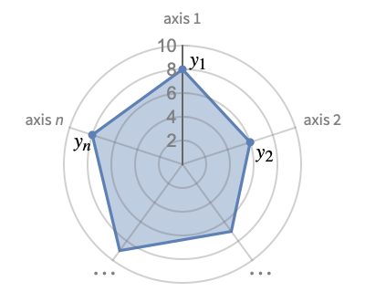
RadialAxisPlot
RadialAxisPlot[{y1,y2,…,yn}]
generates a radial axis plot where the yi are displayed on radial axes equally spaced around the origin.
RadialAxisPlot[{data1,data2,…}]
plots several datasets datai on the axes.
Details and Options
- RadialAxisPlot is also known as radar plot, spider chart or star plot.
- RadialAxisPlot is used to visualize multidimensional data by mapping each dimension to an axis, creating a unique shape. The shapes for different data points can then be compared with each other.
- The data values yi can be given in the following forms:
-
yi a real-valued number Quantity[yi,unit] a quantity with a unit - Values yi that are not of the forms previously shown are taken to be missing and are not shown.
- The datai have the following forms and interpretations:
-
<"k1"y1,"k2"y2,…> values {y1,y2,…} {y1"lbl1",y2"lbl2",…}, {y1,y2,…}{"lbl1","lbl2",…} values {y1,y2,…} with labels {lbl1,lbl2,…} SparseArray values as a normal array TimeSeries,EventSeries,… values from time series data QuantityArray magnitudes WeightedData unweighted values - RadialAxisPlot[Tabular[…]cspec] extracts and plots values from the tabular object using the column specification cspec.
- The following forms of column specifications cspec are allowed for plotting tabular data:
-
{coly1,…,colyn} plot each column colyi on its own axis - The following wrappers w can be used for the datai:
-
Annotation[datai,label] provide an annotation for the data Button[datai,action] define an action to execute when the data is clicked Callout[datai,label] label the data with a callout Callout[datai,label,pos] place the callout at relative position pos EventHandler[datai,events] define a general event handler for the data Hyperlink[datai,uri] make the data a hyperlink Labeled[datai,label] label the data Labeled[datai,label,pos] place the label at relative position pos Legended[datai,label] identify the data in a legend PopupWindow[datai,cont] attach a popup window to the data StatusArea[datai,label] display in the status area on mouseover Style[datai,styles] show the data using the specified styles Tooltip[datai,label] attach a tooltip to the curve - Wrappers w can be applied at multiple levels:
-
{…,w[yi],…} wrap the value yi in data {…,w[{xi,yi}],…} wrap the point {xi,yi} w[datai] wrap the data w[{data1,…}] wrap a collection of datai w1[w2[…]] use nested wrappers - Callout, Labeled and Placed can use the following positions pos:
-
Automatic automatically placed labels Above, Below, Before, After positions around the curve {pos,epos} epos in label placed at relative position pos of the curve - RadialAxisPlot has the same options as Graphics, with the following additions and changes: [List of all options]
-
Axes True whether to draw axes AxesOrigin Automatic where to position the axes ColorFunction Automatic how to determine the coloring of lines ColorFunctionScaling True whether to scale arguments to ColorFunction Filling True filling under each line FillingStyle Automatic style to use for filling GridLines Automatic whether to draw grid lines GridLinesStyle Automatic style to use for grid lines Method Automatic what method to use PerformanceGoal $PerformanceGoal aspects of performance to try to optimize PlotLayout Automatic how to position data PlotLegends None legends for lines PlotMarkers Automatic markers to use to indicate each point PlotRange Automatic range of values to include PlotStyle Automatic graphics directives to determine the style of each line PlotTheme $PlotTheme overall theme for the plot ScalingFunctions None how to scale individual coordinates - The axes are arranged clockwise starting from the positive y axis.
- By default, all the axes have the same plot range.
- With AxesAutomatic, only the first axis will be shown if all of the axes have the same scale and plot range. If there are any differences, all the axes will be shown.
- With the default setting PlotRangeAutomatic, all the axes use the same plot range.
- PlotRangeAll uses a different plot range for each axis.
- Options that apply to each axis, such as Axes, Ticks and PlotRange, can take the following forms:
-
s use setting s for each axis {s1,…,sn} use per-axis setting s1 for the first axis, etc. {…,pats,…} use setting s for axis positions matching pattern pat - With the form {…,pats,…}, pat can be any pattern. The first pattern that matches an axis position will be used. If no pattern matches an axis position, the default value is used.
- The arguments supplied to ColorFunction are y1,y2,…,yn. By default, the color function arguments are scaled per axis to be between 0 and 1.
- Possible settings for PlotLayout that show multiple points in a single plot panel include:
-

"Overlaid" show all the data overlapping 
"Stacked" accumulate the data 
"Percentile" accumulate and normalize the data - Possible settings for PlotLayout that show a single point in multiple plot panels include:
-
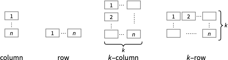
"Column" use separate curves in a column of panels "Row" use separate curves in a row of panels {"Column",k},{"Row",k} use k columns or rows {"Column",UpTo[k]},{"Row",UpTo[k]} use at most k columns or rows - ColorData["DefaultPlotColors"] gives the default sequence of colors used by PlotStyle.
List of all options
Examples
open all close allBasic Examples (3)
RadialAxisPlot[{9, 7, 9, 5, 5, 7}]RadialAxisPlot[{{9, 7, 9, 5, 5, 7}, {6, 2, 3, 8, 8, 7}, {6, 8, 3, 4, 1, 9}}]Use ColorFunction to style lines by the values on the first axis:
RadialAxisPlot[RandomReal[{1, 10}, {5, 10}], ColorFunction -> (ColorData["Rainbow"][#]&), Filling -> False]Scope (23)
General Data (6)
RadialAxisPlot visualize multidimensional data by placing each dimension on an axis with a shared origin:
RadialAxisPlot[{9, 13, 5, 7, 3, 11}]Automatic PlotRange shows every axis in the same range:
RadialAxisPlot[{1, 5, 10, 15, 20, 25, 50, 100}]PlotRangeAll shows every axis in its own range:
RadialAxisPlot[{1, 5, 10, 15, 20, 25, 50, 100}, PlotRange -> All]RadialAxisPlot[{{9, 13, 5, 7, 3, 11}, {5, 9, 8, 13, 10, 9}, {6, 7, 4, 13, 3, 6}, {3, 13, 2, 12, 6, 11}}]Datasets with different lengths are padded with zero:
RadialAxisPlot[{{6, 10, 5, 9, 7, 4}, {10, 5, 8, 6, 3}, {2, 5, 3}}]Data with nonreal values are left out:
RadialAxisPlot[{{8, 3, 5, 6, Missing[], 9}, {2, 6, a, 9, 12, 5}, {6, I, 5, 9, 5, 7}}]Tabular Data (1)
iris = ResourceData["Sample Tabular Data: Fisher Iris"]Plot parallel axis to see relations per row on the table:
RadialAxisPlot[iris -> {"SepalLength", "SepalWidth", "PetalLength", "PetalWidth"}, AxesLabel -> {"SepalLength", "SepalWidth", "PetalLength", "PetalWidth"}]Use different scales for each axis:
RadialAxisPlot[iris -> {"SepalLength", "SepalWidth", "PetalLength", "PetalWidth"}, AxesLabel -> {"SepalLength", "SepalWidth", "PetalLength", "PetalWidth"}, PlotRange -> All]Special Data (2)
Use Quantity to include units with the data:
RadialAxisPlot[{Quantity[Range[6], "Meters"], Quantity[Range[6], "Yards"], Quantity[Range[6], "Feet"]}, PlotRange -> Automatic]Plot the values in TimeSeries:
RadialAxisPlot[{TimeSeries[{19, 16, 9, 3, 7, 2, 17}, {"May 24, 1982"}],
	TimeSeries[{10, 19, 15, 3, 18, 17, 19}, {"May 24, 1982"}],
	TimeSeries[{10, 11, 17, 18, 8, 7, 19}, {"May 24, 1982"}]}]
Keys in Association are automatically used as axes labels:
RadialAxisPlot[{<|"a" -> 1, "b" -> 2, "c" -> 3|>, <|"a" -> 3, "b" -> 1, "c" -> 2|>, <|"a" -> 5, "b" -> 1, "c" -> 4|>}]Data Wrapper (4)
Use wrappers on datasets or collections of datasets:
{RadialAxisPlot[{Style[{1, 3, 2, 4, 5}, Directive[Thick, Red]], {2, 4, 6, 2, 3}, {3, 1, 2, 1, 4}}],
RadialAxisPlot[Style[{{1, 3, 2, 4, 5}, {2, 4, 6, 2, 3}, {3, 1, 2, 1, 4}}, Directive[Thick, Red]]]}RadialAxisPlot[Style[{Style[{1, 3, 2, 4, 5}, Directive[Thick, Red]], {2, 4, 6, 2, 3}, {3, 1, 2, 1, 4}}, Directive[Dashed, Purple]]]Use PopupWindow to provide additional drilldown information:
RadialAxisPlot[{Style[PopupWindow[{1, 3, 2, 4, 5}, RadialAxisPlot[{1, 3, 2, 4, 5}]], Red], {2, 4, 6, 2, 3}, {3, 1, 2, 1, 4}}]Button can be used to trigger any action:
RadialAxisPlot[{Button[Style[{1, 3, 2, 4, 5}, Red], Print[RadialAxisPlot[{1, 3, 2, 4, 5}]]], {2, 4, 6, 2, 3}, {3, 1, 2, 1, 4}}]Labeling and Legending (6)
Use LabelingFunction to add individual labels to each dataset:
RadialAxisPlot[RandomReal[1, {4, 5}], LabelingFunction -> (Callout[RandomWord[]]&)]Use the index of datasets provided to LabelingFunction to construct labels:
labels = Table[RandomWord[], 4]RadialAxisPlot[RandomReal[1, {4, 5}], LabelingFunction -> (Callout[Part[labels, Last@#2]]&)]RadialAxisPlot[RandomReal[1, {4, 5}], LabelingFunction -> (Callout[Part[labels, Last@#2], Before]&)]Use Callout to add a label:
RadialAxisPlot[{Callout[{1, 3, 2, 4, 3}, "label"], {2, 4, 6, 2, 1}, {3, 1, 2, 1, 4}}]Use PlotLegends to add a bar legend to represent the colors from ColorFunction:
RadialAxisPlot[RandomReal[10, {5, 5}], ColorFunction -> "Rainbow", PlotLegends -> Automatic]Use legends to identify the color groups:
RadialAxisPlot[RandomReal[10, {3, 5}], PlotLegends -> {"a", "b", "c"}]Use Legended to add a legend:
RadialAxisPlot[{Legended[Style[{1, 3, 2, 4, 3}, Red], "label"], {2, 4, 6, 2, 1}, {3, 1, 2, 1, 4}}]Presentation (4)
Multiple datasets are automatically colored to be distinct:
RadialAxisPlot[RandomReal[10, {3, 5}]]Provide explicit styling to different curves:
RadialAxisPlot[RandomReal[10, {3, 5}], PlotStyle -> {RGBColor[0.8, 0.1, 0.1], Darker@Green, Hue[0.7]}]Use a theme with high-contrast background and line style:
RadialAxisPlot[RandomReal[10, {3, 5}], PlotTheme -> "Marketing"]RadialAxisPlot[RandomReal[10, {3, 5}], PlotLegends -> Automatic]Options (53)
AspectRatio (3)
By default, RadialAxisPlot uses the same width and height:
RadialAxisPlot[{{9, 7, 9, 5, 5, 7}, {6, 2, 3, 8, 8, 7}, {6, 8, 3, 4, 1, 9}}]Use numerical values to specify the height-to-width ratio:
RadialAxisPlot[{{9, 7, 9, 5, 5, 7}, {6, 2, 3, 8, 8, 7}, {6, 8, 3, 4, 1, 9}}, AspectRatio -> (1/2)]AspectRatioFull adjusts the height and width to tightly fit inside other constructs:
plot = RadialAxisPlot[{{9, 7, 9, 5, 5, 7}, {6, 2, 3, 8, 8, 7}, {6, 8, 3, 4, 1, 9}}, AspectRatio -> Full];{Framed[Pane[plot, {50, 100}]], Framed[Pane[plot, {100, 100}]], Framed[Pane[plot, {100, 50}]]}Axes (4)
By default, ticks are shared on all axes:
RadialAxisPlot[{8, 4, 7, 6, 9, 7, 5, 5, 1}]Different plot ranges force all axes to show ticks:
RadialAxisPlot[{8, 4, 7, 6, 9, 7, 5, 5, 1}, PlotRange -> All]RadialAxisPlot[{8, 4, 7, 6, 9, 7, 5, 5, 1}, PlotRange -> {3 -> {0, 15}}]Specify which axes to show as a list:
RadialAxisPlot[{8, 4, 7, 6, 9, 7, 5, 5, 1}, Axes -> {True, False, True, Automatic}]Specify which axes to show as using rules:
RadialAxisPlot[{8, 4, 7, 6, 9, 7, 5, 5, 1}, Axes -> {1 -> True, _ -> False}]AxesLabel (2)
AxesOrigin (3)
RadialAxisPlot[{{3, 6, 6, 8, 2, 6}, {6, 3, 0, 1, 7, 5}}, AxesOrigin -> Pi / 3]RadialAxisPlot[{{3, 6, 6, 8, 2, 6}, {6, 3, 0, 1, 7, 5}}, AxesOrigin -> .5]Specify the radial axis orientation:
Table[RadialAxisPlot[{{3, 6, 6, 8, 2, 6}, {6, 3, 0, 1, 7, 5}}, AxesOrigin -> {Pi / 3, o}], {o, {-1, 1}}]Specify the angular axis starting point:
RadialAxisPlot[{{3, 6, 6, 8, 2, 6}, {6, 3, 0, 1, 7, 5}}, AxesOrigin -> {{Pi / 3, -1}, 0.2}]AxesStyle (3)
Change the style for the axes:
RadialAxisPlot[{3, 9, 9, 8, 4}, Axes -> True, AxesStyle -> Red]Specify the style of each axis:
RadialAxisPlot[{3, 9, 9, 8, 4}, Axes -> True, AxesStyle -> {{Thick, Red}, {Thick, Green}, {Thick, Blue}, {Thick, Yellow}, {Thick, Purple}}]Use different styles for the labels and the axes:
RadialAxisPlot[{3, 9, 9, 8, 4}, Axes -> True, AxesStyle -> Red, LabelStyle -> Green]ColorFunction (1)
Color curves based on values on the first axis:
data = RandomReal[1, {10, 5}];RadialAxisPlot[data, ColorFunction -> "Rainbow"]Color curves based on values on the fifth axis:
RadialAxisPlot[data, ColorFunction -> (ColorData["Rainbow"][#5]&)]ColorFunctionScaling (1)
Filling (6)
Filling is turned on by default:
RadialAxisPlot[{{3, 9, 9, 7, 2}, {8, 10, 0, 6, 7}, {7, 10, 2, 4, 3}}]Filling is from curve to curve in a stacked layout:
RadialAxisPlot[{{3, 9, 9, 7, 2}, {8, 10, 0, 6, 7}, {7, 10, 2, 4, 3}}, PlotLayout -> "Stacked"]RadialAxisPlot[{{3, 9, 9, 7, 2}, {8, 10, 0, 6, 7}, {7, 10, 2, 4, 3}}, Filling -> None]Fill between two curves, 1 and 2:
RadialAxisPlot[{{10, 14, 15, 11, 1, 12, 4, 13, 8, 7, 3, 5, 6, 2, 9}, {1, 2, 3, 11, 15, 7, 5, 14, 6, 12, 9, 10, 13, 8, 4}}, Filling -> {1 -> {2}}]Fill between curves 1 and 2 with a specific style:
RadialAxisPlot[{{10, 14, 15, 11, 1, 12, 4, 13, 8, 7, 3, 5, 6, 2, 9}, {1, 2, 3, 11, 15, 7, 5, 14, 6, 12, 9, 10, 13, 8, 4}}, Filling -> {2 -> {{1}, Red}}]Stacked values fill to the curve below:
RadialAxisPlot[RandomReal[{-5, 10}, {3, 10}], PlotLayout -> "Stacked"]FillingStyle (1)
Frame (2)
FrameStyle (2)
RadialAxisPlot[RandomInteger[10, {4, 5}], Frame -> True, FrameStyle -> Red]Use a different style on the inner frame:
RadialAxisPlot[{{9, 7, 9, 5, 5, 7}, {6, 2, 3, 8, 8, 7}, {6, 8, 3, 4, 1, 9}}, AxesOrigin -> {{Automatic, Automatic}, 0.2}, Frame -> True, FrameStyle -> {Directive[Red, Thick], Blue}]GridLines (3)
Radial grid lines are drawn automatically:
RadialAxisPlot[RandomInteger[10, {4, 5}], GridLines -> Automatic]RadialAxisPlot[RandomInteger[10, {4, 5}], GridLines -> {2, 4, 10}]Use different shapes as grid lines:
Table[RadialAxisPlot[RandomInteger[10, {4, 5}], GridLines -> shape, PlotLabel -> shape], {shape, {"Polygon", "Circle"}}]GridLinesStyle (1)
ImageSize (7)
Use named sizes, such as Tiny, Small, Medium and Large:
{RadialAxisPlot[{{9, 7, 9, 5, 5, 7}, {6, 2, 3, 8, 8, 7}, {6, 8, 3, 4, 1, 9}}, ImageSize -> Tiny], RadialAxisPlot[{{9, 7, 9, 5, 5, 7}, {6, 2, 3, 8, 8, 7}, {6, 8, 3, 4, 1, 9}}, ImageSize -> Small]}Specify the width of the plot:
{RadialAxisPlot[{{9, 7, 9, 5, 5, 7}, {6, 2, 3, 8, 8, 7}, {6, 8, 3, 4, 1, 9}}, ImageSize -> 150], RadialAxisPlot[{{9, 7, 9, 5, 5, 7}, {6, 2, 3, 8, 8, 7}, {6, 8, 3, 4, 1, 9}}, AspectRatio -> 1.5, ImageSize -> 150]}Specify the height of the plot:
{RadialAxisPlot[{{9, 7, 9, 5, 5, 7}, {6, 2, 3, 8, 8, 7}, {6, 8, 3, 4, 1, 9}}, ImageSize -> {Automatic, 150}], RadialAxisPlot[{{9, 7, 9, 5, 5, 7}, {6, 2, 3, 8, 8, 7}, {6, 8, 3, 4, 1, 9}}, AspectRatio -> 2, ImageSize -> {Automatic, 150}]}Allow the width and height to be up to a certain size:
{RadialAxisPlot[{{9, 7, 9, 5, 5, 7}, {6, 2, 3, 8, 8, 7}, {6, 8, 3, 4, 1, 9}}, ImageSize -> UpTo[200]], RadialAxisPlot[{{9, 7, 9, 5, 5, 7}, {6, 2, 3, 8, 8, 7}, {6, 8, 3, 4, 1, 9}}, AspectRatio -> 2, ImageSize -> UpTo[200]]}Specify the width and height for a graphic, padding with space if necessary:
RadialAxisPlot[{{9, 7, 9, 5, 5, 7}, {6, 2, 3, 8, 8, 7}, {6, 8, 3, 4, 1, 9}}, ImageSize -> {200, 200}, Background -> StandardGray]Setting AspectRatioFull will fill the available space:
RadialAxisPlot[{{9, 7, 9, 5, 5, 7}, {6, 2, 3, 8, 8, 7}, {6, 8, 3, 4, 1, 9}}, AspectRatio -> Full, ImageSize -> {200, 200}, Background -> StandardGray]Use maximum sizes for the width and height:
{RadialAxisPlot[{{9, 7, 9, 5, 5, 7}, {6, 2, 3, 8, 8, 7}, {6, 8, 3, 4, 1, 9}}, ImageSize -> {UpTo[150], UpTo[100]}], RadialAxisPlot[{{9, 7, 9, 5, 5, 7}, {6, 2, 3, 8, 8, 7}, {6, 8, 3, 4, 1, 9}}, AspectRatio -> 2, ImageSize -> {UpTo[150], UpTo[100]}]}Use ImageSizeFull to fill the available space in an object:
Framed[Pane[RadialAxisPlot[{{9, 7, 9, 5, 5, 7}, {6, 2, 3, 8, 8, 7}, {6, 8, 3, 4, 1, 9}}, ImageSize -> Full, Background -> StandardGray], {200, 100}]]Specify the image size as a fraction of the available space:
Framed[Pane[RadialAxisPlot[{{9, 7, 9, 5, 5, 7}, {6, 2, 3, 8, 8, 7}, {6, 8, 3, 4, 1, 9}}, AspectRatio -> Full, ImageSize -> {Scaled[0.5], Scaled[0.5]}, Background -> StandardGray], {200, 200}]]PlotLayout (4)
By default, curves are overlapped:
RadialAxisPlot[{{10, 7, 0, 2, 3, 10}, {3, 10, 4, 3, 10, 0}, {3, 0, 3, 4, 3, 3}, {0, 0, 0, 6, 8, 10}}]RadialAxisPlot[{{10, 7, 0, 2, 3, 10}, {3, 10, 4, 3, 10, 0}, {3, 0, 3, 4, 3, 3}, {0, 0, 0, 6, 8, 10}}, PlotLayout -> "Stacked"]RadialAxisPlot[RandomInteger[{-5, 10}, {4, 6}], PlotLayout -> "Stacked"]RadialAxisPlot[RandomInteger[{-5, 10}, {3, 6}], PlotLayout -> "Row"]RadialAxisPlot[RandomInteger[{-5, 10}, {3, 6}], PlotLayout -> "Column"]PlotMarkers (2)
PlotRange (3)
By default, axes share the same automatic plot range:
data = RandomInteger[10, {4, 5}];RadialAxisPlot[data]Use individual plot ranges on all axes:
RadialAxisPlot[data, PlotRange -> All]RadialAxisPlot[RandomInteger[10, {4, 5}], PlotRange -> {0, 20}]Specify the plot range selectively to each axis using rule replacement:
RadialAxisPlot[RandomInteger[10, {4, 5}], PlotRange -> {1 -> {0, 15}, _ -> {0, 10}}]PlotRangePadding (4)
Padding is chosen automatically by default:
RadialAxisPlot[{{9, 8, 9, 7, 7}, {3, 0, 3, 10, 6}}]RadialAxisPlot[{{9, 8, 9, 7, 7}, {3, 0, 3, 10, 6}}, PlotRangePadding -> None]Add absolute plot range padding:
RadialAxisPlot[{{9, 8, 9, 7, 7}, {3, 0, 3, 10, 6}}, PlotRangePadding -> 4]Specify scaled plot range padding:
RadialAxisPlot[{{9, 8, 9, 7, 7}, {3, 0, 3, 10, 6}}, PlotRangePadding -> Scaled[0.2]]Applications (1)
RadialAxisPlot is naturally great at visualizing sports stats. For example, visualize the performance of the NBA players for the whole 2018–2019 season:
headers = {"Rk", "Player", "Pos", "Age", "Tm", "G", "GS", "MP", "FG", "FGA", "FG%", "3P", "3PA", "3P%", "2P", "2PA", "2P%", "FT", "FTA", "FT%", "ORB", "DRB", "TRB", "AST", "STL", "BLK", "TOV", "PF", "PTS"};
data = IconizedObject[«Player Data»];
Filter out players who did not play very much:
assocData = Dataset[AssociationThread[headers, #]& /@ data];
assocData = Select[assocData, And[#["MP"] / #["G"] > 24, #["G"] > 42]&];Length[assocData]Select[assocData, #Player == "Devin Booker"&]Pick the following five stats to visualize:
vals = {"2P", "3P", "PTS", "TRB", "AST"};
labels = {"2 Pointers Made", "3 Pointers Made", "Points", "Rebounds", "Assists"};
Find the mean values of these five stats:
avgs = Mean@assocData[[All, vals]];Use Manipulate to create an interface to toggle through each player and use RadialAxisPlot to visualize their performance compared to the averages:
Manipulate[
	RadialAxisPlot[
	{
	IconizedObject[«avgs»],
	Normal[Select[IconizedObject[«assocData»], #Player == player&][[1]]][[IconizedObject[«vals»]]]
	},
	PlotRange -> {1 -> {0, 10}, 2 -> {0, 4}, 3 -> {0, 40}, 4 -> {0, 20}, 5 -> {0, 10}},
	PlotLegends -> {"League Average", player},
	AxesLabel -> IconizedObject[«labels»],
	ImageSize -> 400
],
	{{player, "Devin Booker"}, assocData[All, "Player"]//Normal}
	]
Properties & Relations (4)
RadialAxisPlot plots multidimensional points on multiple radial axes:
RadialAxisPlot[{{1, 1, 1, 1, 1}, {1, 2, 3, 4, 5}, {5, 5, 5, 5, 5}}]ListPolarPlot plots multiple points on a polar axis:
ListPolarPlot[{{1, 1, 1, 1, 1}, {1, 2, 3, 4, 5}, {5, 5, 5, 5, 5}}, Joined -> True]ParallelAxisPlot plots multidimensional points on multiple parallel axes:
{RadialAxisPlot[{{1, 1, 1, 1, 1}, {1, 2, 3, 4, 5}, {5, 5, 5, 5, 5}}], ParallelAxisPlot[{{1, 1, 1, 1, 1}, {1, 2, 3, 4, 5}, {5, 5, 5, 5, 5}}]}RadialAxisPlot displays a single point using multiple axes:
RadialAxisPlot[{1, 2, 3}]AngularGauge plots multiple values on a single axis:
AngularGauge[{1, 2, 3}, {0, 3}]PieChart displays values as parts of a whole:
{RadialAxisPlot[{1, 2, 3}], PieChart[{1, 2, 3}]}Neat Examples (1)
Use RadialGradientFilling to create a highly stylized filling:
RadialAxisPlot[RandomReal[{0.5, 2}, 8], FillingStyle -> RadialGradientFilling[{ImageScaled[0], ImageScaled[0.5], ImageScaled[1]} -> {Red, Purple, Blue}], Method -> {"AxesInFront" -> True, "GridLinesInFront" -> True}]Text
Wolfram Research (2020), RadialAxisPlot, Wolfram Language function, https://reference.wolfram.com/language/ref/RadialAxisPlot.html (updated 2025).
CMS
Wolfram Language. 2020. "RadialAxisPlot." Wolfram Language & System Documentation Center. Wolfram Research. Last Modified 2025. https://reference.wolfram.com/language/ref/RadialAxisPlot.html.
APA
Wolfram Language. (2020). RadialAxisPlot. Wolfram Language & System Documentation Center. Retrieved from https://reference.wolfram.com/language/ref/RadialAxisPlot.html