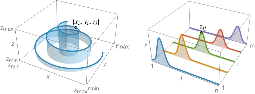
ListLinePlot3D[{{z11,z12,…,z1n},…,{zm1,zm2,…,zmn}}]
plots each row {zi1,zi2,…,zin} as a curve in the ![]() direction, with successive curves stacked in the
direction, with successive curves stacked in the ![]() direction.
direction.


ListLinePlot3D
ListLinePlot3D[{{x1,y1,z1},{x2,y2,z2},…,{xn,yn,zn}}]
plots a curve through the 3D points {xi,yi,zi}.
ListLinePlot3D[{{z11,z12,…,z1n},…,{zm1,zm2,…,zmn}}]
plots each row {zi1,zi2,…,zin} as a curve in the ![]() direction, with successive curves stacked in the
direction, with successive curves stacked in the ![]() direction.
direction.
ListLinePlot3D[{data1,data2,…}]
plots curves through multiple sets of {x,y,z} points.
Details and Options
- ListLinePlot3D is also known as 3D line graph, or 3D area graph when the area under the curve is filled. When showing each row of the data as a separate curve, ListLinePlot3D is also known as a ridgeline plot.
- ListLinePlot3D allows you to draw curves in 3D through a given set of points.
- Data values xi, yi and zi can be given in the following forms:
-
xi a real-valued number Quantity[xi,unit] a quantity with a unit Around[xi,ei] value xi with uncertainty ei Interval[{xmin,xmax}] values between xmin and xmax - Values xi, yi and zi that are not of the preceding form are taken to be missing and are not shown.
- The datai have the following forms and interpretations:
-
<"k1"{x1,y1,z1},"k2"{x2,y2,z2},…> values {{x1,y1,z1},{x2,y2,z2},…} {{x1,y1,z1}"lbl1",{x2,y2,z2}"lbl2",…}, data{"lbl1","lbl2",…} values {{x1,y1,z1},{x2,y2,z2},…} with labels {lbl1,lbl2,…} SparseArray values as a normal array QuantityArray magnitudes WeightedData unweighted values - ListLinePlot3D[Tabular[…]cspec] extracts and plots values from the tabular object using the column specification cspec.
- The following forms of column specifications cspec are allowed for plotting tabular data:
-
{colx,coly,colz} plot values from columns colx, coly and colz {{colx1,coly1,colz1},{colx2,coly2,colz2},…} plot values from multiple sets of columns {{colz1},{colz2},…} plot each column colz1, colz2, … as sequences of heights - The following wrappers w can be used for the datai:
-
Annotation[datai,label] provide an annotation for the data Button[datai,action] define an action to execute when the data is clicked Callout[datai,label] label the data with a callout Callout[datai,label,pos] place the callout at relative position pos EventHandler[datai,…] define a general event handler for the data Hyperlink[datai,uri] make the data a hyperlink Labeled[datai,label] label the data Labeled[datai,label,pos] place the label at relative position pos Legended[datai,label] identify the data in a legend PopupWindow[datai,cont] attach a popup window to the data StatusArea[datai,label] display in the status area on mouseover Style[datai,styles] show the data using the specified styles Tooltip[datai,label] attach a tooltip to the data Tooltip[datai] use data values as tooltips - Wrappers w can be applied at multiple levels:
-
{{…,w[zi,j],…}} wrap the value zi,j in array data {…,w[{xi,yi,zi}],…} wrap the point {xi,yi,zi} w[datai] wrap the data w[{data1,…}] wrap a collection of datai w1[w2[…]] use nested wrappers - ListLinePlot3D takes the same options as Graphics3D with the following additions and changes: [List of all options]
-
Axes True whether to draw axes BoxRatios {1,1,0.4} bounding 3D box ratios ColorFunction Automatic how to determine the color of points ColorFunctionScaling True whether to scale arguments to ColorFunction DataRange Automatic the range of x and y values to assume for data Filling None how to fill in stems for each point FillingStyle Automatic style to use for filling IntervalMarkers Automatic how to render uncertainty IntervalMarkersStyle Automatic style for uncertainty elements Joined True whether to join the points LabelingFunction Automatic how to label points LabelingSize Automatic size to use for callout and label Mesh None how many mesh points to draw on each line MeshFunctions {#1&} how to determine the placement of mesh points MeshShading None how to shade regions between mesh points MeshStyle Automatic the style for mesh points PerformanceGoal $PerformanceGoal aspects of performance to try to optimize PlotFit None how to fit a curve to the points PlotFitElements Automatic fitted elements to show in the plot PlotLabels None labels to use for curves PlotLegends None legends for points PlotMarkers None markers to use for points PlotRange {Full,Full,Automatic} the range of z or other values to include PlotRangePadding Automatic how much to pad the range of values PlotStyle Automatic styles of points PlotTheme $PlotTheme overall theme for the plot RegionFunction (True&) how to determine whether a point should be included RegionBoundaryStyle ![TemplateBox[{Automatic, paclet:ref/Automatic}, RefLink, BaseStyle -> {3ColumnTableMod}]](Files/ListLinePlot3D.en/4.png "TemplateBox[{Automatic, paclet:ref/Automatic}, RefLink, BaseStyle -> {3ColumnTableMod}]")
style to use for a region ScalingFunctions None how to scale individual coordinates - ListLinePlot3D[{{z11,z12,…},…}] by default takes the x and y coordinate values for each data point to be successive integers starting at 1.
- The setting DataRange->{{xmin,xmax},{ymin,ymax}} specifies other ranges of coordinate values to use.
- With the default setting DataRange->Automatic, ListLinePlot3D[{{z11,z12,z13},…,{zn1,zn2,zn3}}] will assume that the data being given is {{x1,y1,z1},…}, rather than an
 ×3 array of heights.
 - ListLinePlot3D[data,DataRange->All] always takes data to represent an array of heights.
- Possible settings for PlotMarkers include:
-
None omit markers when drawing surfaces "Point" use 2D points as markers "Sphere" use 3D spheres as markers {"Point",s},{"Sphere",s} specify the size s of the markers {spec1,spec2,…} use specification speci for expression expri - The marker size s can be a symbolic value such as Tiny, Small, Medium and Large or a scaled fraction of the width of the graphic.
- Possible settings for IntervalMarkers include:
-

"Bars" draw bars to represent errors 
"Tubes" draw tubes to represent errors - Possible settings for ScalingFunctions include:
-
sz scale the z axis {sx,sy} scale x and y axes {sx,sy,sz} scale x, y and z axes - Each scaling function si is either a string "scale" or {g,g-1}, where g-1 is the inverse of g.
- The arguments supplied to functions in MeshFunctions and RegionFunction are
 ,
,  and
and  . Functions in ColorFunction are by default supplied with scaled versions of these arguments.
 -
AlignmentPoint Center the default point in the graphic to align with AspectRatio Automatic ratio of height to width Axes True whether to draw axes AxesEdge Automatic on which edges to put axes AxesLabel None axes labels AxesOrigin Automatic where axes should cross AxesStyle {} graphics directives to specify the style for axes Background None background color for the plot BaselinePosition Automatic how to align with a surrounding text baseline BaseStyle {} base style specifications for the graphic Boxed True whether to draw the bounding box BoxRatios {1,1,0.4} bounding 3D box ratios BoxStyle {} style specifications for the box ClipPlanes None clipping planes ClipPlanesStyle Automatic style specifications for clipping planes ColorFunction Automatic how to determine the color of points ColorFunctionScaling True whether to scale arguments to ColorFunction ContentSelectable Automatic whether to allow contents to be selected ControllerLinking False when to link to external rotation controllers ControllerPath Automatic what external controllers to try to use DataRange Automatic the range of x and y values to assume for data Epilog {} 2D graphics primitives to be rendered after the main plot FaceGrids None grid lines to draw on the bounding box FaceGridsStyle {} style specifications for face grids Filling None how to fill in stems for each point FillingStyle Automatic style to use for filling FormatType TraditionalForm default format type for text ImageMargins 0. the margins to leave around the graphic ImagePadding All what extra padding to allow for labels, etc. ImageSize Automatic absolute size at which to render the graphic IntervalMarkers Automatic how to render uncertainty IntervalMarkersStyle Automatic style for uncertainty elements Joined True whether to join the points LabelingFunction Automatic how to label points LabelingSize Automatic size to use for callout and label LabelStyle {} style specifications for labels Lighting Automatic simulated light sources to use Mesh None how many mesh points to draw on each line MeshFunctions {#1&} how to determine the placement of mesh points MeshShading None how to shade regions between mesh points MeshStyle Automatic the style for mesh points Method Automatic details of 3D graphics methods to use PerformanceGoal $PerformanceGoal aspects of performance to try to optimize PlotFit None how to fit a curve to the points PlotFitElements Automatic fitted elements to show in the plot PlotLabel None a label for the plot PlotLabels None labels to use for curves PlotLegends None legends for points PlotMarkers None markers to use for points PlotRange {Full,Full,Automatic} the range of z or other values to include PlotRangePadding Automatic how much to pad the range of values PlotRegion Automatic final display region to be filled PlotStyle Automatic styles of points PlotTheme $PlotTheme overall theme for the plot PreserveImageOptions Automatic whether to preserve image options when displaying new versions of the same graphic Prolog {} 2D graphics primitives to be rendered before the main plot RegionBoundaryStyle ![TemplateBox[{Automatic, paclet:ref/Automatic}, RefLink, BaseStyle -> {3ColumnTableMod}]](Files/ListLinePlot3D.en/11.png "TemplateBox[{Automatic, paclet:ref/Automatic}, RefLink, BaseStyle -> {3ColumnTableMod}]")
style to use for a region RegionFunction (True&) how to determine whether a point should be included RotationAction "Fit" how to render after interactive rotation ScalingFunctions None how to scale individual coordinates SphericalRegion Automatic whether to make the circumscribing sphere fit in the final display area Ticks Automatic specification for ticks TicksStyle {} style specification for ticks TouchscreenAutoZoom False whether to zoom to fullscreen when activated on a touchscreen ViewAngle Automatic angle of the field of view ViewCenter Automatic point to display at the center ViewMatrix Automatic explicit transformation matrix ViewPoint {1.3,-2.4,2.} viewing position ViewProjection Automatic projection method for rendering objects distant from the viewer ViewRange All range of viewing distances to include ViewVector Automatic position and direction of a simulated camera ViewVertical {0,0,1} direction to make vertical
List of all options
Examples
open all close allBasic Examples (5)
Plot a path through a set of points:
ListLinePlot3D[{{0, 0, 0}, {1, 0, 1}, {1, 1, 2}, {2, 2, 2}, {2, 4, 3}, {3, 6, 4}}]Fill the area under the curve:
ListLinePlot3D[{{0, 0, 0}, {1, 0, 1}, {1, 1, 2}, {2, 2, 2}, {2, 4, 3}, {3, 6, 4}}, Filling -> Bottom]Plot multiple filled paths at successive locations along the axis:
ListLinePlot3D[{{2.1, 2.9, 2.8, 1.9, 1.1, 1.2, 2.1}, {2.2, 2.7, 1.1, 2.2, 2.7, 1.1, 2.2}, {2.3, 1.7, 2.3, 1.7, 2.3, 1.7, 2.3}, {2.4, 1.0, 2.6, 2.4, 1.0, 2.6, 2.4}}]Plot multiple filled paths at successive locations along the axis:
ListLinePlot3D[IconizedObject[«data»], Filling -> Axis]Plot multiple curves through space:
ListLinePlot3D[Table[{r Sin[t], r Cos[t], Cos[r t]}, {r, 4}, {t, 0, 2Pi, Pi / 15}]]Scope (36)
General Data (7)
For regular data consisting of ![]() values, the
values, the ![]() and
and ![]() data ranges are taken to be integer values:
data ranges are taken to be integer values:
ListLinePlot3D[IconizedObject[«waves»]]Provide explicit ![]() and
and ![]() data ranges by using DataRange:
data ranges by using DataRange:
ListLinePlot3D[IconizedObject[«waves»], DataRange -> {{0, 1}, {0, 1}}]For irregular data consisting of ![]() triples, the
triples, the ![]() and
and ![]() data ranges are inferred from the data:
data ranges are inferred from the data:
ListLinePlot3D[Table[{i, Cos[i], Sin[i]}, {i, 0, 20, .1}]]Plot multiple sets of irregular data:
data1 = Table[{i, Cos[i], Sin[i]}, {i, 0, 20, .1}];
data2 = Table[{i, Cos[i + Pi / 2], Sin[i + Pi / 2]}, {i, 0, 20, .1}];ListLinePlot3D[{data1, data2}]Areas around where the data is nonreal are excluded:
ListLinePlot3D[Table[Sqrt[2 - i ^ 2 - j ^ 2], {i, -2, 2, .1}, {j, -2, 2, .1}]]PlotRange is selected automatically:
ListLinePlot3D[Table[1 / (x ^ 2 + y ^ 2), {x, -2, 2, 8 / 51}, {y, -2, 2, 8 / 51}]]Use PlotRange to focus in on areas of interest:
{ListLinePlot3D[Table[x ^ 4 + y ^ 4 - x ^ 2 - y ^ 2 + 1, {x, -2, 2, 0.15}, {y, -2, 2, 0.15}]], ListLinePlot3D[Table[x ^ 4 + y ^ 4 - x ^ 2 - y ^ 2 + 1, {x, -2, 2, 0.15}, {y, -2, 2, 0.15}], PlotRange -> {0, 2}]}Use RegionFunction to restrict lines to a region given by inequalities:
ListLinePlot3D[IconizedObject[«waves»], RegionFunction -> (#1 ^ 2 + #2 ^ 2 < 7&), DataRange -> {{-Pi, Pi}, {-Pi, Pi}}]Tabular Data (1)
tabdata = Tabular[IconizedObject[«waves»], {"n=1", "n=2", "n=3", "n=4", "n=5", "n=6"}]Plot separate curves for separate columns:
ListLinePlot3D[tabdata -> {{"n=1"}, {"n=2"}, {"n=3"
	}, {"n=4"}, {"n=5"}, {"n=6"}}]
Get temperature data for a few years, split by city:
temps = PivotToColumns[Tabular[IconizedObject[«Temperature data»], {"IndexDate", "Date", "City", "Temperature"}], "City" -> "Temperature"]Plot the temperatures as separate curves over time:
ListLinePlot3D[temps -> {{"Austin"}, {"Atlanta"}, {"Denver"}, {"Miami"}, {"New York City"}}]Special Data (6)
Use Quantity to include units with the data:
ListLinePlot3D[Quantity[RandomReal[1, {6, 3}], "Meters"], AxesLabel -> Automatic]Plot data in a QuantityArray:
temps = QuantityArray[StructuredArray`StructuredData[{6, 28},
  {{{53., 39.900000000000006, 31., 38.300000000000004, 70.3, 28.},
    {49., 37.5, 26.8, 44.900000000000006, 58.2, 32.7}, {44.900000000000006, 34.1, 27.5,
     43.300000000000004, 53.30000000 ... 004}, {52.1, 51.7, 31.200000000000003, 19.1, 74.10000000000001,
     37.800000000000004}, {63.1, 53.2, 40.400000000000006, 27.3, 78., 42.900000000000006},
{73.5, 63.2, 42.800000000000004, 25., 78.5, 41.7}}, "DegreesFahrenheit", {{2}, {1}}}]];cities = {Entity["City", {"Austin", "Texas", "UnitedStates"}], Entity["City", {"Atlanta", "Georgia", "UnitedStates"}], Entity["City", {"Chicago", "Illinois", "UnitedStates"}], Entity["City", {"Denver", "Colorado", "UnitedStates"}], Entity["City", {"Miami", "Florida", "UnitedStates"}], Entity["City", {"NewYork", "NewYork", "UnitedStates"}]};ListLinePlot3D[temps, AxesLabel -> Automatic, PlotLegends -> cities]Specify the units used with TargetUnits:
ListLinePlot3D[temps, TargetUnits -> {None, None, "DegreesCelsius"}, AxesLabel -> Automatic, PlotLegends -> cities]zvar = Table[Around[Sin[x] Cos[y], 0.25], {x, -4, 4}, {y, -4, 4}];ListLinePlot3D[zvar]Plot data from time series with automatic date ticks:
cities = {Entity["City", {"Austin", "Texas", "UnitedStates"}], Entity["City", {"Atlanta", "Georgia", "UnitedStates"}], Entity["City", {"Chicago", "Illinois", "UnitedStates"}], Entity["City", {"Denver", "Colorado", "UnitedStates"}], Entity["City", {"Miami", "Florida", "UnitedStates"}], Entity["City", {"NewYork", "NewYork", "UnitedStates"}]};data = AirTemperatureData[cities, {DateObject[{2021, 2, 1}, "Day", "Gregorian", -5.], DateObject[{2021, 2, 28}, "Day", "Gregorian", -5.], "Day"}];ListLinePlot3D[data, PlotLegends -> cities]Specify strings to use as labels:
ListLinePlot3D[RandomReal[1, {6, 3}] -> RandomWord[6], LabelingFunction -> Callout]Plot data in a SparseArray:
ListLinePlot3D[SparseArray[{{i_, i_} -> -2, {i_, j_} /; Abs[i - j] == 1 -> 1}, {5, 5}]]Data Wrappers (6)
Use a wrapper to style a specific curve:
ListLinePlot3D[{Style[IconizedObject[«curve A»], Green], IconizedObject[«curve B»]}]Apply a style to all the curves:
ListLinePlot3D[Style[{IconizedObject[«curve A»], IconizedObject[«curve B»]}, Blue]]Use the value of each point as a tooltip:
ListLinePlot3D[Tooltip[RandomReal[1, {10, 3}]], PlotMarkers -> Automatic]Use a specific label for all the points:
ListLinePlot3D[Tooltip[RandomReal[1, {10, 3}], "hello"]]Label points with automatically positioned text:
ListLinePlot3D[Sort[Table[Labeled[RandomReal[1, 3], i], {i, 15}]], PlotMarkers -> Automatic]Use PopupWindow to provide additional drilldown information:
ListLinePlot3D[{{1, 1, 1}, PopupWindow[{2, 2, 2}, DateListPlot[FinancialData["IBM", "Jan. 1, 2004"]]], {3, 3, 3}}, PlotMarkers -> {"Sphere", .05}]Button can be used to trigger any action:
ListLinePlot3D[{{1, 1, 1}, Button[{2, 2, 2}, Speak[2]], {3, 3, 3}}, PlotMarkers -> {"Sphere", 0.05}]Labeling and Legending (6)
Label points with automatically positioned text:
ListLinePlot3D[{Table[Labeled[i, i], {i, 10}], Table[Labeled[i, i], {i, 10}]}]Specify that labels should be above or below the curve:
ListLinePlot3D[{Table[Labeled[i, i, Above], {i, 10}], Table[Labeled[i, i, Below], {i, 10}]}]Specify label names with LabelingFunction:
ListLinePlot3D[Sort[RandomReal[1, {10, 3}]], LabelingFunction -> (#1[[1]] &)]Include legends for each point collection:
ListLinePlot3D[IconizedObject[«waves»], PlotLegends -> Automatic]Specify the maximum size of labels:
data = Sort[Table[Labeled[{RandomReal[i], RandomReal[i], RandomReal[i]}, RandomWord[]], {i, 10}]];ListLinePlot3D[data, LabelingSize -> 30]ListLinePlot3D[data, LabelingSize -> Full]For dense sets of points, some labels may be turned into tooltips by default:
data = Table[Labeled[{Cos[i], Sin[i], Sin[7i]}, i], {i, 0, 2Pi, 0.1}];ListLinePlot3D[data, ImageSize -> 200]ListLinePlot3D[data, ImageSize -> 400]Presentation (10)
Provide an explicit PlotStyle for the lines:
ListLinePlot3D[IconizedObject[«waves»], PlotStyle -> {Red, Green, Blue, Orange, Magenta}]Provide separate styles for different sets:
data1 = Table[Sqrt[1 - x ^ 2 - y ^ 2], {x, -1, 1, 0.05}, {y, -1, 1, 0.1}];data2 = Table[-Sqrt[1 - x ^ 2 - y ^ 2], {x, -1, 1, 0.05}, {y, -1, 1, 0.1}];ListLinePlot3D[{data1, data2}, PlotStyle -> {Red, Blue}, BoxRatios -> Automatic, DataRange -> {{-1, 1}, {-1, 1}}]ListLinePlot3D[IconizedObject[«waves»], AxesLabel -> {j, i}, PlotLabel -> Sin[i + j ^ 2], PlotStyle -> Purple]ListLinePlot3D[IconizedObject[«waves»], ColorFunction -> Function[{x, y, z}, Hue[z]]]Provide an interactive Tooltip for the whole plot:
ListLinePlot3D[Tooltip[IconizedObject[«waves»], TraditionalForm@Sin[i + j ^ 2]], PlotStyle -> Darker[Green]]ListLinePlot3D[IconizedObject[«waves»], Filling -> Bottom, FillingStyle -> Directive[Opacity[0.3], Blue], PlotStyle -> Red]Use a theme with simple ticks in a bright color scheme:
ListLinePlot3D[IconizedObject[«waves»], PlotTheme -> "Business"]ListLinePlot3D[IconizedObject[«waves»], PlotTheme -> "Marketing"]Use a logarithmic scale on the ![]() axis:
axis:
ListLinePlot3D[EntityValue[EntityClass["Country", "GroupOf7"], Dated["Population", All], "EntityAssociation"], PlotLegends -> "Expressions", ScalingFunctions -> {None, None, "Log"}]Specify scaling functions for each axis:
curve = Table[t ^ 2{Cos[t], Sin[t], Sqrt[t]}, {t, 0, 100, 0.25}];ListLinePlot3D[curve, BoxRatios -> 1, ScalingFunctions -> {"Reverse", "Infinite", "Log"}]Options (78)
Axes (3)
ListLinePlot3D[IconizedObject[«waves»]]Use AxesFalse to turn off axes:
ListLinePlot3D[IconizedObject[«waves»], Axes -> False]Turn each axis on individually:
{ListLinePlot3D[IconizedObject[«waves»], Axes -> {True, False, False}], ListLinePlot3D[IconizedObject[«waves»], Axes -> {False, True, False}], ListLinePlot3D[IconizedObject[«waves»], Axes -> {False, False, True}]}AxesLabel (4)
No axes labels are drawn by default:
ListLinePlot3D[IconizedObject[«waves»]]ListLinePlot3D[IconizedObject[«waves»], AxesLabel -> "zlabel"]ListLinePlot3D[IconizedObject[«waves»], AxesLabel -> {"Label1", "Label2", "Label3"}]ListLinePlot3D[QuantityArray[Table[PDF[NormalDistribution[m, Sqrt[Abs[3 - m]]]][x], {m, -2, 2}, {x, -5, 5, 0.5}], "Meters"], AxesLabel -> Automatic]AxesOrigin (2)
The position of the axes is determined automatically:
ListLinePlot3D[Table[PDF[NormalDistribution[m, Sqrt[Abs[3 - m]]]][x], {m, -2, 2}, {x, -5, 5, 0.5}]]Specify an explicit origin for the axes:
ListLinePlot3D[Table[PDF[NormalDistribution[m, Sqrt[Abs[3 - m]]]][x], {m, -2, 2}, {x, -5, 5, 0.5}], AxesOrigin -> {10, 0, 0}]AxesStyle (4)
Change the style for the axes:
ListLinePlot3D[IconizedObject[«waves»], AxesStyle -> Red]Specify the style of each axis:
ListLinePlot3D[Table[PDF[NormalDistribution[m, 0.4]][x], {m, 1, 5}, {x, 0, 5, 0.2}], AxesStyle -> {Directive[Thick, RGBColor[0.6, 0.4, 0.2]], Directive[Thick, RGBColor[0, 0, 1]], Directive[Thick, RGBColor[1, 0.5, 0]]}]Use different styles for the ticks and the axes:
ListLinePlot3D[IconizedObject[«waves»], AxesStyle -> Green, TicksStyle -> Blue]Use different styles for the labels and the axes:
ListLinePlot3D[IconizedObject[«waves»], AxesStyle -> Green, LabelStyle -> Blue]BoxRatios (2)
Automatic uses the natural scale from PlotRange:
{ListLinePlot3D[IconizedObject[«waves»]], ListLinePlot3D[IconizedObject[«waves»], BoxRatios -> Automatic]}Use BoxRatios to emphasize some particular feature, in this case, a saddle surface:
ListLinePlot3D[IconizedObject[«waves»], BoxRatios -> {1, 1, 2}]ColorFunction (7)
Use a named gradient from ColorData to color curves by their height:
ListLinePlot3D[IconizedObject[«curves»], ColorFunction -> "Rainbow"]Color curves by scaled ![]() values:
values:
ListLinePlot3D[IconizedObject[«curves»], ColorFunction -> Function[{x, y, z}, Hue[x]]]Color curves by scaled ![]() values:
values:
ListLinePlot3D[IconizedObject[«curves»], ColorFunction -> Function[{x, y, z}, Hue[y]]]Color curves by scaled ![]() values:
values:
ListLinePlot3D[IconizedObject[«curves»], ColorFunction -> Function[{x, y, z}, Hue[z]]]Colors from ColorFunction are used with the filled regions as well as the curve:
ListLinePlot3D[IconizedObject[«curves»], ColorFunction -> "Rainbow", Filling -> Axis]Colors from ColorFunction have higher priority than from PlotStyle:
ListLinePlot3D[IconizedObject[«curves»], ColorFunction -> "Rainbow", PlotStyle -> Red]Colors from ColorFunction combine with non-color styles from PlotStyle:
ListLinePlot3D[IconizedObject[«curves»], ColorFunction -> "Rainbow", PlotStyle -> Directive[Thick, Dashed, Opacity[0.5]]]ColorFunctionScaling (2)
ListLinePlot3D[IconizedObject[«curves»], ColorFunction -> Function[{x, y, z}, Hue@Rescale[Arg[Sin[x + I y]], {-Pi, Pi}]], ColorFunctionScaling -> False]Unscaled coordinates are dependent on DataRange:
ListLinePlot3D[IconizedObject[«curves»], ColorFunction -> Function[{x, y, z}, RGBColor[x, y, 0]], ColorFunctionScaling -> False]ListLinePlot3D[IconizedObject[«curves»], ColorFunction -> Function[{x, y, z}, RGBColor[x, y, 0]], ColorFunctionScaling -> False, DataRange -> {{0, 1}, {0, 1}}]DataRange (4)
Arrays of height values are displayed against the number of elements in each direction:
ListLinePlot3D[IconizedObject[«waves»]]Rescale to the sampling space:
ListLinePlot3D[IconizedObject[«waves»], DataRange -> {{0, 1}, {0, 1}}]Triples are interpreted as ![]() ,
, ![]() ,
, ![]() coordinates:
coordinates:
ListLinePlot3D[IconizedObject[«waves»]]Force interpretation as arrays of height values:
data = Table[Sin[i + j], {j, 0, 2Pi, 0.1}, {i, -1, 1}];ListLinePlot3D[data, DataRange -> All]The dataset is normally interpreted as a list of ![]() ,
, ![]() ,
, ![]() triples:
triples:
ListLinePlot3D[data]Filling (3)
Fill to the bottom, using "stems":
ListLinePlot3D[IconizedObject[«waves»], Filling -> Bottom, PlotRange -> All]Filling occurs along the region cut by the RegionFunction:
ListLinePlot3D[IconizedObject[«waves»], Filling -> Bottom, RegionFunction -> (#1 ^ 2 + #2 ^ 2 < 5&), DataRange -> {{-Pi, Pi}, {-Pi, Pi}}]Fill surface 1 to the bottom with blue and surface 2 to the top with red:
ListLinePlot3D[IconizedObject[«waves»], PlotRange -> All, Filling -> {1 -> {Bottom, Blue}, 2 -> {Top, Red}}]FillingStyle (2)
Fill to the bottom with a variety of styles:
{ListLinePlot3D[IconizedObject[«heights»], Filling -> Bottom, FillingStyle -> Directive[Opacity[0.2], Gray]], ListLinePlot3D[IconizedObject[«heights»], Filling -> Bottom, FillingStyle -> Opacity[0.75]]}Fill to the plane ![]() from above only:
from above only:
ListLinePlot3D[IconizedObject[«heights»], Filling -> 0, FillingStyle -> Blue]ImageSize (7)
Use named sizes such as Tiny, Small, Medium and Large:
{ListLinePlot3D[IconizedObject[«waves»], ImageSize -> Tiny], ListLinePlot3D[IconizedObject[«waves»], ImageSize -> Small]}Specify the width of the plot:
{ListLinePlot3D[IconizedObject[«waves»], ImageSize -> 150], ListLinePlot3D[IconizedObject[«waves»], BoxRatios -> {1, 1, 2}, ImageSize -> 150]}Specify the height of the plot:
{ListLinePlot3D[IconizedObject[«waves»], ImageSize -> {Automatic, 150}], ListLinePlot3D[IconizedObject[«waves»], BoxRatios -> {1, 1, 2}, ImageSize -> {Automatic, 150}]}Allow the width and height to be up to a certain size:
{ListLinePlot3D[IconizedObject[«waves»], ImageSize -> UpTo[200]], ListLinePlot3D[IconizedObject[«waves»], BoxRatios -> {1, 1, 2}, ImageSize -> UpTo[200]]}Specify the width and height for a graphic, padding with space if necessary:
ListLinePlot3D[IconizedObject[«waves»], ImageSize -> {200, 250}, Background -> StandardGray]Use maximum sizes for the width and height:
{ListLinePlot3D[IconizedObject[«waves»], ImageSize -> {UpTo[150], UpTo[100]}], ListLinePlot3D[IconizedObject[«waves»], BoxRatios -> {1, 1, 2}, ImageSize -> {UpTo[150], UpTo[100]}]}Use ImageSizeFull to fill the available space in an object:
Framed[Pane[ListLinePlot3D[IconizedObject[«waves»], ImageSize -> Full, Background -> StandardGray], {200, 100}]]Specify the image size as a fraction of the available space:
Framed[Pane[ListLinePlot3D[IconizedObject[«waves»], AspectRatio -> Full, ImageSize -> {Scaled[0.5], Scaled[0.5]}, Background -> StandardGray], {200, 200}]]IntervalMarkers (2)
Interval markers are bars by default:
zvar = Table[Around[Sin[x] Cos[y], 0.25], {x, -4, 4}, {y, -4, 4}];ListLinePlot3D[zvar]Use named IntervalMarkers:
xyzvar = Table[{Cos[t], Sin[t], Around[Sin[t] Cos[t], 1]}, {t, 0, 2Pi, 0.2}];ListLinePlot3D[xyzvar, IntervalMarkers -> "Tubes"]IntervalMarkersStyle (2)
Interval markers are black by default:
zvar = Table[Around[Sin[x] Cos[y], 0.25], {x, -4, 4}, {y, -4, 4}];ListLinePlot3D[zvar]Specify the style for the bars:
xyzvar = Table[{Cos[t], Sin[t], Around[Sin[t] Cos[t], 1]}, {t, 0, 2Pi, 0.2}];ListLinePlot3D[xyzvar, IntervalMarkersStyle -> Red]Joined (3)
Datasets are joined by default:
ListLinePlot3D[IconizedObject[«waves»]]Join the first dataset with a line, but use points for the second dataset:
ListLinePlot3D[IconizedObject[«waves»], Joined -> {True, False, False, False, False}]Join the dataset with a line and show the original points:
ListLinePlot3D[IconizedObject[«waves»], Joined -> True, Mesh -> All, PlotStyle -> Thin]PlotLegends (5)
ListLinePlot3D[IconizedObject[«waves»]]Generate a legend using labels:
ListLinePlot3D[IconizedObject[«waves»], PlotLegends -> {"One", "Two", "Three", "Four", "Five"}]Generate a legend using placeholders:
ListLinePlot3D[IconizedObject[«waves»], PlotLegends -> Automatic]Use Placed to specify legend placement:
{ListLinePlot3D[IconizedObject[«waves»], PlotLegends -> Placed[Range[5], Above]], ListLinePlot3D[IconizedObject[«waves»], PlotLegends -> Placed[Range[5], Below]]}Build a custom legend with BarLegend:
ListLinePlot3D[IconizedObject[«waves»], ColorFunction -> (ColorData["Rainbow"][#1]&), PlotLegends -> Placed[BarLegend[{"Rainbow", {-1, 1}}], Below]]PlotMarkers (4)
ListLinePlot normally shows just the curves:
ListLinePlot3D[IconizedObject[«waves»], PlotMarkers -> None]Include the data points in the plot:
ListLinePlot3D[IconizedObject[«waves»], PlotMarkers -> Automatic, PlotStyle -> Thin]Change the size of the default plot markers:
{ListLinePlot3D[IconizedObject[«waves»], PlotMarkers -> {Automatic, Medium}], ListLinePlot3D[IconizedObject[«waves»], PlotMarkers -> {Automatic, Large}]}ListLinePlot3D[IconizedObject[«waves»], PlotMarkers -> "Sphere"]Specify how large the spheres should be:
ListLinePlot3D[IconizedObject[«waves»], PlotMarkers -> {"Sphere", Medium}]PlotRange (3)
Automatically compute the ![]() range:
range:
ListLinePlot3D[IconizedObject[«array»]]Use all points to compute the range:
ListLinePlot3D[IconizedObject[«array»], PlotRange -> All]Use an explicit ![]() range to emphasize features:
range to emphasize features:
ListLinePlot3D[Table[y ^ 2 - x ^ 2, {x, -4, 4, 0.1}, {y, -4, 4, 0.1}], PlotRange -> {-2, 2}]PlotTheme (2)
RegionBoundaryStyle (3)
Show the region being plotted:
ListLinePlot3D[Table[Exp[-(i ^ 2 + j ^ 2)], {i, -2, 2, 0.1}, {j, -2, 2, 0.1}], RegionFunction -> Function[{x, y, z}, x < 0 || y > 0], DataRange -> {{-2, 2}, {-2, 2}}]Use None to not draw the region:
ListLinePlot3D[Table[Exp[-(i ^ 2 + j ^ 2)], {i, -2, 2, 0.1}, {j, -2, 2, 0.1}], RegionFunction -> Function[{x, y, z}, x < 0 || y > 0], DataRange -> {{-2, 2}, {-2, 2}}, RegionBoundaryStyle -> None]Use a custom RegionBoundaryStyle:
ListLinePlot3D[Table[Exp[-(i ^ 2 + j ^ 2)], {i, -2, 2, 0.1}, {j, -2, 2, 0.1}], RegionFunction -> Function[{x, y, z}, x < 0 || y > 0], DataRange -> {{-2, 2}, {-2, 2}}, PlotStyle -> PointSize[Small], RegionBoundaryStyle -> Directive[Yellow, Opacity[.2]]]ScalingFunctions (5)
By default, plots have linear scales in each direction:
ListLinePlot3D[IconizedObject[«data»], PlotRange -> All]Use a log scale in the ![]() direction:
direction:
ListLinePlot3D[IconizedObject[«data»], ScalingFunctions -> "Log"]Use a linear scale in the ![]() direction that shows smaller numbers at the top:
direction that shows smaller numbers at the top:
ListLinePlot3D[IconizedObject[«data»], ScalingFunctions -> "Reverse", PlotRange -> All]Use different scales in the ![]() ,
, ![]() and
and ![]() directions:
directions:
ListLinePlot3D[IconizedObject[«data»], ScalingFunctions -> {"Log", "Log", "Reverse"}]Use a scale defined by a function and its inverse:
ListLinePlot3D[IconizedObject[«data»], ScalingFunctions -> {None, None, {-Log[#]&, Exp[-#]&}}]Ticks (6)
Ticks are placed automatically in each plot:
ListLinePlot3D[Table[{r Sin[t], r Cos[t], Cos[r t]}, {r, 4}, {t, 0, 2 Pi, Pi / 25}]]Use TicksNone to not draw any tick marks:
ListLinePlot3D[Table[{r Sin[t], r Cos[t], Cos[r t]}, {r, 4}, {t, 0, 2 Pi, Pi / 25}], Ticks -> None]Place tick marks at specific positions:
ListLinePlot3D[Table[{r Sin[t], r Cos[t], Cos[r t]}, {r, 4}, {t, 0, 2 Pi, Pi / 25}], Ticks -> {{-1, 1, 2}, {-1, 1, 2}, {-1, 0, 1}}]Draw tick marks at the specified positions with the specified labels:
ListLinePlot3D[Table[{r Sin[t], r Cos[t], Cos[r t]}, {r, 4}, {t, 0, 2 Pi, Pi / 25}], Ticks -> {{{-1, -a}, {1, a}, {2, b}}, {{-1, -a}, {1, a}, {2, b}}, {{-1, -a}, {0, zero}, {1, a}}}]Specify tick marks with scaled lengths:
ListLinePlot3D[Table[{r Sin[t], r Cos[t], Cos[r t]}, {r, 4}, {t, 0, 2 Pi, Pi / 25}], Ticks -> {{{-1, -a, .10}, {1, a, .1}, {2, b, .075}}, {{-1, -a, .05}, {1, a, .06}, {2, b, .07}}, {{-1, -a, Automatic}, {0, zero, .14}, {1, a, .6}}}]Customize each tick with position, length, labeling and styling:
ListLinePlot3D[Table[{r Sin[t], r Cos[t], Cos[r t]}, {r, 4}, {t, 0, 2 Pi, Pi / 25}], Ticks -> {{{-1, -a, .10, Directive[Thick, Red]}, {1, a, .1, Directive[Thick, Red]}, {2, b, .075, Directive[Thick, Red]}}, {{-1, -a, .05, Directive[Red]}, {1, a, .06, Directive[Red]}, {2, b, .07, Directive[Red]}}, {{-1, -a, Automatic, Directive[Thick, Blue]}, {0, zero, .14, Directive[Dashed, Thick, Blue]}, {1, a, .13, Directive[Thick, Blue]}}}]TicksStyle (3)
By default, the ticks and tick labels use the same styles as the axis:
ListLinePlot3D[Table[{r Sin[t], r Cos[t], Cos[r t]}, {r, 4}, {t, 0, 2 Pi, Pi / 25}], AxesStyle -> Directive[Red, Thick]]Specify the overall tick style, including the tick labels:
ListLinePlot3D[Table[{r Sin[t], r Cos[t], Cos[r t]}, {r, 4}, {t, 0, 2 Pi, Pi / 25}], TicksStyle -> Red]Specify the tick style for each of the axes:
ListLinePlot3D[Table[{r Sin[t], r Cos[t], Cos[r t]}, {r, 4}, {t, 0, 2 Pi, Pi / 25}], TicksStyle -> {Red, Directive[Blue, Thick], Directive[Brown, 14]}]Applications (6)
Random Walks (3)
Visualize a random walk in 3D:
ListLinePlot3D[Accumulate[RandomReal[{-1, 1}, {100, 3}]], BoxRatios -> Automatic]ListLinePlot3D[Table[Accumulate[RandomReal[{-1, 1}, {100, 3}]], 5], BoxRatios -> Automatic]Visualize a random walk on a lattice:
ListLinePlot3D[Accumulate[RandomChoice[IconizedObject[«moves»], 100]], BoxRatios -> Automatic]ListLinePlot3D[Table[Accumulate[RandomChoice[IconizedObject[«moves»], 100]], 5], BoxRatios -> Automatic]Make a random walk where successive steps change direction by between 0° and 20° in any Euler angle:
ListLinePlot3D[AnglePath3D[RandomReal[{0°, 20°}, {1000, 3}]], BoxRatios -> Automatic]ListLinePlot3D[Table[AnglePath3D[RandomReal[{0°, 20°}, {250, 3}]], 10], BoxRatios -> Automatic]Optimization Paths (1)
Show the steps used by an optimization method to arrive at a minimum:
fn = y Sin[x] + x Cos[y] + 5Sqrt[x ^ 2 + y ^ 2];surf = Plot3D[fn, {x, -10, 10}, {y, -10, 10}, Mesh -> None, PlotStyle -> Opacity[0.7, White]]Use StepMonitor to follow the progress of FindMinimum from different starting points:
path = Quiet[Table[First[Last[Reap[FindMinimum[fn, {{x, RandomReal[{-10, 10}]}, {y, RandomReal[{-10, 10}]}}, StepMonitor :> Sow[{x, y, fn}, "A"]], "A"]]], 15]];Plot the sequences of steps on the actual surface:
Show[surf, ListLinePlot3D[path]]Time Series (1)
Plot the performance of several companies as separate curves:
companies = {["AAPL"], ["Amazon"], ["IBM"], ["MSFT"]};data = EntityValue[companies, EntityProperty["Financial", "CumulativeFractionalChange", {"Date" -> Interval[{DateObject[{2021, 1, 1}, "Day", "Gregorian", -5.], DateObject[{2021, 3, 14}, "Day", "Gregorian", -5.]}]}]];ListLinePlot3D[data, Filling -> Axis, PlotLegends -> companies]Spatial Data (1)
Find the position of the International Space Station for the next few hours:
iss = GeoPositionXYZ[Entity["Satellite", "25544"][Dated["Position", #]& /@ DateRange[Now, Now + Quantity[6, "Hours"], Quantity[1, "Minutes"]]]]["XYZ"];Show the path around a simple model of the Earth:
Show[ListLinePlot3D[iss, PlotTheme -> "NoAxes"], Graphics3D[{Gray, Sphere[{0, 0, 0}, 6.37 * 10 ^ 6]}], BoxRatios -> 1, PlotRange -> All]Properties & Relations (12)
Use ListPlot and ListLinePlot to plot heights in 2D:
{ListPlot[{1, 3, 4, 2, 7, 5}], ListLinePlot[{1, 3, 4, 2, 7, 5}]}{ListPlot[{{1, 5}, {2, 2}, {3, 9}, {4, 3}, {4, 7}, {5, 7}, {7, 1}, {8, 4}}], ListLinePlot[{{1, 5}, {2, 2}, {3, 9}, {4, 3}, {4, 7}, {5, 7}, {7, 1}, {8, 4}}]}Use ListPointPlot3D to show three-dimensional data plots:
ListPointPlot3D[Table[Sin[j ^ 2 + i], {i, 0, Pi, 0.1}, {j, 0, Pi, 0.1}]]Use ListPlot3D to create surfaces from data:
ListPlot3D[Table[Sin[j ^ 2 + i], {i, 0, Pi, 0.1}, {j, 0, Pi, 0.1}]]Use Plot3D to visualize functions:
Plot3D[Sin[x y], {x, 0, 3}, {y, 0, 3}]Use ParametricPlot3D to plot a curve from functions:
ParametricPlot3D[{Cos[t], Sin[t], Sin[5t]}, {t, 0, 2Pi}]Use ListLogPlot, ListLogLogPlot and ListLogLinearPlot for logarithmic data plots:
ListLogPlot[Table[Binomial[25, k], {k, 0, 25}], Joined -> True]Use ListPolarPlot for polar plots:
ListPolarPlot[Table[{x, Sqrt[x]}, {x, 0, 2Pi, 0.1}], Joined -> True]Use DateListPlot to show data over time:
DateListPlot[{34, 51, 11, 5, 39, 47, 28, 42, 66, 13, 24, 31}, {2006, 1}, Joined -> True]Use ListContourPlot to create contours from continuous data:
ListContourPlot[Table[Sin[j ^ 2 + i], {i, 0, Pi, 0.1}, {j, 0, Pi, 0.1}]]Use ListDensityPlot to create densities from continuous data:
ListDensityPlot[Table[Sin[j ^ 2 + i], {i, 0, Pi, 0.1}, {j, 0, Pi, 0.1}]]Use ArrayPlot and MatrixPlot for arrays of discrete values:
ArrayPlot[Table[GCD[i, j], {i, 1, 20}, {j, 1, 20}]]Use ParametricPlot for parametric curves:
{ParametricPlot[{Cos[θ], Sin[θ]}, {θ, 0, 2Pi}], ListLinePlot[Table[{Cos[θ], Sin[θ]}, {θ, 0, 2Pi, 0.1}], AspectRatio -> 1]}Text
Wolfram Research (2021), ListLinePlot3D, Wolfram Language function, https://reference.wolfram.com/language/ref/ListLinePlot3D.html (updated 2026).
CMS
Wolfram Language. 2021. "ListLinePlot3D." Wolfram Language & System Documentation Center. Wolfram Research. Last Modified 2026. https://reference.wolfram.com/language/ref/ListLinePlot3D.html.
APA
Wolfram Language. (2021). ListLinePlot3D. Wolfram Language & System Documentation Center. Retrieved from https://reference.wolfram.com/language/ref/ListLinePlot3D.html