

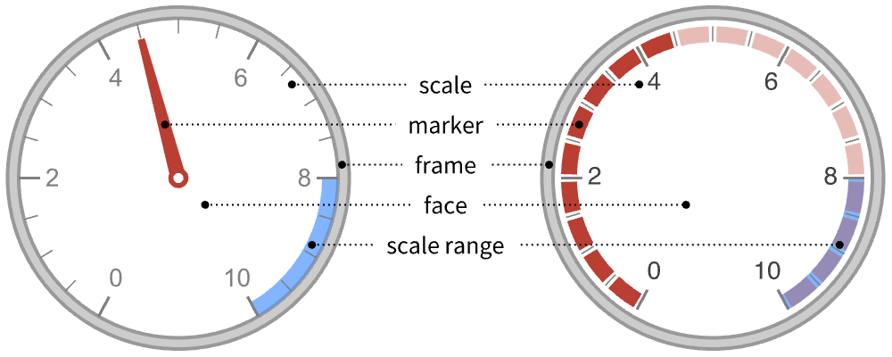
AngularGauge
AngularGauge[value]
draws a gauge showing value in the range 0 to 1.
AngularGauge[value,{min,max}]
draws a gauge showing value in a range of min to max.
AngularGauge[Dynamic[value],…]
allows value to be set interactively using the gauge.
AngularGauge[{value1,value2,…},…]
draws a gauge showing multiple values.
Details and Options
- Values less than min or greater than max are clipped to the respective limits.
- Undefined values or bad input is taken to be missing and typically displays the min value.
- Units may be assigned to value, min, and max by using Quantity.
- The units do not need to be the same, but must be compatible.
- AngularGauge has the same options as Graphics with the following additions and changes: [List of all options]
-
GaugeFaceElementFunction Automatic function to draw the face GaugeFaceStyle Automatic style for the gauge face GaugeFrameElementFunction Automatic function to draw the frame GaugeFrameSize Automatic how large to make the gauge frame GaugeFrameStyle Automatic style for the gauge frame GaugeLabels None labels for the gauge GaugeMarkers Automatic appearance for the marker GaugeStyle Automatic style for gauge markers Method Automatic method to use PerformanceGoal $PerformanceGoal aspects of performance to try to optimize PlotTheme $PlotTheme theme to use for drawing the gauge ScaleDivisions Automatic the number and distribution of ticks ScaleOrigin Automatic where to position the scale in the gauge ScalePadding Automatic how to draw the space around the scale ScaleRanges None the sections of the scale to be styled ScaleRangeStyle Automatic how to draw the scale ranges ScalingFunctions None scaling functions for the gauge TargetUnits Automatic units to display in the gauge - GaugeLabels can take the following forms:
-
None no gauge labels Automatic include units as labels Full include units and a value as labels All include all values as labels "Value" include values as labels "Unit" include units as labels label use label as a label Placed[label,pos] place label at position pos {label1,label2,…} use multiple labels - GaugeLabels->Placed[label,pos] can use the positions pos:
-
Top,Bottom,Left,Right,Center positions within the gauge face bs position along the scale Scaled[bs] scaled position along the scale {bx,by} scaled position {bx,by} in the gauge {pos,{lx,ly}} scaled position {lx,ly} in the label at general position pos in the gauge - A list of built-in settings for GaugeMarkers, GaugeFaceElementFunction, and GaugeFrameElementFunction can be obtained from ChartElementData["AngularGauge"]. A visual gallery is available in the Chart Element Schemes palette.
- GaugeMarkers->Placed[marker,pos] can be used to control where the marker is placed in the gauge. The possible positions pos are:
-
"Center" center of the dial face "DivisionCenter" cumulative markers centered on division marks "DivisionInterval" cumulative markers between division marks "Scale" within the scale region "OutsideScale" outside the scale region "InsideScale" inside the scale region "ScaleRange" cumulative marker within the scale region "Frame" within the dial frame - ScaleOrigin can take the following values:
-
r radius of the scale Left,Right,Bottom,Top on which side to center the scale {θmin,θmax} angular locations of min and max for the scale {angle,r} angular and radial origins for the scale - The angles in ScaleOrigin are measured in radians, counterclockwise from the positive
 axis. The values need not be between 0 and
  .
. - Scales run counterclockwise when θmin<θmax and clockwise when θmin>θmax.
- If Abs[θmax-θmin]>2Pi, the scale will overlap itself.
- The radial component r of the scale origin is scaled to run from 0 at the center of the gauge to 1 at the edge of the face.
- ScalePadding can take the following forms:
-
p angular padding p on each end of the scale {pmin,pmax} padding pmin before the scale and pmax after None no padding around the scale Automatic automatically determined padding Full pad to the nearest chord of a circle All pad the scale to make a complete circle - TargetUnits->Automatic automatically selects the units based on the input. If no units are present, none will be displayed.
- TargetUnits->unit displays unit in the gauge, even if no units were present in the input.
List of all options
Examples
open all close allBasic Examples (4)
Generate a dial gauge for a particular value:
AngularGauge[42, {0, 100}]Generate a gauge using values with units:
AngularGauge[["68 m/s"], {["0 m/s"], ["100 m/s"]}, GaugeLabels -> "Unit"]Generate a gauge that displays multiple values:
AngularGauge[{15, 42, 63, 88}, {0, 100}]Generate a dial gauge with an interactive value:
DynamicModule[{y = 0}, AngularGauge[Dynamic[y], {0, 100}]]Scope (22)
Data and Layouts (7)
Data values are clipped to be within the range of the scale:
AngularGauge[{-500, 1, 8, 14.68}, {0, 10}]Nonreal data is taken to be missing and typically uses the minimum value of the gauge:
Table[AngularGauge[a, {0, 10}],
	{a, {2 + 2I, "Hi"}}]
The min and max specified are sorted so that the smaller number of the list is always min:
AngularGauge[42, {100, 0}]Generate a gauge using values with units:
AngularGauge[["68 m/s"], {["0 m/s"], ["100 m/s"]}, GaugeLabels -> "Unit"]Specify the displayed units with TargetUnits:
AngularGauge[["68 m/s"], {["0 m/s"], ["100 m/s"]}, GaugeLabels -> "Unit", TargetUnits -> "Kilometers" / "Hours"]Change the position of the scale:
AngularGauge[42, {0, 100}, ScaleOrigin -> Left]Display the gauge as a semicircle:
AngularGauge[88, {0, 100}, ScaleOrigin -> {π, 0}]Use Dynamic to make an interactive gauge:
DynamicModule[{x}, Column[{AngularGauge[Dynamic[x], GaugeLabels -> Automatic], Slider[Dynamic[x]], Button["Reset", x = 0]}]]Styling and Appearance (9)
Use a theme to control the overall appearance:
AngularGauge[42, {0, 100}, PlotTheme -> "Business"]Use explicit styles for the markers:
AngularGauge[{2, 17, 42, 88}, {0, 100}, GaugeStyle -> {Red, Green, Blue, Yellow}]Use any gradient or indexed color schemes from ColorData to style the markers:
Table[AngularGauge[{2, 17, 42, 88}, {0, 100}, GaugeStyle -> f], {f, {61, "Pastel"}}]Change the type of markers used:
Table[AngularGauge[42, {0, 100}, GaugeMarkers -> f], {f, {"BezelBevelNeedle", "ShinyHubNeedle"}}]Change where the markers are placed:
Table[AngularGauge[42, {0, 100}, GaugeMarkers -> Placed[Automatic, f]], {f, {"Center", "InsideScale", "OutsideScale", "Frame", "DivisionCenter", "ScaleRange"}}]Use any graphic or image for the marker:
AngularGauge[42, {0, 100}, GaugeMarkers -> Placed[[image], #]]& /@ {"InsideScale", "DivisionCenter"}Change the style of the face of the gauge:
Table[AngularGauge[42, {0, 100}, GaugeFaceStyle -> c], {c, {LightGray, LightOrange}}]Change the style of the frame around the gauge:
Table[AngularGauge[42, {0, 100}, GaugeFrameStyle -> c], {c, {Black, LightOrange}}]Specify ranges of the scale to be colored on the dial face:
AngularGauge[20, {0, 100}, ScaleRanges -> {{50, 60}, {60, 70}, {70, 80}, {80, 100}}]Labeling (6)
Use GaugeLabels to add a label to the gauge face:
AngularGauge[88, {0, 100}, GaugeLabels -> "MPH"]Add a display of the scale value:
AngularGauge[9, {0, 10}, GaugeLabels -> "Value"]Add a display of the gauge units:
AngularGauge[Quantity[9, "Feet"], {0, 10}, GaugeLabels -> "Unit"]AngularGauge[Quantity[9, "Feet"], {0, 10}, GaugeLabels -> Full]Use Placed to change the location of the label on the face of the gauge:
AngularGauge[86, {0, 100}, GaugeLabels -> Placed[ "% Complete", Above]]Use a list to specify more than one label:
AngularGauge[68.2, {0, 100}, GaugeLabels -> {"Tank Pressure", "Value"}]Options (87)
AspectRatio (2)
AspectRatio is automatic by default, resulting in perfect circles:
AngularGauge[60, {0, 100}]Use a fixed ratio to change the shape of the gauge:
AngularGauge[60, {0, 100}, AspectRatio -> 1 / 2]Background (1)
Insert a background color behind the gauge:
AngularGauge[42, {0, 100}, Background -> LightBlue]Use GaugeFaceStyle to set the face style:
AngularGauge[42, {0, 100}, GaugeFaceStyle -> LightBlue]Frame (4)
AngularGauge does not use a frame by default:
AngularGauge[42, {0, 100}]Use FrameTrue to draw a frame around the plot:
AngularGauge[42, {0, 100}, Frame -> True]Draw a frame on the left and right edges:
AngularGauge[42, {0, 100}, Frame -> {{True, True}, {False, False}}]Draw a frame on the left and bottom edges:
AngularGauge[42, {0, 100}, Frame -> {{True, False}, {True, False}}]FrameStyle (2)
Specify the style of the frame:
AngularGauge[42, {0, 100}, Frame -> True, FrameStyle -> Directive[StandardBlue, Thick]]Specify the style for each frame edge:
AngularGauge[42, {0, 100}, Frame -> True, FrameStyle -> {{Directive[Green, Thick], Red}, {Directive[Gray, Thick], Blue}}]GaugeFaceElementFunction (3)
List built-in settings for GaugeFaceElementFunction:
ChartElementData["AngularGauge", "Face"]For detailed settings, use Palettes ▶ Chart Element Schemes:
Table[AngularGauge[42, {0, 100}, GaugeFrameStyle -> None, GaugeFaceStyle -> LightBlue, GaugeFaceElementFunction -> f, PlotLabel -> f], {f, {"GlassSector", "OscillatingSector"}}]Write a custom GaugeFaceElementFunction:
f[{{θ1_, θ2_}, {r1_, r2_}}, __] := First[ParametricPlot[(Max[r, 0.65 + 0.1Abs[Cos[θ ^ 1.3]]Sin[16θ]]){ Cos[θ], Sin[θ]}, {θ, θ1, θ2}, {r, r1, r2}, Mesh -> None, PlotPoints -> {30, 3}, PlotStyle -> Directive[Opacity[1], LightGray], BoundaryStyle -> Gray]]AngularGauge[42, {0, 100}, GaugeFrameStyle -> None, GaugeFaceElementFunction -> f]GaugeFaceStyle (3)
Specify the style for the gauge face:
Table[AngularGauge[42, {0, 100}, GaugeFaceStyle -> c], {c, {LightGray, LightOrange}}]Use None to turn off the face:
AngularGauge[42, {0, 100}, GaugeFaceStyle -> None, Background -> LightBlue]Use a Texture as a gauge face:
AngularGauge[42, {0, 100}, TicksStyle -> Black, GaugeFaceStyle -> Texture[ExampleData[{"ColorTexture", "Amboyna"}]]]AngularGauge[42, {0, 100}, TicksStyle -> Black, GaugeFaceStyle -> Texture[ImageCrop[Graphics3D[Sphere[], Boxed -> False]]]]GaugeFrameElementFunction (3)
List built-in settings for GaugeFrameElementFunction:
ChartElementData["AngularGauge", "Frame"]For detailed settings, use Palettes ▶ Chart Element Schemes:
Table[AngularGauge[42, {0, 100}, GaugeFrameElementFunction -> f, PlotLabel -> f], {f, {"BezelSector", "GlassSector"}}]Construct a custom rendering function:
f[{{tmin_, tmax_}, {rmin_, rmax_}}, ___] := Module[{inpts, outpts},
	inpts = Array[rmin{Cos[2π # / 100], Sin[2π # / 100]}&, 100];
	outpts = Array[rmax{Cos[2π # / 100], Sin[2π # / 100]}&, 100];
{EdgeForm[Directive[Thick, Dashed, Gray]], LightGray, FilledCurve[{{Line[inpts]}, {Line[outpts]}}]}]AngularGauge[5.5, {0, 10}, GaugeFrameElementFunction -> f]GaugeFrameSize (3)
Make the frame have an explicit width scaled to the size of the gauge face:
{AngularGauge[42, {0, 100}, GaugeFrameSize -> .4],
	AngularGauge[42, {0, 100}, GaugeFrameSize -> .05]}
Use None to turn off the frame:
AngularGauge[42, {0, 100}, GaugeFrameSize -> None]Use named sizes for the frame:
AngularGauge[42, {0, 100}, GaugeFrameSize -> #]& /@ {Tiny, Small , Medium, Large}GaugeFrameStyle (1)
GaugeLabels (10)
AngularGauge[55, {0, 100}, GaugeLabels -> Automatic]AngularGauge[55, {0, 100}, GaugeLabels -> Style["", 24]]Table[AngularGauge[55, {0, 100}, GaugeLabels -> label], {label, {Sqrt[x^x], [image], [image]}}]If units are present, they can be added as a label to the gauge:
{AngularGauge[42, {0, 100}, TargetUnits -> "psi", GaugeLabels -> "Unit"], AngularGauge[Quantity[6.5, "Feet"], {0, 10}, GaugeLabels -> "Unit"]}Use Placed to control label placement:
Table[AngularGauge[9, {0, 10}, GaugeLabels -> Placed["Value", p]], {p, {Left, Top, Right}}]Position labels at values along the scale:
Table[AngularGauge[9, {0, 10}, GaugeLabels -> Placed["Value", {p, {0.5, 0.5}}]], {p, {0, 5, 10}}]Position labels using a scaled coordinate system along the scale:
Table[AngularGauge[9, {0, 10}, GaugeLabels -> Placed["Value", {Scaled[p], {0.5, 0.5}}]], {p, {0, 1 / 2, 1}}]Use a scaled coordinate system over the entire gauge:
Table[AngularGauge[9, {0, 10}, GaugeLabels -> Placed["Value", p]], {p, {{0.35, 0.5}, {0.1, 0.9}, {0.5, 0.65}}}]Place all labels at the middle of the scale and vary the coordinates within the label:
Table[AngularGauge[9, {0, 10}, GaugeLabels -> Placed["Value", {Scaled[0.5], p}]], {p, {{0.5, 0}, {0.5, 1}, {0.5, 2.75}}}]Use a list to specify more than one label:
AngularGauge[9, {0, 10}, TargetUnits -> "RPM", GaugeLabels -> {"×1000",
    "Unit", "Value"}]
GaugeMarkers (8)
Table[AngularGauge[42, {0, 100}, GaugeMarkers -> typ], {typ, {Automatic, None}}]List built-in settings for GaugeMarkers:
ChartElementData["AngularGauge", "Markers"]For detailed settings, use Palettes ▶ Chart Element Schemes:
Table[AngularGauge[42, {0, 100}, GaugeMarkers -> typ], {typ, {"BevelNeedle", "TwoToneNeedle", "BezelBevelNeedle", "ShinyHubNeedle"}}]Use an image or graphic for a marker:
AngularGauge[42, {0, 100}, GaugeMarkers -> [image]]Use Placed to change the location of the marker:
Table[AngularGauge[42, {0, 100}, GaugeMarkers -> Placed["PolarMarker", loc]], {loc, {"InsideScale", "OutsideScale", "Scale", "Frame"}}]Fill a cumulative bar to the value:
AngularGauge[42, {0, 100}, GaugeMarkers -> Placed[Automatic, "ScaleRange"]]Fill segments that are centered on division values:
{AngularGauge[42, {0, 100}, GaugeMarkers -> Placed[Automatic, "DivisionCenter"]],
	AngularGauge[42, {0, 100}, GaugeMarkers -> Placed[Automatic, "DivisionCenter"], TicksStyle -> Gray]}
Sequential markers are activated when the value rounds to the division value:
{AngularGauge[94.99, {0, 100}, ScaleDivisions -> {5, 2}, TicksStyle -> Gray, GaugeMarkers -> Placed[Automatic, "DivisionCenter"]], AngularGauge[95, {0, 100}, ScaleDivisions -> {5, 2}, TicksStyle -> Gray, GaugeMarkers -> Placed[Automatic, "DivisionCenter"]]}Fill segments that are between division values:
{AngularGauge[42, {0, 100}, GaugeMarkers -> Placed[Automatic, "DivisionInterval"]],
	AngularGauge[42, {0, 100}, GaugeMarkers -> Placed[Automatic, "DivisionInterval"], TicksStyle -> Gray]}
Sequential markers are activated when the value is greater than or equal to the division value:
{AngularGauge[99.99, {0, 100}, ScaleDivisions -> {5, 2}, TicksStyle -> Gray, GaugeMarkers -> Placed[Automatic, "DivisionInterval"]], AngularGauge[100, {0, 100}, ScaleDivisions -> {5, 2}, TicksStyle -> Gray, GaugeMarkers -> Placed[Automatic, "DivisionInterval"]]}Use an image or graphic for a cumulative marker:
AngularGauge[42, {0, 100}, GaugeMarkers -> Placed[[image], "DivisionInterval"]]GaugeStyle (5)
Table[AngularGauge[42, {0, 100}, GaugeStyle -> s], {s, {Red, Darker[Blue]}}]By default, different styles are chosen for multiple markers:
AngularGauge[{10, 27, 45, 62, 80, 97}, {0, 100}]AngularGauge[{10, 27, 45, 62, 80, 97}, {0, 100}, GaugeStyle -> {Red, Orange, Yellow, Green, Blue, Purple}]Use any gradient or indexed color schemes from ColorData:
Table[AngularGauge[{10, 27, 45, 62, 80, 97}, {0, 100}, GaugeStyle -> s], {s, {"BlueGreenYellow", 24}}]Specify the style for cumulative markers up to the gauge value:
Table[AngularGauge[42, {0, 100}, GaugeMarkers -> p, GaugeStyle -> Blue], {p, {"DivisionCenter", "ScaleRange"}}]Specify an additional style for markers beyond the gauge value:
Table[AngularGauge[42, {0, 100}, GaugeMarkers -> p, GaugeStyle -> {Blue, Lighter[Blue, 0.7]}], {p, {"DivisionCenter", "ScaleRange"}}]Use None to not use any style:
Table[AngularGauge[42, {0, 100}, GaugeMarkers -> p, GaugeStyle -> {Blue, None}], {p, {"DivisionCenter", "ScaleRange"}}]ImageSize (7)
Use named sizes such as Tiny, Small, Medium and Large:
{AngularGauge[60, {0, 100}, ImageSize -> Tiny], AngularGauge[60, {0, 100}, ImageSize -> Small]}Specify the width of the plot:
{AngularGauge[60, {0, 100}, ImageSize -> 150], AngularGauge[60, {0, 100}, AspectRatio -> 1.5, ImageSize -> 150]}Specify the height of the plot:
{AngularGauge[60, {0, 100}, ImageSize -> {Automatic, 150}], AngularGauge[60, {0, 100}, AspectRatio -> 2, ImageSize -> {Automatic, 150}]}Specify the width and height for a graphic, padding with space if necessary:
AngularGauge[60, {0, 100}, ImageSize -> {200, 200}, Background -> LightBlue]Use maximum sizes for the width and height:
{AngularGauge[60, {0, 100}, ImageSize -> {UpTo[150], UpTo[100]}], AngularGauge[60, {0, 100}, AspectRatio -> 1.5, ImageSize -> {UpTo[150], UpTo[100]}]}Use ImageSizeFull to fill the available space in an object:
Framed[Pane[AngularGauge[60, {0, 100}, ImageSize -> Full, Background -> LightBlue], {200, 100}]]Specify the image size as a fraction of the available space:
Framed[Pane[AngularGauge[60, {0, 100}, ImageSize -> {Scaled[0.5], Scaled[0.5]}, Background -> LightBlue], {200, 100}]]LabelStyle (1)
PerformanceGoal (2)
PlotTheme (4)
Create gauges using a variety of base themes:
Multicolumn[Table[Labeled[AngularGauge[7, {0, 10}, PlotTheme -> t, ImageSize -> 125], t], {t, {"Business", "Detailed", "Marketing", "Minimal", "Monochrome", "Scientific", "Web", "Classic"}}]]Combine the base themes with the "GaugeHalf" feature theme:
Multicolumn[Table[Labeled[AngularGauge[7, {0, 10}, PlotTheme -> {t, "GaugeHalf"}, ImageSize -> 125], t], {t, {"Business", "Detailed", "Marketing", "Minimal", "Monochrome", "Scientific", "Web", "Classic"}}]]Combine the "Marketing" theme with a scale origin:
AngularGauge[37, {0, 100}, PlotTheme -> "Marketing", ScaleOrigin -> {6Pi / 5, -Pi / 5}]The "Sparkline" theme fits gauges in the surrounding text:
gauge = AngularGauge[0.54, PlotTheme -> "Sparkline"]TextCell[Row[{"Sparkline gauges ", gauge, " match the surrounding text size."}], FontFamily -> "Arial", FontSize -> 32]ScaleDivisions (2)
ScaleOrigin (4)
Use ScaleOrigin to specify a radial position for the scale:
AngularGauge[42, {0, 100}, ScaleOrigin -> .75]Use a relative location for the center of the scale:
AngularGauge[42, {0, 100}, ScaleOrigin -> Left]Specify a starting and ending angle for the scale:
AngularGauge[42, {0, 100}, ScaleOrigin -> {π, -π / 2}]Change the order of the endpoints to reverse the scale direction:
AngularGauge[42, {0, 100}, ScaleOrigin -> {-π / 2, π}]Change the endpoints to use the opposite arc of the scale:
AngularGauge[42, {0, 100}, ScaleOrigin -> {π, 3π / 2}, ScalePadding -> All]Change the order of the endpoints to reverse the scale direction:
AngularGauge[42, {0, 100}, ScaleOrigin -> {3π / 2, π}, ScalePadding -> All]Specify a radial and angular position for the scale:
Table[AngularGauge[42, {0, 100}, ScaleOrigin -> f, ScalePadding -> All, PlotLabel -> f], {f, {{Left, .75}, {{π, -Pi / 2}, 1}}}]ScalePadding (5)
Use automatically determined angular padding:
AngularGauge[42, {0, 100}, ScaleOrigin -> {0, π / 2}, ScalePadding -> Automatic]Full padding will ensure a "nice" dial face shape:
AngularGauge[42, {0, 100}, ScaleOrigin -> {π / 4, 3π / 4}, ScalePadding -> Full]Leave no angular padding around the scale:
AngularGauge[42, {0, 100}, ScaleOrigin -> {0, π}, ScalePadding -> None]Specify a constant angular padding:
AngularGauge[42, {0, 100}, ScaleOrigin -> {0, π}, ScalePadding -> π / 12]Specify different angular padding on each side:
AngularGauge[42, {0, 100}, ScaleOrigin -> {0, π / 2}, ScalePadding -> {π / 20, 11π / 20}]ScaleRanges (7)
Highlight a range of values on the scale:
AngularGauge[42, {0, 100}, ScaleRanges -> {80, 100}]AngularGauge[42, {0, 100}, ScaleRanges -> {{50, 75}, {75, 90}, {90, 100}}]Style the entire region behind the scale:
AngularGauge[42, {0, 100}, ScaleRangeStyle -> Directive[White, EdgeForm[Black]], GaugeFrameStyle -> None, GaugeMarkers -> #, ScaleRanges -> All]& /@ {Automatic, "DivisionCenter"}Ranges need not be contiguous or distinct:
AngularGauge[42, {0, 100}, ScaleRanges -> {{0, 25}, {50, 75}, {75, 100}, {65, 85}}]Directly associate a style with a range, using range->style:
AngularGauge[42, {0, 100}, ScaleRanges -> {{0, 33} -> Green, {33, 66} -> Yellow, {66, 100} -> Red}]ScaleRanges appears in front of the gauge face:
AngularGauge[42, {0, 100}, ScaleRanges -> All, GaugeFaceStyle -> LightGray]AngularGauge[17, {0, 100}, ScaleRanges -> {{{0, 33}, .1}, {{33, 66}, .1}, {{66, 100}, .1}}, ScaleRangeStyle -> 24]Vary the width for each scale range:
AngularGauge[17, {0, 100}, ScaleRanges -> {{{0, 33}, {0, 0.1}}, {{33, 66}, {0, 0.2}}, {{66, 100}, {0, 0.3}}}, ScaleRangeStyle -> 24]ScaleRangeStyle (8)
By default, the scale ranges are styles based on the marker color:
AngularGauge[42, {0, 100}, GaugeStyle -> #, ScaleRanges -> {{50, 70}, {70, 80}, {80, 90}, {90, 100}}]& /@ {Automatic, Orange}AngularGauge[42, {0, 100}, ScaleRanges -> {{50, 70}, {70, 80}, {80, 90}, {90, 100}}, AxesStyle -> None, ScaleRangeStyle -> EdgeForm[{Darker@Gray}]]Use a list of directives to style each range separately:
AngularGauge[42, {0, 100}, ScaleRanges -> {{70, 80}, {80, 90}, {90, 100}}, ScaleRangeStyle -> {Yellow, Orange, Red}]Styles will repeat cyclically if necessary:
AngularGauge[42, {0, 100}, ScaleRanges -> Table[{i, i + 10}, {i, 0, 100, 10}], ScaleRangeStyle -> {Yellow, Orange}]Use ScaleRangeStyle->{None,style} to apply a style to the scale only:
AngularGauge[42, {0, 100}, ScaleRanges -> {80, 100}, ScaleRangeStyle -> {None, Red}]Apply a style to the backgrounds and foregrounds of all the ranges:
AngularGauge[42, {0, 100}, ScaleRanges -> {{0, 20}, {80, 100}}, ScaleRangeStyle -> {{LightBlue, Blue}, {LightRed, Red}}]Color the scale ranges with built-in color schemes:
Table[AngularGauge[42, {0, 100}, ScaleRanges -> {{0, 20}, {20, 50}, {50, 80}, {80, 100}}, ScaleRangeStyle -> f], {f, {"BlueGreenYellow", 24}}]Define a one-dimensional color function:
CoolColor[ z_ ] := RGBColor[1 - z, z, 1];AngularGauge[42, {0, 100}, ScaleRanges -> {{0, 20}, {20, 50}, {50, 80}, {80, 100}}, ScaleRangeStyle -> CoolColor]Applications (6)
Use a gauge as a control in Manipulate:
Manipulate[Plot[Sin[a x], {x, 0, 4Pi}], {{a, 1}, 0, 4, AngularGauge[##, ImageSize -> 125]&}, ControlPlacement -> Left]Visualize leaf count for successive integrals:
AngularGauge[Dynamic[exp], {0, 300}]Do[(Pause[.4];exp = LeafCount[Integrate[1 / (x ^ n - 1), x]];), {n, 10}];Monitor memory used by processes with an indicator of the max memory used:
AngularGauge[{MemoryInUse[], MaxMemoryUsed[]} / 10. ^ 9, {0, 4}, GaugeMarkers -> {"DivisionInterval", "Frame"}, GaugeFrameSize -> 0.25, GaugeStyle -> {{Green, None}, Red}]Monitor progress when integrating a differential equation:
AngularGauge[Dynamic[t], {0, 30}, PlotLabel -> "Currently estimating x=", GaugeStyle -> Black]sol = NDSolve[{y'[x] == y[x]Cos[x + y[x]], y[0] == 1}, y, {x, 0, 30}, EvaluationMonitor :> (Pause[0.02];(t = x))]Visualize properties of noble gases:
Partition[Table[Grid[{{Style[element, "Section"], SpanFromLeft}, {AngularGauge[ElementData[element, "AtomicWeight"], {0, 200}, GaugeLabels -> "AMU", PlotLabel -> "Atomic Weight", ImageSize -> 130],
	ThermometerGauge[ElementData[element, "CriticalTemperature"], {0, 500}, ImageSize -> {75, 300}, GaugeLabels -> Placed[ Rotate["Critical Temperature (K)", π / 2], {.1, .5}]]},
	{AngularGauge[ElementData[element, "CriticalPressure"], {0, 10}, GaugeLabels -> Placed["Mega pascals", {.5, .35}], PlotLabel -> "Critical Pressure", ImageSize -> 130], SpanFromAbove}}, Frame -> True, Alignment -> Bottom], {element, ElementData["NobleGas"][[1 ;; 6]]}], 2]//Grid
Visualize the first two derivatives of a polynomial:
Manipulate[With[{f = Function[x, x ^ 3 + 3x ^ 2 - 3x - 1]},
Column[{Row[{AngularGauge[(D[f[x], {x, 1}] /. x -> p), {-20, 20}, GaugeLabels -> {Placed["SuperscriptBox[1, st] Derivative", {.5, .7}], Automatic}],
AngularGauge[(D[f[x], {x, 2}] /. x -> p), {-20, 20}, GaugeLabels -> {Placed["SuperscriptBox[2, nd] Derivative", {.5, .7}], Automatic}]}],
Plot[f[t], {t, -4, 2}, Epilog -> {PointSize[Large], Red, Point[{p, f[p]}]}, ImageSize -> Medium]}, Center]], {{p, -3.5}, -4, 2}]
 An Elementary Introduction to the Wolfram Language
Text
Wolfram Research (2012), AngularGauge, Wolfram Language function, https://reference.wolfram.com/language/ref/AngularGauge.html (updated 2015).
CMS
Wolfram Language. 2012. "AngularGauge." Wolfram Language & System Documentation Center. Wolfram Research. Last Modified 2015. https://reference.wolfram.com/language/ref/AngularGauge.html.
APA
Wolfram Language. (2012). AngularGauge. Wolfram Language & System Documentation Center. Retrieved from https://reference.wolfram.com/language/ref/AngularGauge.html