


ListPlot
詳細とオプション
- ListPlotは,高さ yiのリストが与えられた場合は散布図または点プロットとしても知られている.
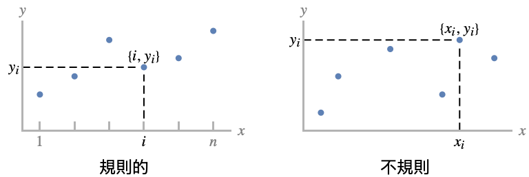
- 規則的データ{y1,…,yn}は点{i,yi}としてプロットされる.
- 不規則データ{{x1,y1},…,{xn,yn}}は点{xi,yi}としてプロットされる.
- データ値 xiおよび yiは次の形式で与えることができる.
-
xi 実数値の数 Quantity[xi,unit] 単位の付いた数量 Around[xi,ei] 不確かさ eiの値 xi Interval[{xmin,xmax}] xminから xmaxまでの値 - 上記の形式ではない値 xiおよび yiは,欠落値とみなされ,表示されない.
- dataiは次の形式と解釈を持つ.
-
<"k1"y1,"k2"y2,…> 値{y1,y2,…} <x1y1,x2y2,…> キーと値のペア{{x1,y1},{x2,y2},…} {y1"lbl1",y2"lbl2",…}, {y1,y2,…}{"lbl1","lbl2",…} ラベル{lbl1,lbl2,…}の付いた値{y1,y2,…} SparseArray 正規配列としての値 TimeSeries, EventSeries 時点と値のペア QuantityArray 大きさ WeightedData 重みのない値 - ListPlot[Tabular[…]cspec]は,列指定 cspec を使って表形式オブジェクトから値を抽出し,これをプロットする.
- 次は,表形式データのプロットに使用可能な列指定 cspec の形式である.
-
{colx,coly} 列 y と列 x をプロットする {{colx1,coly1},{colx2,coly2},…} 列 y1と列 x1,列 y2と列 x2をプロットする等 coly, {coly} 列 y を一連の値としてプロットする {{coly1},…,{colyi},…} 列 y1, y2, …を一連の値としてプロットする - colxはAutomaticでもよい.その場合は,DataRangeを使って一連の値が生成される.
- ListPlot[TimeSeries[…]cspec]およびListPlot[EventSeries[…]cspec]は,列指定 cspec を用いて,時系列または事象系列から値を抽出し,それをプロットする.
- 系列データをプロットするために許可される成分指定 cspec の形式は次の通りである.
-
com タイムスタンプと成分 com をプロットする {com1,com2,…} タイムスタンプと各成分 comiをプロットする - dataiには,次のラッパー w を使うことができる.
-
Annotation[datai,label] データに注釈を与える Button[datai,action] データがクリックされた際に実行するアクションを定義する Callout[datai,label] コールアウトでデータにラベルを付けるl Callout[datai,label,pos] コールアウトを相対位置 pos に置く EventHandler[datai,…] データの一般的なイベントハンドラを定義する Highlighted[datai,effect] 効果を使って fiを動的にハイライトする Highlighted[datai,Placed[effect,pos]] 位置 pos で効果を使って fiを静的にハイライトする Hyperlink[datai,uri] データをハイパーリンクにする Labeled[datai,label] データにラベルを付ける Labeled[datai,label,pos] 相対位置 pos にラベルを置く Legended[datai,label] データを凡例で識別する PopupWindow[datai,cont] データにポップアップウィンドウを付ける StatusArea[listi,label] マウスが来たときにステータスエリアに表示する Style[listi,opts] 指定したスタイルを使ってデータを示す Tooltip[listi,label] データにツールチップを付ける Tooltip[datai] データの値をツールチップとして使う - ラッパー w は複数のレベルで適用することができる.
-
{…,w[yi],…} データの値 yiを囲む {…,w[{xi,yi}],…} 点{xi,yi}を囲む w[datai] データを囲む w[{data1,…}] dataiの集合を囲む w1[w2[…]] ネストしたラッパーを使う - Callout,Labeled,Placedには次の位置 pos が使える.
-
Automatic 自動的に置かれたラベル 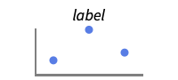
Above データあるいは点の上の位置 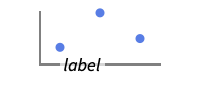
Below データあるいは点の下の位置 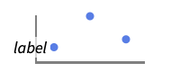
Before データあるいは点の前の位置 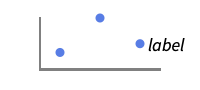
After データあるいは点の後ろの位置 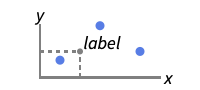
{pos,epos} データの相対位置 pos に置かれたラベルの中の epos - ListPlotには,Graphicsと同じオプションに以下の追加・修正を加えたものが使える. [全オプションのリスト]
- DataRangeは,値{y1,…,yn}をどのように{{x1,y1},…,{xn,yn}}と解釈するかを決定する.次は使用可能な設定である.
-
Automatic,All 1から n まで一様に {xmin,xmax} xminから xmaxまで一様に - 一般に,ペア{{x1,y1},{x2,y2},…}のリストは点のリストと解釈されるが,設定DataRangeAllはそれを複数の datai {{y11,y12},{y21,y23},…}として解釈するように強制する. »
- LabelingFunction->f は,各点に f[value,index,lbls]で与えられるラベルを付けるように指定する.ただし,value は点に関連付けられた値,index は data 内の位置,lbls は関連ラベルのリストである.
- 複数のデータ集合は,PlotLayoutの以下の設定を使って表示することができる.
-
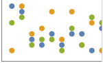
"Overlaid" すべてのデータを重ねて表示する 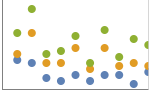
"Stacked" データを積み重ねる 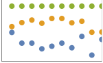
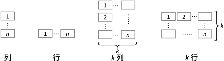
"Percentile" データを積み重ねて正規化する - 次は,複数のプロットパネルで単一の曲線を表示するPlotLayoutの可能な設定である.
-
"Column" パネルの列内で別々のプロットを使う "Row" パネルの行内で別々のプロットを使う {"Column",k},{"Row",k} k 列(行)を使う {"Column",UpTo[k]},{"Row",UpTo[k]} 最高で k 列(行)を使う - 次は,HighlightedとPlotHighlightingの使用可能なハイライト効果である.
-

style 指定のデータをハイライトする 
"Ball" データ中の指定の点をハイライトしてラベルを付ける 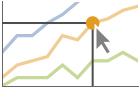
"Dropline" データ中の指定の点を軸までのドロップラインでハイライトしてラベルを付ける 
"XSlice" 垂直スライスに沿ったすべての点をハイライトしてラベルを付ける 
"YSlice" 水平スライスに沿ったすべての点をハイライトしてラベルを付ける 
Placed[effect,pos] 指定の位置 pos を静的にハイライトする - 位置指定 pos のハイライトには以下がある.
-
x, {x} {x,y}における効果,y は自動的に選択される {x,y} {x,y}における効果 {pos1,pos2,…} 複数の位置 posi - PlotLegendsによく使われる設定値
-
None 凡例は使わない Automatic 凡例を自動的に決定する {lbl1,lbl2,…} lbl1, lbl2, …を凡例ラベルとして使う Placed[lspec,…] 凡例の置き方を指定する - PlotStylesty は,各曲線に使用するスタイルを指定する.可能な設定には以下がある.
-
{sty1,sty2,…} データ集合に対するスタイルの列 <"key"val,…> 異なるデータレベルに対するスタイル要素 - 受け入れられるキーは次の通りである.
-
"Base" すべての dataiに対する全体的なスタイル "Lists" dataiごとのスタイル styiのリスト - ColorData["DefaultPlotColors"]は,PlotStyleで使われるデフォルトの色のシーケンスを与える.
- ScalingFunctions->"scale"は
 座標をスケールする.ScalingFunctions{"scalex","scaley"}は
  座標と
座標と  座標の両方をスケールする.
 - 関数に与えられる引数は,ColorFunctionにおいては
 と
と  である.デフォルトでは,ColorFunctionに指定する関数には,これらの引数のスケーリングされた値が与えられる.
全オプションのリスト
例題
すべて開く すべて閉じる例 (7)

ListPlot[Prime[Range[25]]]

ListPlot[RandomVariate[BinormalDistribution[{4, 4}, {1, 1}, 0.5], 750]]ListPlot[Table[{k, PDF[BinomialDistribution[50, p], k]}, {p, {0.3, 0.5, 0.8}}, {k, 0, 50}], Filling -> Axis, PlotLegends -> {0.3, 0.5, 0.8}]ListPlot[Labeled[#, #]& /@ Table[Prime[n], {n, 10}], PlotStyle -> PointSize[Medium]]ListPlot[{Labeled[Sqrt[Range[40]], "sqrt"], Labeled[Log[Range[40, 80]], "log"]}]ListPlot[{Labeled[Sqrt[Range[40]], "sqrt"], Labeled[Log[Range[40, 80]], "log"]}, PlotLayout -> "Row"]ListPlot[Table[Style[{Cos[t], Sin[2t]}, Hue[t / (2Pi)]], {t, 0, 2Pi, Pi / 20}], PlotStyle -> PointSize[Medium]]スコープ (64)
一般的なデータ (11)
 の値からなる規則的なデータについて,
 データの範囲は整数値であると考えられる:
ListPlot[Sqrt[Range[40]]]DataRangeを使って明示的な  データの範囲を与える:
ListPlot[Sqrt[Range[40]], DataRange -> {0, 1}]ListPlot[{Sqrt[Range[40]], Log[Range[40, 80]]}]ListPlot[Quantity[Sqrt[Range[10]], "Meters"]] 値のペアからなる不規則なデータについては,
 のデータ範囲はデータから推論される:
data = Last[Reap[NIntegrate[Sin[x] ^ 2, {x, 0, 2Pi}, EvaluationMonitor :> Sow[{x, Sin[x] ^ 2}]]]];ListPlot[data]data1 = Table[{x, Sin[x]}, {x, RandomReal[2Pi, 50]}];
data2 = Table[{x, Cos[x]}, {x, RandomReal[2Pi, 250]}];ListPlot[{data1, data2}]DataRangeを使って同じ  範囲にマップして,規則的か否かにかかわらず,複数のデータ集合をプロットする:
data1 = Table[Sin[x], {x, 0, 2Pi, 0.1}];
data2 = Table[{x, Cos[x]}, {x, RandomReal[2Pi, 100]}];ListPlot[{data1, data2}, DataRange -> {0, 2Pi}]{ListPlot[{1, 1 + I, 3, None, 5, 6, Missing["NotAvailable"], 8, 9}], ListPlot[Sqrt[Sin[Range[0, 3Pi, 0.1]]]]}MaxPlotPointsを使って使用する点の数を制限する:
Table[ListPlot[Table[Sin[2Pi n / 10], {n, 100}], MaxPlotPoints -> mp, Joined -> True], {mp, {Infinity, 50, 30}}]PlotRangeは自動的に設定される:
{ListPlot[{2 ^ Range[15], Fibonacci[Range[15]]}], ListPlot[{2 ^ Range[15], Fibonacci[Range[15]]}, PlotRange -> All]}{ListPlot[{0, 1, 2, 3, 100, 5, 6, 7}], ListPlot[{0, 1, 2, 3, 100, 5, 6, 7}, PlotRange -> All]}PlotRangeを使って関心領域に焦点を当てる:
{ListPlot[Table[x ^ 4 - x ^ 2 + 1, {x, -2, 2, 0.1}]], ListPlot[Table[x ^ 4 - x ^ 2 + 1, {x, -2, 2, 0.1}], PlotRange -> {0, 2}]}ScalingFunctionsを使って軸をスケールする:
ListPlot[Factorial[Range[20]], ScalingFunctions -> "Log"]表形式データ (3)
tabular = Tabular[ResourceData["Sample Data: Fisher's Irises"]]ListPlot[tabular -> {"SepalLength", "SepalWidth"}]PivotToColumnsを使って,各種について萼片の長さの列を作成する:
pivot = PivotToColumns[tabular, "Species" -> "PetalLength"]ListPlot[pivot -> {{"PetalWidth", ExtendedKey["PetalLength", "setosa"]}, {"PetalWidth", ExtendedKey["PetalLength", "versicolor"]}, {"PetalWidth", ExtendedKey["PetalLength", "virginica"]}}]ListPlot[pivot -> {{"PetalWidth", "setosa"}, {"PetalWidth", "versicolor"}, {"PetalWidth", "virginica"}}]ListPlot[tabular -> {"Species", "PetalLength"}, ScalingFunctions -> {NominalScale[Automatic], None}]TimeSeriesまたはEventSeriesの全データをプロットする:
ListPlot[TimeSeries[TimeEventSeries`TimestampData[Association["UniformlySpacedQ" -> False,
   "Timestamps" -> TabularColumn[Association[
      "Data" -> {7, {{NumericArray[{-248, 118, 298, 638, 865, 1006, 1216}, "Integer32"], {},
          None}}, None},  ...   "Data" -> {{32, 62, 112, 167, 179, 209, 214}, {}, None}, "ElementType" -> "Integer64"]],
         TabularColumn[Association["Data" -> {{30, 49, 81, 125, 142, 174, 177}, {}, None},
"ElementType" -> "Integer64"]]}}]]]], Association[]]]TimeSeriesまたはEventSeriesの特定の成分をプロットする:
trees = TimeSeries[TimeEventSeries`TimestampData[Association["UniformlySpacedQ" -> False,
   "Timestamps" -> TabularColumn[Association[
      "Data" -> {7, {{NumericArray[{-248, 118, 298, 638, 865, 1006, 1216}, "Integer32"], {},
          None}}, None},  ...   "Data" -> {{32, 62, 112, 167, 179, 209, 214}, {}, None}, "ElementType" -> "Integer64"]],
         TabularColumn[Association["Data" -> {{30, 49, 81, 125, 142, 174, 177}, {}, None},
"ElementType" -> "Integer64"]]}}]]]], Association[]];ListPlot[trees -> "tree 1"]ListPlot[trees -> {"tree 1", "tree 2"}]特殊データ (10)
Quantityを使ってデータに単位を加える:
ListPlot[Quantity[Sqrt[Range[10]], "Meters"], AxesLabel -> Automatic]data = EntityValue[EntityClass["Element", All], {"AtomicMass", "MeltingPoint"}];ListPlot[data, AxesLabel -> Automatic]QuantityArray中のデータをプロットする:
data = QuantityArray[EntityValue[EntityClass["Element", All], {"AtomicMass", "MeltingPoint"}]]ListPlot[data, AxesLabel -> Automatic]TargetUnitsで単位を指定する:
ListPlot[data, TargetUnits -> {Automatic, "Kelvin"}, AxesLabel -> Automatic]ListPlot[Table[Around[RandomReal[5], RandomReal[0.5]], 20]]ListPlot[Table[Interval[RandomReal[5] + {-0.5, 0.5}], 20]]ListPlot[{2 -> "a", 3 -> "b", 5 -> "c", 7 -> "d", 11 -> "e", 13 -> "f", 17 -> "g"}]LabelingFunctionでラベルの位置を指定する:
ListPlot[{2, 3, 5, 7, 11, 13, 17} -> {"a", "b", "c", "d", "e", "f", "g"}, LabelingFunction -> Above]Association中の数値は  座標として使われる:
ListPlot[<|"a" -> 2, "b" -> 3, "c" -> 5, "d" -> 7, "e" -> 11, "f" -> 13|>]Association中のキーと値は  座標と
座標と  座標として使われる:
ListPlot[<|2 -> 1, 3 -> 2, 5 -> 3, 7 -> 4, 11 -> 5, 13 -> 6|>]TimeSeriesを自動日付目盛で直接プロットする:
data = CountryData["UnitedStates", {{"Population"}, {1988, 2013}}]ListPlot[data, AxesLabel -> Automatic]TimeSeriesを直接プロットする:
ts = TimeSeries[Transpose@{{4, 9, 18, 27, 34, 40, 49, 54, 64, 72}, {1, 9, 11, 16, 18, 25, 34, 43, 49, 54} + 5, Sort[RandomInteger[{10, 100}, 10]]}, {{2013, 1, 1}, Automatic, "Day"}, ComponentKeys -> {"a", "b", "c"}]ListPlot[ts]ListPlot[ts -> "b"]ListPlot[ts -> {"a", "c"}]SparseArray中のデータをプロットする:
ListPlot[SparseArray[Table[Prime[i] -> 1, {i, 25}]]]WeightedData中の重みは無視される:
ListPlot[WeightedData[{2, 3, 5, 7, 11, 13, 17, 19, 23, 29}, {1, 2, 3, 4, 5, 6, 7, 8, 9, 10}]]データのラッパー (6)
個々のデータ,データ集合,データ集合の集合にラッパーを使う:
{ListPlot[{{1, Style[2, Red], 3}, {4, 5, 6}}, PlotStyle -> PointSize[0.05]], ListPlot[{Style[{1, 2, 3}, Green], {4, 5, 6}}, PlotStyle -> PointSize[0.05]], ListPlot[Style[{{1, 2, 3}, {4, 5, 6}}, Blue], PlotStyle -> PointSize[0.05]]}{ListPlot[{{1, Style[2, Red], 3}, {4, 5, 6}}, PlotStyle -> PointSize[0.05]], ListPlot[{Style[{1, Style[2, Red], 3}, Green], {4, 5, 6}}, PlotStyle -> PointSize[0.05]], ListPlot[Style[{Style[{1, Style[2, Red], 3}, Green], {4, 5, 6}}, Blue], PlotStyle -> PointSize[0.05]]}ListPlot[Tooltip[Prime[Range[100]]]]ListPlot[Tooltip[Prime[Range[100]], "primes"]]ListPlot[Table[Labeled[RandomReal[1, 2], i], {i, 20}], PlotStyle -> PointSize[Medium], ImageSize -> 300]PopupWindowを使って追加的なドリルダウン情報を与える:
ListPlot[{1, PopupWindow[2, DateListPlot[FinancialData["IBM", "Jan. 1, 2004"]]], 3}, PlotStyle -> PointSize[0.05]]Buttonを使って任意のアクションを引き起こす:
ListPlot[{1, Button[2, Speak[2]], 3}, PlotStyle -> PointSize[0.05]]ラベルと凡例 (16)
ListPlot[Table[Labeled[RandomReal[1, 2], i], {i, 20}]]Table[ListPlot[Table[Labeled[RandomReal[1, 2], i, p], {i, 5}], PlotLabel -> p], {p, {Above, Below, Before, After}}]データにLabeledでラベルを付ける:
data = Table[Table[{x, f}, {x, 0, 2Pi, 0.1}], {f, {Sin[x], Sin[2x]}}];ListPlot[MapThread[Labeled[#1, #2]&, {data, {Sin[x], Sin[2x]}}]]PlotLabelsでデータにラベルを付ける:
data = Table[Table[{x, f}, {x, 0, 2Pi, 0.1}], {f, {Sin[x], Sin[2x]}}];ListPlot[data, PlotLabels -> {Sin[x], Sin[2x]}]ListPlot[Labeled[Table[{x, Sin[x]}, {x, 0, 2Pi, 0.1}], "sin(x)", 3]]ListPlot[Labeled[Table[{x, Sin[x]}, {x, 0, 2Pi, 0.1}], "sin(x)", Scaled[0.25]]]ListPlot[Labeled[Table[{x, Sin[x]}, {x, 0, 2Pi, 0.1}], Sin[x], {Scaled[0.25], Above}]]Calloutでデータの自動的にラベルを付ける:
ListPlot[{Callout[Table[PartitionsQ[n], {n, 18}], PartitionsQ[n]], Callout[Table[n, {n, 18}], n]}]ListPlot[Callout[Table[n ^ Sin[n], {n, 1, 10, 0.25}], "label", Above]]ListPlot[Callout[Table[n ^ Sin[n], {n, 1, 10, 0.25}], "label", 5]]LabelingFunctionでラベル名を指定する:
ListPlot[Prime[Range[10]], LabelingFunction -> (#1 &)]data = Table[Labeled[Prime[i], RandomWord[]], {i, 10}];ListPlot[data, LabelingSize -> 30]ListPlot[data, LabelingSize -> Full]密な点集合については,デフォルトで,ラベルの中にツールチップに変換されるものがあるかもしれない:
data = Table[Callout[RandomReal[1, 2], i], {i, 100}];ListPlot[data]プロットサイズを大きくすると,より多くのラベルが表示される:
ListPlot[data, ImageSize -> 400]data = Table[Table[{x, f}, {x, 0, 2Pi, 0.1}], {f, {Sin[x], Sin[2x]}}];ListPlot[data, PlotLegends -> {Sin[x], Sin[2x]}]Legendedを使って特定のデータ集合に凡例を付ける:
upper = RandomReal[{1.5, 2}, 50];
lower = RandomReal[0.5, 50];ListPlot[{lower, Legended[Mean[{lower, upper}], "average"], upper}]Placedを使って凡例の位置を変える:
ListPlot[{lower, Legended[Mean[{lower, upper}], Placed["average", Below]], upper}]ListPlot[<|"fibonacci" -> Fibonacci[Range[10]], "primes" -> Prime[Range[10]]|>, PlotLabels -> Automatic, PlotLegends -> None]プロットには,通常,マウスオーバーした位置の座標を示すインタラクティブなコールアウトが付いている:
ListPlot[{...}]特定のラッパーまたはツールチップのようなインタラクションを含めてインタラクティブな特徴をオフにすることができる:
ListPlot[Callout[{...}, "hello", 13]]{ListPlot[{{...}, {...}}, PlotHighlighting -> "Dropline"], ListPlot[{{...}, {...}}, PlotHighlighting -> "XSlice"]}Highlightedを使ってプロット中の特定の点を強調する:
ListPlot[Highlighted[{...}, Placed["Ball", 7]]]ListPlot[Highlighted[{...}, Placed["Ball", {{7}, {17}}]]]プレゼンテーション (18)
data = Table[Table[{x, f}, {x, 0, 2Pi, 0.1}], {f, {Sin[x], Sin[2x]}}];ListPlot[data]data = Table[Table[{x, f}, {x, 0, 2Pi, 0.1}], {f, {Sin[x], Sin[2x]}}];ListPlot[data, PlotStyle -> {Blue, Red}]ListPlot[Table[{Sin[3t + Pi / 2], Sin[t]}, {t, 0, 2Pi, .05}], PlotTheme -> "Marketing", AspectRatio -> 1]Calloutでデータにラベルを付ける:
ListPlot[Table[Callout[Table[{x, f}, {x, 0, 2Pi, 0.1}], f], {f, {Sin[x], Sin[2x]}}]]data = Table[Table[{x, f}, {x, 0, 2Pi, 0.1}], {f, {Sin[x], Sin[2x]}}];ListPlot[data, PlotLegends -> {Sin[x], Sin[2x]}]Legendedを使って指定されたデータ集合に凡例を与える:
upper = RandomReal[{1.5, 2}, 50];
lower = RandomReal[0.5, 50];ListPlot[{lower, Legended[Mean[{lower, upper}], "average"], upper}]ListPlot[Table[{k, Binomial[15, k]}, {k, 0, 15}], AxesLabel -> {k, None}, PlotLabel -> Binomial[15, k], PlotStyle -> Directive[PointSize[Medium], Purple]]データにインタラクティブなTooltipを与える:
ListPlot[Tooltip[Table[If[PrimeQ[x], Tooltip[x, Row[{"prime: ", x}]], x], {x, 1, 25}]], PlotStyle -> Directive[PointSize[Medium], Orange]]ListPlot[{Tooltip[(3 / 2) ^ Range[15], TraditionalForm[(3 / 2) ^ k]], Tooltip[Fibonacci[Range[15]], TraditionalForm[Fibonacci[k]]]}, PlotStyle -> PointSize[Medium]]ListPlot[{Table[Sin[x], {x, 0, 2Pi, 0.1}], Table[Sinc[x], {x, 0, 2Pi, 0.1}]}, Filling -> {1 -> {2}}, FillingStyle -> {Red, Blue}]ListPlot[{{1, 2, 3, 5, 8}, {2, 3, 6, 9, 10}, {4, 5, 7, 10, 12}}, PlotMarkers -> Automatic]ListPlot[{{1, 2, 3, 5, 8}, {2, 3, 6, 9, 10}, {4, 5, 7, 10, 12}}, PlotMarkers -> {"1", "2", "3"}]Joinedを使ってデータ集合を線で繋ぐ:
ListPlot[{1, 2, 4, 7, 3, 5, 8, 10, 9}, Joined -> True, PlotStyle -> Orange]ListPlotは,軸と枠についてTimeSeriesのデータ情報を自動的に使う:
data = WeatherData["Chicago", "Temperature", {2021, 8}]ListPlot[data, Joined -> True, AxesLabel -> Automatic]InterpolationOrderを使って繋いだデータを滑らかにする:
Table[ListPlot[{1, 2, 4, 7, 3, 5, 8, 10, 9}, Joined -> True, InterpolationOrder -> io, PlotStyle -> Dashed], {io, {0, 1, 2, 3}}]ListPlot[{IconizedObject[«[image]»], IconizedObject[«[image]»]}, PlotLayout -> "Row", AspectRatio -> 1, PlotStyle -> AbsolutePointSize[2]]ListPlot[{IconizedObject[«[image]»], IconizedObject[«[image]»]}, PlotLayout -> "Column", AspectRatio -> 1, PlotStyle -> AbsolutePointSize[2]]ListPlot[{IconizedObject[«[image]»], IconizedObject[«[image]»], IconizedObject[«[image]»], IconizedObject[«[image]»]}, PlotLayout -> {"Row", 2}, AspectRatio -> 1, PlotStyle -> AbsolutePointSize[2]]data = {{10, 9, 4, 3, 5, 3, 5, 5, 2, 6}, {2, 10, 5, 6, 9, 4, 9, 3, 7, 2}, {7, 8, 3, 4, 4, 2, 6, 3, 8, 7}};ListPlot[data, PlotLayout -> "Stacked", Joined -> True]ListPlot[data, PlotLayout -> "Percentile", Joined -> True]ListPlot[{Prime[Range[10]], Range[10] ^ 2}, MultiaxisArrangement -> All]ListPlot[{Range[10], Prime[Range[10]], Range[10] ^ 2}, MultiaxisArrangement -> {Right -> {1, 2}, Left -> 3}]ListPlot[{Range[10], Prime[Range[10]], Range[10] ^ 2}, MultiaxisArrangement -> {Right -> {{1, 2}}, Left -> 3}]オプション (176)
ClippingStyle (6)
ClippingStyleでは少なくとも1組のデータが繋がれて(Joined)いなければならない:
{ListPlot[Table[{x, Sin[x] / x ^ 2}, {x, -10, 10, 0.2}], ClippingStyle -> Red], ListPlot[Table[{x, Sin[x] / x ^ 2}, {x, -10, 10, 0.2}], ClippingStyle -> Red, Joined -> True]}//QuietListPlot[Table[{x, Sin[x] / x ^ 2}, {x, -10, 10, 0.2}], Joined -> True, Joined -> True, ClippingStyle -> None]//QuietListPlot[Table[{x, Sin[x] / x ^ 2}, {x, -10, 10, 0.2}], Joined -> True, ClippingStyle -> Automatic, PlotStyle -> Thick]//QuietListPlot[Table[{x, Sin[x] / x ^ 2}, {x, -10, 10, 0.2}], Joined -> True, ClippingStyle -> Red]//QuietListPlot[Table[{x, Sin[x] / x ^ 2}, {x, -10, 10, 0.2}], Joined -> True, ClippingStyle -> {Red, Thick}]//QuietListPlot[Table[{x, Sin[x] / x ^ 2}, {x, -10, 10, 0.2}], Joined -> True, ClippingStyle -> Directive[Red, Thick]]//QuietColorFunction (6)
ListPlot[Sinc[Range[0, 10, 0.2]], ColorFunction -> "Rainbow"]

Table[ListPlot[Sinc[Range[0, 10, 0.2]], ColorFunction -> f, PlotLabel -> f[x, y], PlotStyle -> Thick], {f, {Hue[#]&, Hue[#2]&}}]ListPlot[Sinc[Range[0, 10, 0.2]], ColorFunction -> "DarkRainbow"]ListPlot[Sinc[Range[0, 10, 0.1]], Joined -> True, ColorFunction -> Function[{x, y}, Hue[x]], Filling -> Axis]ColorFunctionは曲線の彩色に関してPlotStyleより優先順位が高い:
ListPlot[Sinc[Range[0, 10, 0.1]], Joined -> True, ColorFunction -> "DarkRainbow", PlotStyle -> Directive[Red, Thick]]ColorFunctionを使うためにMeshShadingにAutomaticを使う:
ListPlot[Sin[Range[0, 10, 0.1]], Joined -> True, ColorFunction -> "Rainbow", PlotStyle -> Directive[Red, Thick], Mesh -> 10, MeshShading -> {Automatic, StandardGray}, MeshStyle -> None]ColorFunctionScaling (2)

ListPlot[Table[x ^ 2Exp[-x ^ 2], {x, -5, 5, 0.1}], Joined -> True, ColorFunction -> Function[{x, y}, Hue[y]], PlotStyle -> Thick, ColorFunctionScaling -> True]
ListPlot[Table[x ^ 2Exp[-x ^ 2], {x, -5, 5, 0.1}], Joined -> True, ColorFunction -> Function[{x, y}, Hue[y]], PlotStyle -> Thick, ColorFunctionScaling -> False]DataRange (5)
ListPlot[Table[Sin[x], {x, 0, 2Pi, 0.1}]]ListPlot[Table[Sin[x], {x, 0, 2Pi, 0.1}], DataRange -> {0, 2Pi}]ListPlot[{Sqrt[Range[1, 20]], Log[Range[10, 40]]}, DataRange -> {1, 5}]

ListPlot[Table[{i + 10, i}, {i, 25}], AxesOrigin -> {0, 0}] の値はデータの一部なので,この場合はDataRangeを指定しても意味がない:
ListPlot[Table[{i + 10, i}, {i, 25}], AxesOrigin -> {0, 0}, DataRange -> {0, 1}]ListPlot[{{1, 1}, {2, 2}, {3, 3}}, DataRange -> All, AxesOrigin -> {0, 0}, Joined -> True]Filling (8)
Table[ListPlot[Table[Prime[n], {n, 30}], Filling -> c], {c, {Top, Bottom, Axis, Prime[15]}}]ListPlot[{Range[20], Table[Prime[n], {n, 20}]}, Filling -> {1 -> {2}}]ListPlot[{Range[20], Table[Prime[n], {n, 20}]}, Filling -> {1 -> {{2}, Directive[Orange, Dashed]}}]データ1とデータ2の間を埋める.1が2よりも小さい部分は赤,その他の場合は青を使う:
data1 = Sqrt[Range[40]] - 2;
data2 = Log[Range[40]];ListPlot[{data1, data2}, Filling -> {1 -> {{2}, {Red, Blue}}}]data = Last[Reap[Plot[Sin[x], {x, 0, 2Pi}, EvaluationMonitor :> Sow[{x, Sin[x]}]]]];ListPlot[data, Filling -> Axis]数組の不規則なデータを使う.最初の組を参照して間を塗り潰す:
data1 = First@Last[Reap[Plot[Sin[x], {x, 0, 2Pi}, EvaluationMonitor :> Sow[{x, Sin[x]}]]]];
data2 = First@Last[Reap[Plot[Cos[x], {x, 0, 2Pi}, EvaluationMonitor :> Sow[{x, Cos[x]}]]]];ListPlot[{Sort@data1, Sort@data2}, Filling -> {1 -> {2}}]Joinedされたデータ集合間を塗り潰す:
ListPlot[{Range[20], Table[{n + 1 / 2, Prime[n]}, {n, 20}]}, Filling -> {1 -> {2}}, Joined -> True]Table[ListPlot[{Range[20], Range[20] / 2}, Joined -> {True, False}, Filling -> f, PlotLabel -> f], {f, {1 -> {2}, 2 -> {1}}}]FillingStyle (4)
ListPlot[Table[Prime[n], {n, 20}], Filling -> Axis, FillingStyle -> Blue]ListPlot[Table[Prime[n], {n, 20}], Filling -> Axis, FillingStyle -> Directive[Magenta, Dashed]]ListPlot[Table[{x, Sin[x]}, {x, 0, 2Pi, 0.2}], Filling -> Axis, FillingStyle -> {Red, Blue}]ListPlot[Table[{x, Sin[x]}, {x, 0, 2Pi, 0.2}], Filling -> Axis, Joined -> True]Frame (3)
ListPlot[Table[ Sin[x], {x, 0, 2 Pi, Pi / 30}], Frame -> True]ListPlot[Table[ Sin[x], {x, 0, 2 Pi, Pi / 30}], Frame -> {{True, True}, {False, False}}]ListPlot[Table[ Sin[x], {x, 0, 2 Pi, Pi / 30}], Frame -> {{True, False}, {True, False}}]FrameLabel (4)
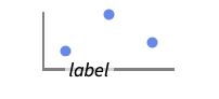
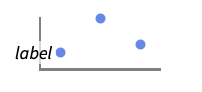
ListPlot[Table[ Sin[x], {x, 0, 2 Pi, Pi / 30}], Frame -> True, FrameLabel -> {"label"}]ListPlot[Table[ Sin[x], {x, 0, 2 Pi, Pi / 30}], Frame -> True, FrameLabel -> {"bottom", "left"}]ListPlot[Table[ Sin[x], {x, 0, 2 Pi, Pi / 30}], Frame -> True, FrameLabel -> {{"left", "right"}, {"bottom", "top"}}]ListPlot[Table[ Sin[x], {x, 0, 2 Pi, Pi / 30}], Frame -> True, FrameLabel -> {{x, x2}, {y, y2}}, LabelStyle -> Directive[Bold, StandardGray]]FrameStyle (2)
ListPlot[Table[ Sin[x], {x, 0, 2 Pi, Pi / 30}], Frame -> True, FrameStyle -> Directive[StandardGray, Thick]]ListPlot[Table[ Sin[x], {x, 0, 2 Pi, Pi / 30}], Frame -> True, FrameStyle -> {{Directive[Green, Thick], Red}, {Directive[Gray, Thick], Blue}}]FrameTicks (9)
ListPlot[Table[ Sin[x], {x, 0, 2 Pi, Pi / 30}], Frame -> True]ListPlot[Table[ Sin[x], {x, 0, 2 Pi, Pi / 30}], Frame -> True, FrameTicks -> None]ListPlot[Table[ Sin[x], {x, 0, 2 Pi, Pi / 180}], Frame -> True, FrameTicks -> {{None, None}, {Automatic, None}}]デフォルトで,上と右の辺には目盛は置かれるが目盛ラベルは置かれない:
ListPlot[Table[ Sin[x], {x, 0, 2 Pi, Pi / 180}], Frame -> True, FrameTicks -> Automatic]Allを使ってすべての辺に目盛ラベルを置く:
ListPlot[Table[ Sin[x], {x, 0, 2 Pi, Pi / 180}], Frame -> True, FrameTicks -> All]ListPlot[Table[ Sin[x], {x, 0, 2 Pi, Pi / 180}], Frame -> True, FrameTicks -> {{{-1, 0, 1}, {-1, 0, 1}}, {{0, 180, 360 }, {0, 180, 360 }}}]ListPlot[Table[ Sin[x], {x, 0, 2 Pi, Pi / 180}], Frame -> True, FrameTicks -> {{{{-1, -a}, {0, 0}, {1, a}}, {-1, 0, 1}}, {{{0, 0}, {180, b}, {360, c} }, {0, 180, 360 }}}]ListPlot[Table[ Sin[x], {x, 0, 2 Pi, Pi / 180}], Joined -> True, Frame -> {{True, True}, {True, True}}, FrameTicks -> {{Automatic, Automatic}, {{{50, a, .1}, {180, b, .1}, {300, c, .1} }, Automatic}}]ListPlot[Table[ Sin[x], {x, 0, 2 Pi, Pi / 180}], Frame -> True, FrameTicks -> {{Automatic, Automatic}, {{{50, a, 0.1}, {180, b, 0.1}, {300, c, 0.1} }, {{50, a, {0.2, 0.1}}, {180, b, {0.2, 0.1}}, {300, c, {0.2, 0.1}} }}}]ListPlot[Table[ Sin[x], {x, 0, 2 Pi, Pi / 180}], Frame -> True, FrameTicks -> {{Automatic, Automatic}, {{{50, a, 0.1, Red}, {180, b, 0.1, Blue}, {300, c, 0.1, Darker@Green} }, Automatic}}]minMeanMax[min_, max_] := {{min, min}, {(max + min) / 2, (max + min) / 2}, {max, max}}ListPlot[Table[ Sin[x], {x, 0, 2 Pi, Pi / 180}], Frame -> True, Joined -> True, FrameTicks -> {{minMeanMax, None}, {minMeanMax, None}}, PlotRangePadding -> None]FrameTicksStyle (3)
デフォルトで,枠目盛と枠目盛ラベルには枠と同じスタイルが使われる:
ListPlot[Table[ Sin[x], {x, 0, 2 Pi, Pi / 180}], Joined -> True, Frame -> True, FrameStyle -> Directive[Red]]ListPlot[Table[ Sin[x], {x, 0, 2 Pi, Pi / 180}], Frame -> True,
FrameStyle -> Red, FrameTicksStyle -> Directive[Blue, Thick]]ListPlot[Table[ Sin[x], {x, 0, 2 Pi, Pi / 180}], Frame -> True, FrameTicks -> All, FrameTicksStyle -> {{Purple, Blue}, {Thick, Red}}]ImageSize (1)
data = RandomReal[10, {100, 2}] -> Range[100];ListPlot[data, ImageSize -> Medium]ListPlot[data, ImageSize -> 200]ListPlot[data, ImageSize -> 500]InterpolationOrder (5)
繋がれた(Joined)曲線は補間することができる:
ListPlot[{{1, 4, 2, 3, 10, 8, 2}}, Joined -> True, InterpolationOrder -> 2]ListPlot[{{1, 4, 2, 3, 10, 8, 2}}, Joined -> True, InterpolationOrder -> None, Mesh -> Full]ListPlot[{{1, 4, 2, 3, 10, 8, 2}}, Joined -> True, InterpolationOrder -> 0, Mesh -> Full]ListPlot[{{1, 4, 2, 3, 10, 8, 2}}, Joined -> True, InterpolationOrder -> 3, Mesh -> Full]Table[ListPlot[{{1, 4, 2, 3, 10, 8, 2}}, Joined -> True, InterpolationOrder -> i, Mesh -> Full, PlotLabel -> i], {i, 0, 5}]IntervalMarkers (3)
ListPlot[Table[Around[RandomReal[], RandomReal[.1]], 10]]ListPlot[Table[Around[RandomReal[], RandomReal[.1]], 10], IntervalMarkers -> "Bars"]ListPlot[Table[Around[RandomReal[], RandomReal[.1]], 10], IntervalMarkers -> "Bands"]IntervalMarkersStyle (2)
ListPlot[{Table[Around[RandomReal[20], 1], 10], Table[Around[RandomReal[20], 1], 10]}, PlotStyle -> {Red, Blue}]ListPlot[{Table[Around[RandomReal[20], 1], 10], Table[Around[RandomReal[20], 1], 10]}, IntervalMarkersStyle -> Gray]Joined (4)
ListPlot[Table[Prime[n], {n, 20}], Joined -> True]ListPlot[{Range[20], Table[Prime[n], {n, 20}]}, Joined -> {True, False}]ListPlot[Table[Prime[n], {n, 20}], Joined -> True, Mesh -> All]Table[ListPlot[{Range[20], Range[20] / 2}, Joined -> {True, False}, Filling -> f, PlotLabel -> f], {f, {1 -> {2}, 2 -> {1}}}]LabelingFunction (6)
ListPlot[{1, 1, 2, 3, 5, 8} -> {"a", "b", "c", "d", "e", "f"}]LabelingFunction->Noneを使ってラベルが付けられないようにする:
ListPlot[{1, 1, 2, 3, 5, 8} -> {"a", "b", "c", "d", "e", "f"}, LabelingFunction -> None]ListPlot[{1, 1, 2, 3, 5, 8} -> {"a", "b", "c", "d", "e", "f"}, LabelingFunction -> Above]ListPlot[{1, 1, 2, 3, 5, 8} -> {"a", "b", "c", "d", "e", "f"}, LabelingFunction -> Tooltip]ListPlot[{1, 1, 2, 3, 5, 8} -> {"a", "b", "c", "d", "e", "f"}, LabelingFunction -> Callout[Automatic, Automatic]]ListPlot[{1, 1, 2, 3, 5, 8} -> {"a", "b", "c", "d", "e", "f"}, LabelingFunction -> (#1&)]ListPlot[{1, 1, 2, 3, 5, 8} -> {"a", "b", "c", "d", "e", "f"}, LabelingFunction -> (#2&)]LabelingSize (4)
ListPlot[{1, 1, 2, 3, 5, 8} -> {"healthfulness", "obstreperous", "spectrogram", "vestige", "coinage", "limey"}, ImageSize -> Medium]ListPlot[{1, 1, 2, 3, 5, 8} -> {[image], [image], [image], [image], [image], [image]}, ImageSize -> Medium]ListPlot[{1, 1, 2, 3, 5, 8} -> {"healthfulness", "obstreperous", "spectrogram", "vestige", "coinage", "limey"}, ImageSize -> Medium, LabelingSize -> 30]ListPlot[{1, 1, 2, 3, 5, 8} -> {[image], [image], [image], [image], [image], [image]}, ImageSize -> Medium, LabelingSize -> 20]ListPlot[{1, 1, 2, 3, 5, 8} -> {[image], [image], [image], [image], [image], [image]}, ImageSize -> Medium, LabelingSize -> Full]LabelingTarget (7)
ListPlot[IconizedObject[«data»]]ListPlot[IconizedObject[«data»], LabelingTarget -> All]ListPlot[IconizedObject[«data»], LabelingTarget -> "Dense"]ListPlot[IconizedObject[«data»], LabelingTarget -> 0.25]ListPlot[IconizedObject[«data»], LabelingTarget -> <|"AllowedLabelingPositions" -> "Sides"|>]ListPlot[IconizedObject[«data»], LabelingTarget -> <|"AllowedLabelingPositions" -> "Corners"|>]ListPlot[IconizedObject[«data»], LabelingTarget -> <|"AllowedLabelingPositions" -> {"Right", "Top"}|>]ListPlot[IconizedObject[«data»], LabelingTarget -> <|"AllowedOverlaps" -> {"Points"}|>]ListPlot[IconizedObject[«data»], LabelingTarget -> <|"AllowLabelClipping" -> True|>]MaxPlotPoints (1)
Table[ListPlot[Table[{n, Sin[2Pi n / 10]}, {n, 100.}], MaxPlotPoints -> mp, Joined -> True], {mp, {Infinity, 50, 30}}]Table[ListPlot[Table[{Sqrt[n]Cos[n / 5], Sqrt[n]Sin[n / 5]}, {n, 100.}], MaxPlotPoints -> mp, Joined -> True], {mp, {Infinity, 50, 30}}]Mesh (6)
Meshでは,少なくとも1組のデータが繋がれて(Joined)いなければならない:
{ListPlot[Table[Sin[x], {x, 8}], Mesh -> 10], ListPlot[Table[Sin[x], {x, 8}], Mesh -> 10, Joined -> True]}{ListPlot[Table[Sin[x], {x, 8}], Mesh -> Full, Joined -> True], ListPlot[Table[Sin[x], {x, 8}], Mesh -> All, Joined -> True]}{ListPlot[Table[Sin[x], {x, 8}], Mesh -> Full, InterpolationOrder -> 2, Joined -> True], ListPlot[Table[Sin[x], {x, 8}], Mesh -> All, InterpolationOrder -> 2, Joined -> True]}
ListPlot[Table[Sin[x], {x, 8}], Mesh -> 20, Joined -> True]
ListPlot[Table[{x, Sin[x]}, {x, 0, 2Pi, 0.1}], Mesh -> {Range[0, 2Pi, Pi / 4]}, MeshStyle -> PointSize[Medium], Joined -> True]ListPlot[Table[{x, Sin[x]}, {x, 0, 2Pi, 2Pi / 20}], Mesh -> {Table[{x, Directive[Hue[x / (2Pi)], PointSize[Medium]]}, {x, 0., 2Pi, 2Pi / 8}]}, Joined -> True]MeshFunctions (3)
MeshFunctionsでは,少なくとも1組のデータ集合が繋がれて(Joined)いなければならない:
{ListPlot[Table[Binomial[15, k], {k, 0, 15}], Mesh -> 10, MeshFunctions -> {#1&}], ListPlot[Table[Binomial[15, k], {k, 0, 15}], Mesh -> 10, MeshFunctions -> {#1&}, Joined -> True]}

Table[ListPlot[Table[Binomial[15, k], {k, 0, 15}], MeshFunctions -> {Function[{x, y}, Evaluate[f]]}, Mesh -> 9, PlotLabel -> f, Joined -> True], {f, {x, y}}] 方向に赤で5つのメッシュレベルを,
 方向に青で10のメッシュレベルを示す:
ListPlot[Table[Binomial[15, k], {k, 0, 15}], Mesh -> {5, 10}, MeshFunctions -> {#1&, #2&}, MeshStyle -> {Directive[PointSize[Medium], Red], Blue}, Joined -> True]MeshShading (7)
MeshShadingでは,少なくとも1組のデータ繋がれて(Joined)いなければならない:
{ListPlot[Table[Binomial[15, k], {k, 0, 15}], Mesh -> 10, MeshShading -> {Red, Blue}], ListPlot[Table[Binomial[15, k], {k, 0, 15}], Mesh -> 10, MeshShading -> {Red, Blue}, Joined -> True]}
ListPlot[Table[Binomial[15, k], {k, 0, 15}], Mesh -> 10, MeshFunctions -> {#1&}, MeshShading -> {Red, Blue}, Joined -> True]Noneを使って線分を除去する:
ListPlot[Table[Binomial[15, k], {k, 0, 15}], Mesh -> 10, MeshFunctions -> {#1&}, MeshShading -> {Red, None}, Joined -> True]MeshShadingはPlotStyleとともに使うことができる:
ListPlot[Table[Binomial[15, k], {k, 0, 15}], Mesh -> 10, PlotStyle -> Thick, MeshFunctions -> {#1&}, MeshShading -> {Red, Blue}, Joined -> True]MeshShadingは曲線のスタイル付けに関しPlotStyleより優先順位が高い:
ListPlot[Table[Binomial[15, k], {k, 0, 15}], Mesh -> 10, PlotStyle -> Green, MeshFunctions -> {#1&}, MeshShading -> {Red, Blue}, Joined -> True]MeshShadingをAutomaticにし,線分にPlotStyleを使う:
ListPlot[Table[Binomial[15, k], {k, 0, 15}], Mesh -> 10, PlotStyle -> Directive[Thick, Yellow], MeshFunctions -> {#1&}, MeshShading -> {Red, Automatic}, Joined -> True]MeshShadingはColorFunctionとともに使うことができる:
ListPlot[Table[Binomial[15, k], {k, 0, 15}], Mesh -> 10, PlotStyle -> Thick, MeshFunctions -> {#1&}, MeshShading -> {StandardGray, Automatic},
	ColorFunction -> Function[{x, y}, Hue[x]], Joined -> True]
MultiaxisArrangement (5)
ListPlot[{Range[10], Prime[Range[10]]}]ListPlot[{Range[10], Prime[Range[10]]}, MultiaxisArrangement -> All]ListPlot[{Range[10], Prime[Range[10]], Range[10] ^ 2}, MultiaxisArrangement -> All]ListPlot[{Range[10], Prime[Range[10]], Range[10] ^ 2}, MultiaxisArrangement -> {{1, 2}, 3}]ListPlot[{Range[10], Prime[Range[10]], Range[10] ^ 2}, MultiaxisArrangement -> {Right -> {1, 2}, Left -> 3}]ListPlot[{Range[10], Prime[Range[10]], Range[10] ^ 2}, MultiaxisArrangement -> {Right -> {{1, 2}}, Left -> 3}]PlotFit (4)
ListPlot[IconizedObject[«data»], PlotFit -> Automatic]ListPlot[IconizedObject[«data»], PlotFit -> "Linear"]ListPlot[IconizedObject[«data»], PlotFit -> "Quadratic"]KernelModelFitを使ってデータを近似する:
ListPlot[IconizedObject[«data»], PlotFit -> PowerModel[]]PlotFitElements (3)
デフォルトで,フィットされたモデルがデータとともに表示される:
ListPlot[IconizedObject[«data»], PlotFit -> Automatic]データの信頼帯をプロットする.デフォルトでは,信頼水準は0.95である:
ListPlot[IconizedObject[«data»], PlotFit -> Automatic, PlotFitElements -> "BandCurves"]ListPlot[IconizedObject[«data»], PlotFit -> Automatic, PlotFitElements -> {"BandCurves", <|"ConfidenceLevel" -> 0.5|>}]点が繋がれていない場合に,データ点からフィットされた曲線までの残差線を表示する:
ListPlot[IconizedObject[«data»], PlotFit -> Automatic, PlotFitElements -> "Residuals"]ListPlot[IconizedObject[«data»], PlotFit -> Automatic, PlotFitElements -> {"DataPoints", {"Residuals", <|"Style" -> Opacity[1, StandardRed]|>}}]PlotHighlighting (9)
デフォルト設定のPlotHighlightingAutomaticのとき,プロットにはインタラクティブな座標コールアウトが付いている:
ListPlot[{IconizedObject[«primes»], IconizedObject[«squares»]}]PlotHighlightingNoneを使うとプロット全体のハイライト効果がオフにできる:
ListPlot[{IconizedObject[«primes»], IconizedObject[«squares»]}, PlotHighlighting -> None]Highlighted[…,None]を使って単一の集合のハイライトをオフにする:
ListPlot[{IconizedObject[«primes»], Highlighted[IconizedObject[«squares»], None]}]点集合にマウスオーバーして任意のグラフィックス指示子でハイライトする:
ListPlot[{IconizedObject[«primes»], IconizedObject[«squares»]}, PlotHighlighting -> Directive[Red, AbsolutePointSize[10], DropShadowing[]]]ListPlot[IconizedObject[«primes»], PlotHighlighting -> "Dropline"]ListPlot[Highlighted[IconizedObject[«primes»], Placed["Dropline", {{7}, {15}}]]]曲線にマウスオーバーしてラベルと軸までのドロップラインでハイライトする:
ListPlot[IconizedObject[«primes»], PlotHighlighting -> "Dropline"]ListPlot[Highlighted[IconizedObject[«primes»], Placed["Dropline", 16]]]プロットにマウスオーバーして  の位置に対応する
  の値を示すスライスでハイライトする:
ListPlot[{IconizedObject[«primes»], IconizedObject[«squares»]}, PlotHighlighting -> "XSlice"]
ListPlot[{Highlighted[IconizedObject[«primes»], Placed["XSlice", 17]], IconizedObject[«squares»]}]プロットにマウスオーバーして  の位置に対応する
  の値を示すスライスでハイライトする:
ListPlot[{IconizedObject[«primes»], IconizedObject[«squares»]}, PlotHighlighting -> "YSlice"]
ListPlot[{IconizedObject[«primes»], IconizedObject[«squares»]}, PlotHighlighting -> Placed["YSlice", 250]]マウスカーソルの  位置に最も近いプロット上の点を示す成分を使う:
ListPlot[{IconizedObject[«primes»], IconizedObject[«squares»]}, PlotHighlighting -> "XNearestPoint"]ListPlot[{IconizedObject[«primes»], IconizedObject[«squares»]}, PlotHighlighting -> {"XNearestPoint", <|"Style" -> Red|>}]ListPlot[{IconizedObject[«primes»], IconizedObject[«squares»]}, PlotHighlighting -> "XYLabel"]Calloutオプションを使ってラベルの外観を変える:
ListPlot[IconizedObject[«primes»], PlotHighlighting -> {"XYLabel", <|"Appearance" -> "Corners", "CalloutMarker" -> "Circle"|>}]ListPlot[IconizedObject[«primes»], PlotHighlighting -> {{"XNearestPoint", <|"Style" -> Red|>}, {"XYLabel", <|"Appearance" -> "Corners", "CalloutMarker" -> "Circle"|>}}]PlotInteractivity (3)
デフォルトで,プロットにはインタラクティブなハイライト機能がある:
ListPlot[{2, 3, 5, 7, 11, 13, 17, 19, 23, 29}]ListPlot[{2, 3, 5, 7, 11, 13, 17, 19, 23, 29}, PlotInteractivity -> False]与えたインタラクティブ要素は有効にして,自動のものは無効にする:
ListPlot[{2, 3, 5, 7, 11, 13, 17, 19, 23, Tooltip[29, "hello"]}, PlotInteractivity -> <|"User" -> True, "System" -> False|>]PlotLabel (1)
PlotLabels (7)
ListPlot[{Sin[Range[0, 2Pi, 0.1]], Cos[Range[0, 2Pi, 0.1]]}, PlotLabels -> {"sine", "cosine"}]Association形式を使ってラベルを指定する:
ListPlot[{Sin[Range[0, 2Pi, 0.1]], Cos[Range[0, 2Pi, 0.1]]}, PlotLabels -> <|"Lists" -> {"sine", "cosine"}|>]ListPlot[{Sin[Range[0, 2Pi, 0.1]], Cos[Range[0, 2Pi, 0.1]]}, PlotLabels -> Placed[{"sine", "cosine"}, Above]]ListPlot[{Sin[Range[0, 2Pi, 0.1]], Cos[Range[0, 2Pi, 0.1]]}, PlotLabels -> {Callout["sin", {Scaled[0.25], Above}], Callout["cos", {Scaled[0.5], Below}]}]Associationからのキーをラベルとして使う:
ListPlot[<|"sine" -> Sin[Range[0, 2Pi, 0.1]], "cosine" -> Cos[Range[0, 2Pi, 0.1]]|>, PlotLabels -> Automatic, PlotLegends -> None]Noneを使ってラベルは加えない:
ListPlot[{Sin[Range[0, 2Pi, 0.1]], Cos[Range[0, 2Pi, 0.1]]}, PlotLabels -> {"sine", None}]data1 = Table[{Cos[x], Sin[x]}, {x, 0, 2Pi, 0.1}];data2 = Table[{Cos[x], Sin[3x]}, {x, 0, 2Pi, 0.1}];ListPlot[{data1, data2}, Joined -> True, PlotLabels -> Callout[{"label1", "label2"}, After]]PlotLayout (3)
data = {{10, 9, 4, 3, 5, 3, 5, 5, 2, 6}, {2, 10, 5, 6, 9, 4, 9, 3, 7, 2}, {7, 8, 3, 4, 4, 2, 6, 3, 8, 7}};ListPlot[data, Joined -> True]ListPlot[data, PlotLayout -> "Stacked", Joined -> True]ListPlot[data, PlotLayout -> "Percentile", Joined -> True]ListPlot[data, PlotLayout -> "Column", Joined -> True, ImageSize -> Medium]ListPlot[data, PlotLayout -> "Row", Joined -> True, ImageSize -> Medium]ListPlot[IconizedObject[«data»], ImageSize -> Medium, Joined -> True, PlotLayout -> {"Column", 4}]ListPlot[IconizedObject[«data»], ImageSize -> Medium, Joined -> True, PlotLayout -> {"Column", UpTo[4]}]ListPlot[{{...}, {...}}, PlotLayout -> "Row", PlotLabels -> {"First", "Second"}, Filling -> Bottom]PlotLegends (8)
ListPlot[{Sqrt[Range[40]], Log[Range[40]]}]ListPlot[{Sqrt[Range[40]], Log[Range[40]]}, PlotLegends -> {"sqrt", "log"}]Association形式を使って凡例を指定する:
ListPlot[{Sqrt[Range[40]], Log[Range[40]]}, PlotLegends -> <|"Lists" -> {"sqrt", "log"}|>]ListPlot[{Sqrt[Range[40]], Log[Range[40]]}, PlotLegends -> Automatic]ListPlot[{Sqrt[Range[40]], Log[Range[40]]}, PlotStyle -> {Red, Blue}, PlotLegends -> {"sqrt", "log"}]Placedを使って凡例の置き方を指定する:
Table[ListPlot[{Sqrt[Range[40]], Log[Range[40]]}, PlotLabel -> pos, PlotLegends -> Placed[{"sqrt", "log"}, pos]], {pos, {Above, Below, Before, After}}]ListPlot[{Sqrt[Range[40]], Log[Range[40]]}, PlotStyle -> {Red, Blue}, PlotLegends -> Placed[{"sqrt", "log"}, {0.85, 0.25}]]PointLegendを使って凡例の外観を変える:
ListPlot[{Sqrt[Range[40]], Log[Range[40]]}, PlotStyle -> {Red, Blue}, PlotLegends -> PointLegend[{"sqrt", "log"}, LegendMarkerSize -> 10, LegendFunction -> Frame]]PlotMarkers (8)
ListPlotは,一般に,データを区別するために異なる色を使う:
ListPlot[Table[n ^ (1 / p), {p, 4}, {n, 10}], PlotMarkers -> None]ListPlot[Table[n ^ (1 / p), {p, 2, 4}, {n, 10}], PlotMarkers -> Automatic]ListPlot[Table[n ^ (1 / p), {p, 4}, {n, 10}], PlotMarkers -> Automatic, PlotStyle -> StandardBlue]Table[ListPlot[Table[n ^ (1 / p), {p, 4}, {n, 5}], PlotMarkers -> {Automatic, s}], {s, {Small, Medium}}]ListPlot[Table[n ^ (1 / p), {p, 4}, {n, 10}], PlotMarkers -> {"1", "2", "3", "4"}]{m1, m2, m3, m4} = Graphics /@ {Circle[{0, 0}, 1], Disk[{0, 0}, 1], Line[{{-0.5, -0.5}, {0.5, -0.5}, {0.5, 0.5}, {-0.5, 0.5}, {-0.5, -0.5}}], Polygon[{{-0.5, -0.5}, {0.5, -0.5}, {0.5, 0.5}, {-0.5, 0.5}}]}ListPlot[Table[n ^ (1 / p), {p, 4}, {n, 10}], PlotMarkers -> Table[{s, 0.1}, {s, {m1, m2, m3, m4}}]]ListPlot[Table[n ^ (1 / p), {p, 4}, {n, 10}], PlotMarkers -> "●"]Table[ListPlot[Table[n ^ (1 / p), {p, 4}, {n, 10}], PlotMarkers -> {"●", s}], {s, {4, 8, 12}}]PlotRange (2)
PlotRangeは自動的に計算される:
ListPlot[Table[i + 100 KroneckerDelta[i - 5] + 50KroneckerDelta[i - 10], {i, 40}]]ListPlot[Table[i + 100 KroneckerDelta[i - 5] + 50KroneckerDelta[i - 10], {i, 40}], PlotRange -> All]PlotStyle (9)
Table[ListPlot[Table[Binomial[10, k], {k, 0, 10}], PlotStyle -> ps], {ps, {Red, PointSize[Large], Darker[Green], Directive[Red, PointSize[Large]]}}]ListPlot[Table[Table[Sin[k x], {x, 0, 2Pi, 0.1}], {k, {1, 2, 3}}]]ListPlot[Table[Table[Sin[k x], {x, 0, 2Pi, 0.1}], {k, {1, 2, 3}}], PlotStyle -> {Red, Green, Blue}]PlotStyleは線と点の両方に適用される:
ListPlot[{{1, 2, 3, 4, 5}, {4, 2, 1, 2, 4}}, Joined -> {True, False}, PlotStyle -> Red]ListPlot[{{1, 2, 3, 4, 5}, {4, 2, 1, 2, 4}}, Joined -> {True, False}, PlotStyle -> {Thick, PointSize[Large]}]連想に基づくシンタックスを使ってすべてのデータのベーススタイルを設定する:
ListPlot[{IconizedObject[«p»], IconizedObject[«p^2»], IconizedObject[«p^3»]}, PlotStyle -> <|"Base" -> PointSize[Large]|>]ListPlot[{IconizedObject[«p»], IconizedObject[«p^2»], IconizedObject[«p^3»]}, PlotStyle -> <|"Lists" -> {RGBColor[0.14, 0.8, 0.14], RGBColor[0.93, 0.27, 0.27], RGBColor[0.4, 0.6, 1]}|>]ListPlot[{IconizedObject[«p»], IconizedObject[«p^2»], IconizedObject[«p^3»]}, PlotStyle -> <|"Base" -> PointSize[Large], "Lists" -> {RGBColor[0.14, 0.8, 0.14], RGBColor[0.93, 0.27, 0.27], RGBColor[0.4, 0.6, 1]}|>]PlotStyleはColorFunctionと組み合せることができる:
ListPlot[Table[Sin[x], {x, 0, 2Pi, 0.1}], Joined -> True, PlotStyle -> Thick, ColorFunction -> Function[{x, y}, Hue[y]]]PlotStyleはMeshShadingと組み合せることができる:
ListLinePlot[Table[Sin[x], {x, 0, 2Pi, 0.1}], Joined -> True, PlotStyle -> Directive[Opacity[0.5], Thick], Mesh -> 10, MeshFunctions -> {#1&}, MeshShading -> {Red, Blue}]MeshStyleはデフォルトでPlotStyleと同じスタイルを使う:
ListLinePlot[Table[Sin[x], {x, 0, 2Pi, 0.1}], PlotStyle -> Red, Mesh -> All]PlotTheme (2)
単純な目盛と格子線がある,明るいカラースキームのテーマを使う:
ListPlot[{Table[Sin[x], {x, 0, 2Pi, 0.1}], Table[Cos[x], {x, 0, 2Pi, 0.1}]}, PlotTheme -> "Business"]ListPlot[{Table[Sin[x], {x, 0, 2Pi, 0.1}], Table[Cos[x], {x, 0, 2Pi, 0.1}]}, PlotTheme -> "Business", PlotStyle -> {StandardBlue, StandardGreen}]ScalingFunctions (9)
ListPlot[{1, 5, 10, 35, 60, 75, 140}]
ListPlot[{1, 5, 10, 35, 60, 75, 140}, ScalingFunctions -> "Log"]
ListPlot[{1, 5, 10, 35, 60, 75, 140}, ScalingFunctions -> "Reverse"]
ListPlot[{1, 5, 10, 35, 60, 75, 140}, ScalingFunctions -> "Reciprocal"]

ListPlot[{1, 5, 10, 35, 60, 75, 140}, ScalingFunctions -> {"Reverse", "Log"}]

ListPlot[{1, 5, 10, 35, 60, 75, 140}, ScalingFunctions -> {"Reverse", None}]ListPlot[{1, 5, 10, 35, 60, 75, 140}, ScalingFunctions -> {None, {-Log[#]&, Exp[-#]&}}]TicksとGridLinesの位置は自動的にスケールされる:
ListPlot[{1, 5, 10, 35, 60, 75, 140}, ScalingFunctions -> "Log", Ticks -> {Automatic, 2 ^ Range[10]}, GridLines -> {None, 2 ^ Range[10]}]PlotRangeとAxesOriginは自動的にスケールされる:
ListPlot[{1, 5, 10, 35, 60, 75, 140}, ScalingFunctions -> "Log", PlotRange -> {1, 100}, AxesOrigin -> {Automatic, 10}]アプリケーション (9)
 番目の素数と推定値を比較する:
ListPlot[{Table[Prime[n], {n, 80}], Table[n Log[n], {n, 80}]}]ListPlot[Reap[NIntegrate[1 / Abs[Sqrt[x]], {x, -1, 0, 1}, EvaluationMonitor :> Sow[x]]][[2, 1]], PlotRange -> All]ListPlot[Reap[NIntegrate[1 / Abs[Sqrt[x]], {x, -1, 0, 1}, EvaluationMonitor :> Sow[{x, 1 / Abs[Sqrt[x]]}]]][[2, 1]], Filling -> Axis]ListPlot[Table[Tooltip[{CountryData[c, "BirthRateFraction"], CountryData[c, "LifeExpectancy"]}, c], {c, CountryData["Countries"]}]]ListPlot[Table[{ElementData[z, "AbsoluteBoilingPoint"], ElementData[z, "VaporizationHeat"]}, {z, 118}]]signal = Table[Mod[i / 2, 10] / 10, {i, 100}];{ListPlot[signal, Filling -> Axis], ListPlot[Abs[Fourier[signal]], DataRange -> {0, 2Pi}, Filling -> Axis, PlotRange -> All]}ListPlot[Table[{k, PDF[BinomialDistribution[50, 0.3], k]}, {k, 0, 40}], Filling -> Axis]ListPlot[Tally[RandomInteger[BinomialDistribution[50, 0.3], 10 ^ 4]], PlotRange -> {{0, 40}, All}, Filling -> Axis]RSolve[x[n + 1] == 4x[n](1 - x[n]) && x[0] == 1 / 10, x, n]//QuietListPlot[Table[Evaluate[x[n] /. First[%]], {n, 0, 100}], Filling -> Axis]data = RandomReal[{-1, 1}, {1000, 2}];Table[ListPlot[Cases[data, p_ /; Norm[p, n] < 1], AspectRatio -> Automatic], {n, {1, 2, 3}}]rmdata = EntityValue["Exoplanet", {EntityProperty["Exoplanet", "Mass", {"Uncertainty" -> "Around"}], EntityProperty["Exoplanet", "Radius", {"Uncertainty" -> "Around"}]}];rmdata = DeleteMissing[rmdata, 1, 2];ListPlot[rmdata, ...]特性と関係 (14)

ListPlot[{{1, 2}, {3, 6}, {7, 5}}]ListPlot[{{1, 2}, {3, 6}, {7, 5}}, DataRange -> All]ListLinePlotはListPlotの特殊ケースである:
{ListLinePlot[Table[Binomial[9, k], {k, 0, 9}]],
ListPlot[Table[Binomial[9, k], {k, 0, 9}], Joined -> True]}関数にPlotを使う:
{Plot[Sin[x ^ 2], {x, 0, 5}], ListLinePlot[Table[{x, Sin[x ^ 2]}, {x, 0, 5, 0.1}]]}対数プロットにListLogPlot,ListLogLogPlot,ListLogLinearPlotを使う:
ListLogPlot[Table[Binomial[25, k], {k, 0, 25}], Joined -> True]極プロットにListPolarPlotを使う:
ListPolarPlot[Table[{x, Sqrt[x]}, {x, 0, 2Pi, 0.1}]]データを時間に対して示すのにDateListPlotを使う:
DateListPlot[{5, 11, 13, 24, 28, 31, 34, 39, 42, 47, 51, 66}, {2006, 1}, PlotStyle -> PointSize[Medium], Joined -> False]ComplexListPlotを使って複素数を,その実部と虚部でプロットする:
data = RandomComplex[{-10 - 10I, 10 + 10I}, 100];ComplexListPlot[data]ListPlot[ReIm[data]]三次元の点を示すのにListPointPlot3Dを使う:
ListPointPlot3D[Table[Sin[j ^ 2 + i], {i, 0, Pi, 0.1}, {j, 0, Pi, 0.1}]]ListLinePlot3Dを使って点のリストを通る曲線をプロットする:
ListLinePlot3D[Table[{Cos[t], Sin[t], Sin[5t]}, {t, 0, 2Pi, 0.1}]]ListLinePlot3D[Table[Sin[j ^ 2 + i], {i, 0, 3, 0.25}, {j, 0, 3, 0.1}]]データから曲面プロットを作るのにListPlot3Dを使う:
ListPlot3D[Table[Sin[j ^ 2 + i], {i, 0, Pi, 0.1}, {j, 0, Pi, 0.1}]]連続データから等高線プロットを作るのにListContourPlotを使う:
ListContourPlot[Table[Sin[j ^ 2 + i], {i, 0, Pi, 0.1}, {j, 0, Pi, 0.1}]]連続データから密度プロットを作るのにListDensityPlotを使う:
ListDensityPlot[Table[Sin[j ^ 2 + i], {i, 0, Pi, 0.1}, {j, 0, Pi, 0.1}]]離散値の配列にArrayPlotとMatrixPlotを使う:
ArrayPlot[Table[GCD[i, j], {i, 1, 20}, {j, 1, 20}]]パラメトリック曲線にParametricPlotを使う:
{ParametricPlot[{Cos[θ], Sin[θ]}, {θ, 0, 2Pi}], ListLinePlot[Table[{Cos[θ], Sin[θ]}, {θ, 0, 2Pi, 0.1}], AspectRatio -> 1]}
 プログラミングの基本:グラフィックス
 An Elementary Introduction to the Wolfram Language
 An Elementary Introduction to the Wolfram Language
テキスト
Wolfram Research (1988), ListPlot, Wolfram言語関数, https://reference.wolfram.com/language/ref/ListPlot.html (2026年に更新).
CMS
Wolfram Language. 1988. "ListPlot." Wolfram Language & System Documentation Center. Wolfram Research. Last Modified 2026. https://reference.wolfram.com/language/ref/ListPlot.html.
APA
Wolfram Language. (1988). ListPlot. Wolfram Language & System Documentation Center. Retrieved from https://reference.wolfram.com/language/ref/ListPlot.html