

BoxWhiskerChart
BoxWhiskerChart[{x1,x2,…}]
makes a box‐and‐whisker chart for the values xi.
BoxWhiskerChart[{x1,x2,…},bwspec]
makes a chart with box‐and‐whisker symbol specification bwspec.
BoxWhiskerChart[{data1,data2,…},…]
makes a chart with box‐and‐whisker symbol for each datai.
BoxWhiskerChart[{{data1,data2,…},…},…]
makes a box‐and‐whisker chart from multiple groups of datasets {data1,data2,…}.
Details and Options
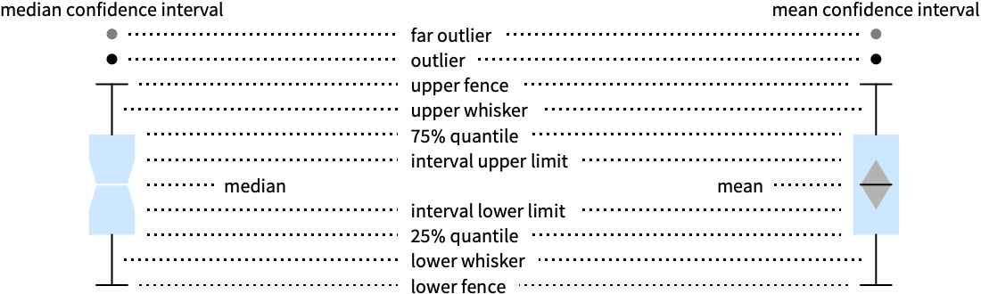
- BoxWhiskerChart draws a box-and-whisker summary of the distribution of values in each datai.
- The following box-and-whisker specifications bwspec can be given:
-
"Notched" median confidence interval notch "Outliers" outlier markers "Median" median marker "Basic" box-and-whisker only "Mean" mean marker "Diamond" mean confidence interval diamond {{elem1,val11,…},…} box-and-whisker element specification {"name",{elem1,val11,…},…} named bwspec with element modifications - The elements and values include:
-
{"Fences",width,style} width and style of fences {"MeanDiamond",width,style} width and style of mean confidence interval {"MeanMarker",width,style} width and style of mean marker line {"MedianNotch",width,style} width and style of median confidence interval {"MedianMarker",width,style} width and style of median marker line {"Outliers",marker,style} marker symbol and style for outliers {"FarOutliers",marker,style} marker symbol and style for far outliers {"Whiskers",style} style for whiskers - The width is given as a fraction of the width of the box, and the marker can be any expression.
- Data elements for BoxWhiskerChart can be given in the following forms:
-
datai a pure dataset Quantity[datai,unit] data datai with units wi[datai,…] data datai with wrapper wi formi->mi data with metadata mi - Each datai should be a list of real numbers {y1,y2,…}. Elements yj that are not real numbers are taken to be missing and are excluded. If datai is not a list of real numbers, it is taken to be missing data and will typically result in the gap in the box-and-whisker chart.
- Datasets for BoxWhiskerChart can be given in the following forms:
-
{data1,data2,…} list of elements with or without wrappers <k1data1,k2data2,…> association of keys and datasets TimeSeries[…],EventSeries[…],TemporalData[…] time series, event series, and temporal data WeightedData[…],EventData[…] augmented datasets w[{data1,data2,…},…] wrapper applied to a grouped dataset w[{{data1,data1,…},…},…] wrapper applied to all grouped datasets - BoxWhiskerChart[Tabular[…]cspec] extracts and plots values from the tabular object using the column specification cspec.
- The following forms of column specifications cspec are allowed for plotting tabular data:
-
colx plot a box-whisker chart for the values in column colx {colx1,colx2,…} plot box-whisker charts for columns colx1, colx2, … - The following wrappers can be used for the datai:
-
Annotation[e,label] provide an annotation Button[e,action] define an action to execute when the element is clicked Callout[e,label] display the element with a callout EventHandler[e,…] define a general event handler for the element Hyperlink[e,uri] make the element act as a hyperlink Labeled[e,…] display the element with labeling Legended[e,…] include features of the element in a chart legend Mouseover[e,over] make the element show a mouseover form PopupWindow[e,cont] attach a popup window to the element StatusArea[e,label] display in the status area when the element is moused over Style[e,opts] show the element using the specified styles Tooltip[e,label] attach an arbitrary tooltip to the element - In BoxWhiskerChart, Labeled and Placed allow the following positions:
-
Top,Bottom,Left,Right,Center positions within the box Above, Below, Before, After positions outside the box and other elements Axis on the bar origin axis "LowerFence","LowerQuartile","MedianMarker","MeanMarker","UpperQuartile","UpperFence" positions given by box-and-whisker elements {{bx,by},{lx,ly}} scaled position {lx,ly} in the label at scaled position {bx,by} for the box-and-whisker elements - BoxWhiskerChart has the same options as Graphics, with the following additions and changes: [List of all options]
-
AspectRatio 1/GoldenRatio overall ratio of height to width BarOrigin Bottom where to place smallest value for box-and-whisker BarSpacing Automatic fractional spacing between box-and-whiskers ChartBaseStyle Automatic overall style for box-and-whiskers ChartElementFunction Automatic how to generate raw graphics for box ChartLabels None labels for data elements and datasets ChartLegends None legends for data elements and datasets ChartStyle Automatic style for box Frame True whether to draw a frame around the chart Joined False whether to join medians LabelingFunction Automatic how to label box-and-whisker elements LabelingSize Automatic maximum size of callouts and labels LegendAppearance Automatic overall appearance of legends Method Automatic what methods to use PerformanceGoal $PerformanceGoal aspects of performance to try to optimize PlotInteractivity $PlotInteractivity whether to allow interactive elements PlotTheme $PlotTheme overall theme for the chart ScalingFunctions None how to scale individual coordinates TargetUnits Automatic units to display in the chart - The arguments supplied to ChartElementFunction are the box region {{xmin,xmax},{ymin,ymax}}, the data datai, and metadata {m1,m2,…} from each level in a nested list of datasets.
- A list of built-in settings for ChartElementFunction can be obtained from ChartElementData["BoxWhiskerChart"].
- With ScalingFunctions->s, the data coordinate is scaled using s.
- Style and other specifications from options and other constructs in BoxWhiskerChart are effectively applied in the order ChartStyle, Style and other wrappers, and ChartElementFunction, with later specifications overriding earlier ones.
List of all options
Examples
open all close allBasic Examples (5)
Generate a box-and-whisker chart for a data vector:
BoxWhiskerChart[RandomVariate[NormalDistribution[0, 1], 100]]Generate a box-and-whisker chart for a list of data vectors:
data = Table[RandomVariate[NormalDistribution[μ, 1], 100], {μ, {0, 3, 2, 5}}];BoxWhiskerChart[data]Chart several collections of datasets:
data = Table[RandomVariate[NormalDistribution[μ, 1], 100], {μ, {0, 3, 2, 5}}, {2}];BoxWhiskerChart[data]Customize the appearance of the box-and-whisker chart:
data = Table[RandomVariate[NormalDistribution[RandomInteger[5], 1], 100], {8}];BoxWhiskerChart[data, "Notched"]BoxWhiskerChart[data, "Outliers"]data = RandomVariate[NormalDistribution[RandomInteger[5], 1], {5, 50}];BoxWhiskerChart[data, "Outliers", PlotStyle -> {RGBColor[0.814481, 0.432822, 0.406287], RGBColor[1, 0.4, 0.4], RGBColor[0.954757, 0.215122, 0.0483253], RGBColor[0.268833, 0.246555, 0.506783], RGBColor[0.570138, 0.0971847, 0.0971847]}]Show notches for the median confidence interval:
BoxWhiskerChart[data, "Notched", PlotStyle -> {RGBColor[0.814481, 0.432822, 0.406287], RGBColor[1, 0.4, 0.4], RGBColor[0.954757, 0.215122, 0.0483253], RGBColor[0.268833, 0.246555, 0.506783], RGBColor[0.570138, 0.0971847, 0.0971847]}]Scope (40)
Data and Wrappers (17)
BoxWhiskerChart[RandomVariate[NormalDistribution[0, 1], 100]]BoxWhiskerChart[RandomReal[NormalDistribution[], {3, 100}]]Data vectors in a dataset are grouped together:
data = RandomVariate[NormalDistribution[0, 1], 100];BoxWhiskerChart[{{data, data + 1, data + 2}, {data, data + 1, data + 2}}]Datasets do not need to have the same number of data vectors:
data = RandomVariate[NormalDistribution[0, 1], 100];BoxWhiskerChart[{{data, data + 1}, {data, data + 1, data + 2, data + 3}}]Nonreal data is taken to be missing and typically yields a gap in the box-and-whisker chart:
data = RandomVariate[NormalDistribution[0, 1], 100];BoxWhiskerChart[{data, Missing[], data, foo, data}, BarSpacing -> 3]A nonreal entry in a data vector is omitted:
BoxWhiskerChart[{I, 1, 2, Missing[], 3, 4, foo, 5}, BarSpacing -> 3]BoxWhiskerChart[{Quantity[33, "Meters"], Quantity[35, "Meters"], Quantity[12, "Meters"], Quantity[8, "Meters"], Quantity[50, "Meters"], Quantity[15, "Meters"], Quantity[24, "Meters"], Quantity[44, "Meters"], Quantity[4, "Meters"], Quantity[37, "Meters"]}, FrameLabel -> Automatic]BoxWhiskerChart[{Quantity[33, "Meters"], Quantity[35, "Meters"], Quantity[12, "Meters"], Quantity[8, "Meters"], Quantity[50, "Meters"], Quantity[15, "Meters"], Quantity[24, "Meters"], Quantity[44, "Meters"], Quantity[4, "Meters"], Quantity[37, "Meters"]}, FrameLabel -> Automatic, TargetUnits -> "Feet"]The time stamps in TimeSeries, EventSeries, and TemporalData are ignored:
d = RandomVariate[NormalDistribution[], 100];BoxWhiskerChart[TimeSeries[d, {"May 24, 1982"}]]The values in associations are taken as the heights of the bars:
d1 = RandomVariate[NormalDistribution[0, 1], 100];
d2 = RandomVariate[NormalDistribution[2, 0.5], 100];BoxWhiskerChart[<|"a" -> d1, "b" -> d2, "c" -> d1 + d2|>]BoxWhiskerChart[<|"a" -> d1, "b" -> d2, "c" -> d1 + d2|>, PlotLabels -> Automatic]BoxWhiskerChart[<|"a" -> d1, "b" -> d2, "c" -> d1 + d2|>, PlotLegends -> Automatic, PlotStyle -> {Hue[0.6, 0.7, 0.8], Hue[0.22, 1, 0.7], Hue[0.75, 0.6, 0.7]}]a1 = RandomVariate[NormalDistribution[0, 2], 100];
a2 = RandomVariate[NormalDistribution[2, 1 / 2], 100];
b1 = RandomVariate[ChiDistribution[1], 100];
b2 = RandomVariate[ChiDistribution[3], 100];BoxWhiskerChart[<|"group a" -> <|"a" -> a1, "b" -> a2, "c" -> a1 + a2|>, "group b" -> <|"a" -> b1, "b" -> b2, "c" -> b1 + b2|>|>, PlotLegends -> Automatic, PlotLabels -> Automatic]Use WeightedData to add weights to data:
data = RandomReal[{-1, 1}, 100];wd = WeightedData[data, data ^ 2]BoxWhiskerChart[{data, wd}]Use EventData to add censoring and truncation information:
event = EventData[data, Round[data]]BoxWhiskerChart[{data, event}]Use wrappers on an individual data vector, datasets, or collections of datasets:
d = RandomVariate[NormalDistribution[0, 1], 100];{BoxWhiskerChart[{{d, Style[d + 1, RGBColor[0.93, 0.27, 0.27]], d + 2}, {d, d + 1, d + 2}}],
BoxWhiskerChart[{Style[{d, d + 1, d + 2}, RGBColor[0.14, 0.8, 0.14]], {d, d + 1, d + 2}}],
BoxWhiskerChart[Style[{{d, d + 1, d + 2}, {d, d + 1, d + 2}}, RGBColor[0.4, 0.6, 1]]]}Inner wrappers take precedence over outer wrappers:
d = RandomVariate[NormalDistribution[0, 1], 100];BoxWhiskerChart[Style[{Style[{d, Style[d + 1, RGBColor[0.93, 0.27, 0.27]], d + 2}, RGBColor[0.14, 0.8, 0.14]], {d, d + 1, d + 2}}, RGBColor[0.4, 0.6, 1]]]Override the default tooltips:
d = RandomVariate[NormalDistribution[0, 1], 100];BoxWhiskerChart[{d, Tooltip[d + 1, "μ = 1"], d + 2}]Use PopupWindow to provide additional drilldown information:
d = RandomVariate[NormalDistribution[0, 1], 100];BoxWhiskerChart[{d, PopupWindow[d + 1, DistributionChart[d + 1]], d + 2}]Use the other charting function in PopupWindow to provide more information:
BoxWhiskerChart[Table[PopupWindow[FinancialData[f, {{2010, 1}, {2010, 6}}], TradingChart[{f, {{2010, 1}, {2010, 6}}}, PlotLabel -> f]], {f, {"MSFT", "ORCL", "ADBE"}}]]Button can be used to trigger any action:
d = RandomVariate[NormalDistribution[0, 1], 100];BoxWhiskerChart[{d, Button[d + 1, Speak["Mean is 1."]], d + 2}]Tabular Data (1)
penguins = ResourceData["Sample Tabular Data: Palmer Penguins"]Generate a box-whisker chart for flipper lengths:
BoxWhiskerChart[penguins -> "flipper_length"]Create a table with flipper lengths divided into columns by species:.
pivot = PivotToColumns[penguins, "species" -> "flipper_length"]Compare flipper lengths by species:
BoxWhiskerChart[pivot -> {ExtendedKey["flipper_length", "Adelie"], ExtendedKey["flipper_length", "Chinstrap"], ExtendedKey["flipper_length", "Gentoo"]}, PlotLabels -> {"Adelie", "Chinstrap", "Gentoo"}]Use abbreviated names for extended keys when the elements are unique:
BoxWhiskerChart[pivot -> {"Adelie", "Chinstrap", "Gentoo"}, PlotLabels -> {"Adelie", "Chinstrap", "Gentoo"}]Elements (11)
data = Table[RandomReal[BetaDistribution[α, 1.5], 100], {α, 1, 5, 1}];Table[BoxWhiskerChart[data, i, PlotLabel -> Text[i]], {i, {"Basic", "Outliers", "Notched", "Median", "Mean", "Diamond"}}]data = Table[RandomReal[BetaDistribution[α, 1.5], 100], {α, 1, 5, 1}];Table[BoxWhiskerChart[data, {{"Whiskers", s}}], {s, {RGBColor[0.93, 0.27, 0.27], Dashed, Thick}}]data = Table[RandomReal[BetaDistribution[α, 1.5], 100], {α, 1, 5, 1}];Table[BoxWhiskerChart[data, {{"Fences", w}}], {w, {0, 0.5, 1}}]Table[BoxWhiskerChart[data, {{"Fences", 1, s}}], {s, {StandardRed, Dashed, Thick}}]Use different shapes for outliers:
data = Table[RandomReal[ParetoDistribution[3, α], 100], {α, 5, 9, 1}];Table[BoxWhiskerChart[data, {{"Outliers", o}}], {o, {"•", "◦", "⊗"}}]Table[BoxWhiskerChart[data, {{"Outliers", "", s}}], {s, {RGBColor[0.93, 0.27, 0.27], RGBColor[0.14, 0.8, 0.14], RGBColor[0.4, 0.6, 1]}}]Use different shapes for far outliers:
data = Table[RandomReal[ParetoDistribution[3, α], 100], {α, 5, 9, 1}];Table[BoxWhiskerChart[data, {{"Outliers", ""}, {"FarOutliers", o}}], {o, {"◦", "⊗", "×"}}]Table[BoxWhiskerChart[data, {{"Outliers", ""}, {"FarOutliers", "", s}}], {s, {RGBColor[0.93, 0.27, 0.27], RGBColor[0.14, 0.8, 0.14], RGBColor[0.4, 0.6, 1]}}]Vary the width of the median marker:
data = Table[RandomReal[BetaDistribution[α, 1.5], 100], {α, 1, 5, 1}];Table[BoxWhiskerChart[data, {{"MedianMarker", w}}], {w, {0.1, 0.5, 1}}]Table[BoxWhiskerChart[data, {{"MedianMarker", 0.8, s}}], {s, {RGBColor[0.93, 0.27, 0.27], Dotted, Thick}}]Use a different shape of median marker:
Table[BoxWhiskerChart[data, {{"MedianMarker", m, GrayLevel[0]}}], {m, {"◦", "⊗", "×"}}]Do not show the median marker:
BoxWhiskerChart[data, {{"MedianMarker", None}}]Vary the width of the median confidence interval:
data = Table[RandomReal[BetaDistribution[α, 1.5], 100], {α, 1, 5, 1}];Table[BoxWhiskerChart[data, {{"MedianNotch", w}}], {w, {0.1, 0.5, 1}}]Style the median confidence interval:
Table[BoxWhiskerChart[data, {{"MedianNotch", 0.5, s}}], {s, {None, Darker@RGBColor[1, 0.75, 0]}}]Vary the width of the mean marker:
data = Table[RandomReal[BetaDistribution[α, 1.5], 100], {α, 1, 5, 1}];Table[BoxWhiskerChart[data, {{"MedianMarker", None}, {"MeanMarker", w}}], {w, {0.1, 0.5, 1}}]Table[BoxWhiskerChart[data, {{"MedianMarker", None}, {"MeanMarker", 0.8, s}}], {s, {RGBColor[0.93, 0.27, 0.27], Dotted, Thick}}]Use a different shape of mean marker:
Table[BoxWhiskerChart[data, {{"MeanMarker", m, GrayLevel[0]}}], {m, {"◦", "⊗", "×"}}]Vary the width of the mean confidence interval:
data = Table[RandomReal[BetaDistribution[α, 1.5], 100], {α, 1, 5, 1}];Table[BoxWhiskerChart[data, {{"MeanDiamond", w}}], {w, {0.1, 0.5, 1}}]Style the mean confidence interval:
Table[BoxWhiskerChart[data, {{"MeanDiamond", 0.5, s}}], {s, {None, RGBColor[1, 0.75, 0]}}]Combine individual elements with named presets:
data = Table[RandomReal[BetaDistribution[α, 1.5], 100], {α, 1, 5, 1}];BoxWhiskerChart[data, {"Basic", {"Whiskers", Dashed}, {"MeanDiamond", 0.5, GrayLevel[0.62]}}]BoxWhiskerChart[data, {"Notched", {"MedianNotch", 0.5, GrayLevel[1]}, {"MedianMarker", RGBColor[0.4, 0.6, 1]}, {"Outliers", "◦", RGBColor[0.93, 0.27, 0.27]}}]BoxWhiskerChart[data, {"Outliers", {"MedianMarker", RGBColor[0.93, 0.27, 0.27]}, {"MedianNotch", 0.5, GrayLevel[0.62]}}]Combine elements with ChartElementFunction:
data = Table[RandomReal[BetaDistribution[α, 1.5], 100], {α, 1, 5, 1}];BoxWhiskerChart[data, {"Outliers", {"MedianMarker", RGBColor[0.4, 0.6, 1]}, {"MedianNotch", 0.5, Gray}}, PlotStyle -> {RGBColor[0.8352941176470589, 0.5764705882352941, 0.5607843137254902], RGBColor[0.9490196078431372, 0.29411764705882354, 0.050980392156862744], RGBColor[1., 0.7333333333333333, 0.2], RGBColor[0.996078431372549, 0.9490196078431372, 0.44313725490196076], RGBColor[0.7058823529411765, 0.6862745098039216, 0.30196078431372547]}, ChartElementFunction -> "GlassBoxWhisker"]Styling and Appearance (6)
Use an explicit list of styles for the box-and-whiskers:
data = Table[RandomVariate[NormalDistribution[μ, 1], 100], {μ, 0, 4, 1}];BoxWhiskerChart[data, PlotStyle -> {RGBColor[0.4, 0.6, 1], RGBColor[0.93, 0.27, 0.27], RGBColor[0.14, 0.8, 0.14], RGBColor[1, 0.75, 0], RGBColor[0.67, 0.54, 0.42]}]Style can be used to override styles:
d[μ_] := RandomVariate[NormalDistribution[μ, 1], 100];BoxWhiskerChart[{d[1], d[2], Style[d[3], RGBColor[0.93, 0.27, 0.27]], d[4], d[5]}, PlotStyle -> {RGBColor[0.797253, 0.904982, 0.410498], RGBColor[0.934691, 0.945708, 0.75346], RGBColor[0.769879, 0.92369, 0.977371], RGBColor[1, 0.566415, 0.0386511], RGBColor[1, 1, 0.4]}]Use built-in programmatically generated bars:
ChartElementData["BoxWhiskerChart"]data = Table[RandomVariate[NormalDistribution[μ, 1], 100], {μ, 0, 5, 1}];Table[BoxWhiskerChart[data, PlotStyle -> {RGBColor[0.8352941176470589, 0.5764705882352941, 0.5607843137254902], RGBColor[0.9490196078431372, 0.29411764705882354, 0.050980392156862744], RGBColor[1., 0.7333333333333333, 0.2], RGBColor[0.996078431372549, 0.9490196078431372, 0.44313725490196076], RGBColor[0.7058823529411765, 0.6862745098039216, 0.30196078431372547]}, ChartElementFunction -> cf], {cf, {"FadingBoxWhisker", "GlassBoxWhisker"}}]For detailed settings use Palettes ▶ ChartElementSchemes:
BoxWhiskerChart[data, ChartElementFunction -> ChartElementData["GradientScaleBoxWhisker", "ColorScheme" -> "RedGreenSplit"]]Use a theme with simple ticks and grid lines:
data = Table[RandomVariate[NormalDistribution[μ, σ], 100], {μ, {0, 4, 2, 6}}, {σ, {1, 1 / 2}}];BoxWhiskerChart[data, PlotTheme -> "Business"]Use a theme with detailed ticks and a reference line:
BoxWhiskerChart[data, PlotTheme -> "Scientific"]Change the origin of box-and-whiskers:
data = Table[RandomVariate[NormalDistribution[μ, 1], 100], {μ, {0, 1, 2}}];Table[BoxWhiskerChart[data, BarOrigin -> o, PlotLabel -> o], {o, {Bottom, Left, Top, Right}}]Adjust the spacing between individuals and groups of box-and-whiskers:
data = Table[RandomVariate[NormalDistribution[μ, 1], 100], {μ, {0, 1, 2}}];Table[BoxWhiskerChart[{data, data}, BarSpacing -> sp, PlotLabel -> sp, PlotStyle -> Opacity[0.7]], {sp, {Automatic, {0, 1}, {-0.3, 1}}}]Labeling and Legending (5)
Use Labeled to add a label to a box-and-whisker:
d[μ_] := RandomVariate[NormalDistribution[μ, 1], 100];BoxWhiskerChart[{d[1], Labeled[d[2], "label"], d[3]}]Use symbolic positions for label placement:
d[μ_] := RandomVariate[BetaDistribution[μ, 0.5], 100];Table[BoxWhiskerChart[{Labeled[d[1], "label", p], d[2], d[3]}, PlotLabel -> p, Frame -> False], {p, {Bottom, Center, Top}}]Table[BoxWhiskerChart[{Labeled[d[1], "label", p], d[2], d[3]}, PlotLabel -> p, Frame -> False], {p, {"LowerFence", "LowerQuartile", "UpperQuartile", "UpperFence"}}]Provide value labels for box-and-whisker by using LabelingFunction:
data = Table[RandomVariate[NormalDistribution[μ, 1], 100], {μ, {0, 2}}, {3}];BoxWhiskerChart[data, LabelingFunction -> (Placed[Mean[#], Tooltip]&)]Add categorical legend entries for the columns of data:
data = Table[RandomVariate[NormalDistribution[μ, 1], 100], {μ, {0, 2}}, {3}];Use Legended to add additional legend entries:
d[μ_] := RandomVariate[NormalDistribution[μ, 1], 100];BoxWhiskerChart[{d[1], Legended[d[2], "extra"], d[3]}, PlotLegends -> <|"Elements" -> {"ccc1", "ccc2", "ccc3"}|>, PlotStyle -> {RGBColor[0.761959, 0.470832, 0.940597], RGBColor[0.9584254999999999, 0.877884, 0.5906629999999999], RGBColor[0.431296, 0.709773, 0.927077]}]BoxWhiskerChart[Legended[{d[1], d[2], d[3]}, "extra"], PlotLegends -> {"ccc1", "ccc2", "ccc3"}, PlotStyle -> {RGBColor[0.761959, 0.470832, 0.940597], RGBColor[0.9584254999999999, 0.877884, 0.5906629999999999], RGBColor[0.431296, 0.709773, 0.927077]}]Options (83)
AspectRatio (3)
By default, AspectRatio uses a fixed ratio of the height to the width of the plot:
BoxWhiskerChart[IconizedObject[«data»]]Make the height the same as the width with AspectRatio1:
BoxWhiskerChart[IconizedObject[«data»], AspectRatio -> 1]AspectRatioFull adjusts the height and width to tightly fit inside other constructs:
plot = BoxWhiskerChart[IconizedObject[«data»], AspectRatio -> Full];{Framed[Pane[plot, {50, 100}]], Framed[Pane[plot, {100, 100}]], Framed[Pane[plot, {100, 50}]]}Axes (4)
By default, BoxWhiskerChart uses a frame instead of axes:
BoxWhiskerChart[IconizedObject[«data»]]BoxWhiskerChart[IconizedObject[«data»], Frame -> False, Axes -> True]Use AxesOrigin to specify where the axes intersect:
BoxWhiskerChart[IconizedObject[«data»], Frame -> False, Axes -> True, AxesOrigin -> {0, 0}]Turn each axis on individually:
{BoxWhiskerChart[IconizedObject[«data»], Frame -> False, Axes -> {False, True}], BoxWhiskerChart[IconizedObject[«data»], Frame -> False, Axes -> {True, False}]}AxesLabel (4)
No axes labels are drawn by default:
BoxWhiskerChart[IconizedObject[«data»], Frame -> False, Axes -> True]
BoxWhiskerChart[IconizedObject[«data»], Frame -> False, Axes -> True, AxesLabel -> "Data"]BoxWhiskerChart[IconizedObject[«data»], Frame -> False, Axes -> True, AxesLabel -> {"Label 1", "Label 2"}]BoxWhiskerChart[QuantityArray[IconizedObject[«data»], "Meters"], Frame -> False, Axes -> True, AxesLabel -> Automatic]AxesOrigin (2)
The position of the axes is determined automatically:
BoxWhiskerChart[IconizedObject[«data»], Frame -> False, Axes -> True]Specify an explicit origin for the axes:
BoxWhiskerChart[IconizedObject[«data»], Frame -> False, Axes -> True, AxesOrigin -> {Automatic, 0}]AxesStyle (4)
Change the style for the axes:
BoxWhiskerChart[IconizedObject[«data»], Frame -> False, Axes -> True, AxesStyle -> RGBColor[0.93, 0.27, 0.27]]Specify the style of each axis:
BoxWhiskerChart[IconizedObject[«data»], Frame -> False, Axes -> True, AxesStyle -> {Directive[Thick, RGBColor[0.93, 0.27, 0.27]], Directive[Thick, RGBColor[0.4, 0.6, 1]]}]Use different styles for the ticks and the axes:
BoxWhiskerChart[IconizedObject[«data»], Frame -> False, Axes -> True, AxesStyle -> RGBColor[0.14, 0.8, 0.14], TicksStyle -> RGBColor[0.4, 0.6, 1]]Use different styles for the labels and the axes:
BoxWhiskerChart[IconizedObject[«data»], Frame -> False, Axes -> True, AxesStyle -> RGBColor[0.14, 0.8, 0.14], LabelStyle -> RGBColor[0.4, 0.6, 1]]BarOrigin (1)
BarSpacing (4)
BoxWhiskerChart automatically selects the spacing between bars:
Table[BoxWhiskerChart[RandomVariate[NormalDistribution[], {n, 100}]], {n, {1, 2, 4, 8}}]Table[BoxWhiskerChart[RandomVariate[NormalDistribution[], {n, 2, 100}]], {n, {2, 4}}]Table[BoxWhiskerChart[RandomVariate[NormalDistribution[], {10, 100}], BarSpacing -> s, PlotLabel -> s], {s, {Tiny, Small, Medium, Large}}]Table[BoxWhiskerChart[RandomVariate[NormalDistribution[], {3, 2, 100}], BarSpacing -> s, PlotLabel -> s], {s, {Tiny, Small, Medium, Large}}]Use explicit spacing between bars:
Table[BoxWhiskerChart[RandomVariate[NormalDistribution[], {10, 100}], BarSpacing -> s, PlotLabel -> s], {s, {0.25, 0.5, 1, 2}}]Table[BoxWhiskerChart[RandomVariate[NormalDistribution[], {4, 2, 100}], BarSpacing -> s, PlotLabel -> s], {s, {{0.25, 0.5}, {0, 1}}}]BoxWhiskerChart[RandomVariate[NormalDistribution[], {10, 100}], BarSpacing -> None]BoxWhiskerChart[RandomVariate[NormalDistribution[], {3, 2, 100}], BarSpacing -> {None, 1}]ChartElementFunction (3)
Get a list of built-in settings for ChartElementFunction:
ChartElementData["BoxWhiskerChart"]For detailed settings, use Palettes ▶ ChartElementSchemes:
Table[BoxWhiskerChart[RandomVariate[NormalDistribution[], {5, 100}], ChartElementFunction -> f], {f, {"GradientScaleBoxWhisker", "GlassBoxWhisker", "FadingBoxWhisker", "PlateauBoxWhisker"}}]Use named specifications with ChartElementFunction:
Table[BoxWhiskerChart[RandomVariate[NormalDistribution[], {5, 100}], "Notched", ChartElementFunction -> f], {f, {"GradientScaleBoxWhisker", "GlassBoxWhisker", "FadingBoxWhisker", "PlateauBoxWhisker"}}]Frame (4)
BoxWhiskerChart uses a frame by default:
BoxWhiskerChart[IconizedObject[«data»]]Use FrameFalse to turn off the frame:
BoxWhiskerChart[IconizedObject[«data»], Frame -> False]Draw a frame on the left and right edges:
BoxWhiskerChart[IconizedObject[«data»], Frame -> {{True, True}, {False, False}}]Draw a frame on the left and bottom edges:
BoxWhiskerChart[IconizedObject[«data»], Frame -> {{True, False}, {True, False}}]FrameLabel (3)
Place a label along the bottom frame of a chart:
BoxWhiskerChart[IconizedObject[«data»], FrameLabel -> {"label"}]Frame labels are placed on the bottom and left frame edges by default:
BoxWhiskerChart[IconizedObject[«data»], FrameLabel -> {"Bottom", "Left"}]Place labels on each of the edges in the frame:
BoxWhiskerChart[IconizedObject[«data»], FrameLabel -> {{"left", "right"}, {"bottom", "top"}}]FrameStyle (2)
Specify a style for the frame:
BoxWhiskerChart[IconizedObject[«data»], FrameStyle -> Directive[RGBColor[0.4, 0.6, 1], Thick]]Specify style for each frame edge:
BoxWhiskerChart[IconizedObject[«data»], FrameStyle -> {{Directive[RGBColor[0.14, 0.8, 0.14], Thick], Directive[RGBColor[0.93, 0.27, 0.27]]}, {Directive[GrayLevel[0.62], Thick], Directive[RGBColor[0.4, 0.6, 1]]}}]FrameTicks (6)
Frame ticks are placed automatically by default:
BoxWhiskerChart[IconizedObject[«data»]]Use All to include tick labels on both left and right edges:
BoxWhiskerChart[IconizedObject[«data»], FrameTicks -> All]Place tick marks at the specified positions:
BoxWhiskerChart[IconizedObject[«data»], FrameTicks -> {{{-3, 0, 3}, Automatic}, {Automatic, Automatic}}]Draw frame tick marks at the specified positions with specific labels:
BoxWhiskerChart[IconizedObject[«data»], FrameTicks -> {{{{-3, -a}, {0, b}, {3, a}}, Automatic}, {Automatic, Automatic}}]Specify the lengths for tick marks as a fraction of the graphics size:
BoxWhiskerChart[IconizedObject[«data»], FrameTicks -> {{{{-3, -a, .1}, {0, b, .1}, {3, a, .1}}, Automatic}, {Automatic, Automatic}}]Use different sizes in the positive and negative directions for each tick mark:
BoxWhiskerChart[IconizedObject[«data»], FrameTicks -> {{{{-3, -a, {.1, .2}}, {0, b, {.1, .1}}, {3, a, {.1, .05}}}, Automatic}, {Automatic, Automatic}}]Specify a style for each frame tick:
BoxWhiskerChart[IconizedObject[«data»], FrameTicks -> {{{{-3, -a, {.1, .2}, Directive[Thick, RGBColor[0.4, 0.6, 1], Dashed]}, {0, b, {.1, .1}, Directive[Thick, RGBColor[0.14, 0.8, 0.14]]}, {3, a, {.1, .05}, Directive[Thick, RGBColor[0.93, 0.27, 0.27]]}}, Automatic}, {Automatic, Automatic}}]FrameTicksStyle (3)
By default, frame ticks and frame tick labels use the same styles as the frame:
BoxWhiskerChart[IconizedObject[«data»], FrameStyle -> Directive[RGBColor[0.93, 0.27, 0.27]]]Specify an overall style for the ticks, including the labels:
BoxWhiskerChart[IconizedObject[«data»], FrameTicksStyle -> Directive[RGBColor[0.4, 0.6, 1], Thick]]Use a different style for each frame edge:
BoxWhiskerChart[IconizedObject[«data»], FrameTicks -> All, FrameTicksStyle -> {{Directive[RGBColor[0.93, 0.27, 0.27], Thick], Directive[RGBColor[0.4, 0.6, 1], Thick]}, {Directive[RGBColor[0.98, 0.56, 0.17], Thick], Directive[Darker@RGBColor[0.14, 0.8, 0.14], Thick]}}]ImageSize (7)
Use named sizes such as Tiny, Small, Medium and Large:
{BoxWhiskerChart[IconizedObject[«data»], ImageSize -> Tiny], BoxWhiskerChart[IconizedObject[«data»], ImageSize -> Small]}Specify the width of the plot:
{BoxWhiskerChart[IconizedObject[«data»], ImageSize -> 150], BoxWhiskerChart[IconizedObject[«data»], AspectRatio -> 1.5, ImageSize -> 150]}Specify the height of the plot:
{BoxWhiskerChart[IconizedObject[«data»], ImageSize -> {Automatic, 150}], BoxWhiskerChart[IconizedObject[«data»], AspectRatio -> 2, ImageSize -> {Automatic, 150}]}Allow the width and height to be up to a certain size:
{BoxWhiskerChart[IconizedObject[«data»], ImageSize -> UpTo[200]], BoxWhiskerChart[IconizedObject[«data»], AspectRatio -> 2, ImageSize -> UpTo[200]]}Specify the width and height for a graphic, padding with space if necessary:
BoxWhiskerChart[IconizedObject[«data»], ImageSize -> {200, 200}, Background -> GrayLevel[0.62]]Setting AspectRatioFull will fill the available space:
BoxWhiskerChart[IconizedObject[«data»], AspectRatio -> Full, ImageSize -> {200, 200}, Background -> GrayLevel[0.62]]Use maximum sizes for the width and height:
{BoxWhiskerChart[IconizedObject[«data»], ImageSize -> {UpTo[150], UpTo[100]}], BoxWhiskerChart[IconizedObject[«data»], AspectRatio -> 2, ImageSize -> {UpTo[150], UpTo[100]}]}Use ImageSizeFull to fill the available space in an object:
Framed[Pane[BoxWhiskerChart[IconizedObject[«data»], ImageSize -> Full, Background -> GrayLevel[0.62]], {200, 100}]]Specify the image size as a fraction of the available space:
Framed[Pane[BoxWhiskerChart[IconizedObject[«data»], AspectRatio -> Full, ImageSize -> {Scaled[0.5], Scaled[0.5]}, Background -> GrayLevel[0.62]], {200, 100}]]Joined (1)
LabelingFunction (2)
By default, bars have tooltips with a summary table of the data:
BoxWhiskerChart[RandomVariate[NormalDistribution[], {5, 100}]]Define a labeling function and place it in a tooltip:
label[data_, index_, label_] := Grid[{{"Case:", index[[2]]}, {"Year:", label[[2, 1]]}, {"μ:", Mean[data]}}, Alignment -> {{Right, Left}}]BoxWhiskerChart[RandomVariate[NormalDistribution[], {5, 100}], LabelingFunction -> (Placed[label[##], Tooltip]&), PlotLabels -> Placed[Range[2005, 2009], None]]LabelingSize (4)
Textual labels are shown at their actual sizes:
BoxWhiskerChart[RandomVariate[NormalDistribution[], {5, 100}], PlotLabels -> {"healthfulness", "obstreperous", "spectrogram", "vestige", "coinage", "limey"}]Image labels are automatically resized:
BoxWhiskerChart[RandomVariate[NormalDistribution[], {5, 100}], PlotLabels -> Placed[{[image], [image], [image], [image], [image], [image], [image]}, Axis]]Specify a maximum size for textual labels:
BoxWhiskerChart[RandomVariate[NormalDistribution[], {5, 100}], PlotLabels -> {"healthfulness", "obstreperous", "spectrogram", "vestige", "coinage", "limey"}, LabelingSize -> 50]Specify a maximum size for image labels:
BoxWhiskerChart[RandomVariate[NormalDistribution[], {5, 100}], PlotLabels -> {[image], [image], [image], [image], [image], [image], [image]}, LabelingSize -> 30]Show image labels at their natural sizes:
BoxWhiskerChart[RandomVariate[NormalDistribution[], {5, 100}], PlotLabels -> {[image], [image], [image], [image], [image], [image], [image]}, LabelingSize -> Full, ImageSize -> Medium]Method (3)
Use bar widths proportional to the square root of the data sizes:
data = Table[RandomReal[NormalDistribution[], i], {i, {100, 400, 900, 1600}}];BoxWhiskerChart[data, Method -> {"BoxWidth" -> "Scaled"}, PlotLabels -> Length /@ data]Use bar widths proportional to the data sizes:
BoxWhiskerChart[data, Method -> {"BoxWidth" -> "Count"}, PlotLabels -> Length /@ data]Put bars on fixed positions with varying bar spacing:
BoxWhiskerChart[data, Method -> {"BoxWidth" -> "Scaled", "EqualSpacing" -> False}, PlotLabels -> Length /@ data]BoxWhiskerChart[data, Method -> {"BoxWidth" -> "Fixed"}, PlotLabels -> Length /@ data]BoxWhiskerChart uses Quartiles to calculate quartiles and extremes:
data = {1, 2, 4, 7, 9, 11};Quartiles[data]BoxWhiskerChart[data]Use Quantile instead:
Quantile[data, {0, 0.25, 0.5, 0.75, 1}]BoxWhiskerChart[data, Method -> {"BoxRange" -> "Quantile"}]Use Quantile with parameters for mode-based estimates:
Quantile[data, {0, 1 / 4, 1 / 2, 3 / 4, 1}, {{1, -1}, {0, 1}}]{BoxWhiskerChart[data, Method -> {"BoxRange" -> {{1, -1}, {0, 1}}}], BoxWhiskerChart[data, Method -> {"BoxRange" -> (Quantile[#, {0, 1 / 4, 1 / 2, 3 / 4, 1}, {{1, -1}, {0, 1}}]&)}]}Create a box-whisker plot using precomputed statistics:
data = RandomVariate[NormalDistribution[], {3, 100}];summaries = Quantile[#, Range[0, 1, 1 / 4]]& /@ data{BoxWhiskerChart[data], BoxWhiskerChart[summaries, Method -> {"BoxRange" -> Identity}]}PerformanceGoal (3)
Generate a box-and-whisker chart with interactive highlighting:
BoxWhiskerChart[RandomVariate[NormalDistribution[], {5, 100}], PerformanceGoal -> "Quality"]Emphasize performance by disabling interactive behaviors:
BoxWhiskerChart[RandomVariate[NormalDistribution[], {5, 100}], PerformanceGoal -> "Speed"]Typically less memory is required for non-interactive charts:
data = RandomVariate[NormalDistribution[], {5, 100}];Table[ByteCount@BoxWhiskerChart[data, PerformanceGoal -> p], {p, {"Quality", "Speed"}}]PlotInteractivity (4)
Charts with a moderate number of bars automatically have tooltips and mouseover effects:
BoxWhiskerChart[{IconizedObject[«Subscript[data, 1]»], IconizedObject[«Subscript[data, 2]»], IconizedObject[«Subscript[data, 3]»], IconizedObject[«Subscript[data, 4]»]}]Turn off all the interactive elements:
BoxWhiskerChart[{IconizedObject[«Subscript[data, 1]»], IconizedObject[«Subscript[data, 2]»], IconizedObject[«Subscript[data, 3]»], IconizedObject[«Subscript[data, 4]»]}, PlotInteractivity -> False]Interactive elements provided as part of the input are disabled:
BoxWhiskerChart[{IconizedObject[«Subscript[data, 1]»], IconizedObject[«Subscript[data, 2]»], IconizedObject[«Subscript[data, 3]»], Tooltip[IconizedObject[«Subscript[data, 4]»], "hello"]}, PlotInteractivity -> False]Allow provided interactive elements and disable automatic ones:
BoxWhiskerChart[{IconizedObject[«Subscript[data, 1]»], IconizedObject[«Subscript[data, 2]»], IconizedObject[«Subscript[data, 3]»], Tooltip[IconizedObject[«Subscript[data, 4]»], "hello"]}, PlotInteractivity -> <|"User" -> True, "System" -> False|>]Use Placed to control label placement:
Table[BoxWhiskerChart[RandomVariate[NormalDistribution[], {5, 100}], PlotLabels -> Placed[{"a", "b", "c", "d", "e"}, p], PlotLabel -> p], {p, {Bottom, Top, Left, Right}}]PlotTheme (2)
Use a theme with a high contrast color scheme and glassy rectangle boxes:
data = Array[RandomVariate[NormalDistribution[RandomReal[{-2.5, 2.5}], RandomReal[{0.5, 1}]], 200]&, {3, 3}];BoxWhiskerChart[data, PlotTheme -> "Marketing"]data = Array[RandomVariate[NormalDistribution[RandomReal[{0, 8}], RandomReal[{1, 4}]], 200]&, {3, 3}];BoxWhiskerChart[data, PlotTheme -> "Marketing", PlotStyle -> <|"Elements" -> {RGBColor[0.761959, 0.470832, 0.940597], RGBColor[0.9584254999999999, 0.877884, 0.5906629999999999], RGBColor[0.431296, 0.709773, 0.927077]}|>]ScalingFunctions (3)
Linear scale is used by default:
BoxWhiskerChart[RandomReal[NormalDistribution[], {3, 100}]]Use log scale in the  coordinate:
BoxWhiskerChart[RandomReal[NormalDistribution[], {3, 100}], ScalingFunctions -> "Log"]When logarithm scale is used, non-positive data is dropped automatically:
data = Range[100] - 25BoxWhiskerChart[data, ScalingFunctions -> "Log"]Ticks (6)
Ticks are placed automatically for each axis:
BoxWhiskerChart[IconizedObject[«data»], Frame -> False, Axes -> True]Use TicksNone to draw axes without any tick marks:
BoxWhiskerChart[IconizedObject[«data»], Frame -> False, Axes -> True, Ticks -> None]Place tick marks at the specified positions:
BoxWhiskerChart[IconizedObject[«data»], Frame -> False, Axes -> True, Ticks -> {{1, 3}, {-2, 0, 2}}]Draw tick marks at the specified positions with specific labels:
BoxWhiskerChart[IconizedObject[«data»], Frame -> False, Axes -> True, Ticks -> {{{1, w1}, {2, w2}, {3, w3}}, {{-2, -a}, {0, 0}, {2, a}}}]Specify the lengths for ticks as a fraction of graphics size:
BoxWhiskerChart[IconizedObject[«data»], Frame -> False, Axes -> True, Ticks -> {{{1, w1, .02}, {2, w2, .02}, {3, w3, .02}}, {{-2, -a, .05}, {0, 0, Automatic}, {2, a, .05}}}]Use different sizes in the positive and negative directions for each tick:
BoxWhiskerChart[IconizedObject[«data»], Frame -> False, Axes -> True, Ticks -> {Automatic, {{-2, -a, {.05, .1}}, {0, 0, {Automatic, .1}}, {2, a, {.05, .1}}}}]Specify a style for each tick:
BoxWhiskerChart[IconizedObject[«data»], Frame -> False, Axes -> True, Ticks -> {Automatic, {{-2, -a, {.05, .1}, Directive[Thick, RGBColor[0.93, 0.27, 0.27]]}, {0, 0, {Automatic, .1}, Directive[RGBColor[0.14, 0.8, 0.14], Thick]}, {2, a, {.05, .1}, Directive[Thick, RGBColor[0.4, 0.6, 1]]}}}]TicksStyle (4)
By default, the ticks and tick labels use the same styles as the axis:
BoxWhiskerChart[IconizedObject[«data»], Frame -> False, Axes -> True]Specify an overall style for the ticks including tick labels:
BoxWhiskerChart[IconizedObject[«data»], Frame -> False, Axes -> True, TicksStyle -> RGBColor[0.93, 0.27, 0.27]]Specify ticks style for each of the axes:
BoxWhiskerChart[IconizedObject[«data»], Frame -> False, Axes -> True, TicksStyle -> {Directive[RGBColor[0.93, 0.27, 0.27], Thick], Directive[RGBColor[0.4, 0.6, 1], Thick]}]Use a different style for the tick labels and tick marks:
BoxWhiskerChart[IconizedObject[«data»], Frame -> False, Axes -> True, TicksStyle -> Directive[RGBColor[0.93, 0.27, 0.27], Thick], LabelStyle -> RGBColor[0.4, 0.6, 1]]Applications (3)
Compare the distribution of salaries for several departments at a university:
salaries = ExampleData[{"Statistics", "UniversitySalaries"}, "DataElements"];
depts = {"Mathematics", "History", "English", "Chemistry", "Law", "Physics", "Statistics"};
data = Table[Cases[salaries, {d, _, salary_, "A"} :> salary], {d, depts}];
all = Cases[salaries, {_, _, salary_, "A"} :> salary];BoxWhiskerChart[data, {"Outliers", {"MedianMarker", 1, Directive[Thick, White]}}, PlotLabels -> Placed[{depts, Length /@ data}, {Axis, Before}], PlotStyle -> {RGBColor[0.6980392156862745, 0.01568627450980392, 0.], RGBColor[0.9215686274509803, 0.49411764705882355, 0.43137254901960786], RGBColor[0.9372549019607843, 0.6274509803921569, 0.16862745098039217], RGBColor[0.9921568627450981, 0.8156862745098039, 0.49019607843137253], RGBColor[0.7254901960784313, 0.8, 0.07058823529411765], RGBColor[0.3176470588235294, 0.49019607843137253, 0.0784313725490196], RGBColor[0.17254901960784313, 0.3607843137254902, 0.07058823529411765]}, GridLines -> {{{Median[all], GrayLevel[0.62]}}, None}, BarOrigin -> Left]A  -test for equal location of two populations effectively checks for overlap in confidence intervals about their means. BoxWhiskerChart can be used to perform a visual
  -test:
BlockRandom[SeedRandom[1];data1 = RandomVariate[NormalDistribution[1, 1], 100];
	data2 = RandomVariate[NormalDistribution[0, 1], 100];
	data3 = RandomVariate[NormalDistribution[0, 1], 100];
	];
The mean diamonds do not overlap. The null hypothesis is rejected at the 5% level:
BoxWhiskerChart[{data1, data2}, {"Diamond", {"MeanDiamond", 1, GrayLevel[0]}}, BarOrigin -> Right]ZTest[{data1, data2}, 1, 0, "ShortTestConclusion", SignificanceLevel -> 0.05]The mean diamonds overlap. There is not enough evidence to reject the null hypothesis:
BoxWhiskerChart[{data2, data3}, {"Diamond", {"MeanDiamond", 1, GrayLevel[0]}}, BarOrigin -> Right]ZTest[{data2, data3}, 1, 0, "ShortTestConclusion", SignificanceLevel -> 0.05]Compare different time slices of a random process:
data = Table[RandomVariate[WienerProcess[2, 3][t], 10 ^ 3], {t, {1, 4, 7, 10, 13}}];BoxWhiskerChart[data, PlotLabels -> {1, 4, 7, 10, 13}]Properties & Relations (6)
Outliers and far outliers are defined using the quartiles and interquartile range:
data = {1, 2, 3, 4, 5, 6, 7, 8, 9, 10, 20, 30};{q1, median, q3} = N[Quartiles[data]]iqr = q3 - q1BoxWhiskerChart[data, {"Outliers", {"Outliers", "●"}, {"FarOutliers", "○"}}, AspectRatio -> 1 / 10, ImageSize -> 500, BarOrigin -> Left, GridLines -> {{{q3 + 1.5iqr, Dashed}, {q3 + 3iqr, Dashed}}, None},
FrameTicks -> {{None, None}, {data, {{q1, "q1"}, {q3, "q3"}, {q3 + 1.5iqr, "near"}, {q3 + 3iqr, "far"}}}}]Use DistributionChart to show distribution of data:
data = Table[RandomVariate[NormalDistribution[μ, 1], 100], {μ, 0, 4, 1}];DistributionChart[data, PlotStyle -> {RGBColor[0.40784313725490196, 0.15294117647058825, 0.13725490196078433], RGBColor[0.6588235294117647, 0.5607843137254902, 0.5333333333333333], RGBColor[0.8313725490196079, 0.43529411764705883, 0.12941176470588237], RGBColor[0.8941176470588236, 0.8274509803921568, 0.7647058823529411], RGBColor[0.9372549019607843, 0.7764705882352941, 0.3137254901960784]}]BoxWhiskerChart is a case of DistributionChart:
data = Table[RandomVariate[NormalDistribution[μ, 1], 100], {μ, 0, 4, 1}];DistributionChart[data, PlotStyle -> {RGBColor[0.8352941176470589, 0.5764705882352941, 0.5607843137254902], RGBColor[0.9490196078431372, 0.29411764705882354, 0.050980392156862744], RGBColor[1., 0.7333333333333333, 0.2], RGBColor[0.996078431372549, 0.9490196078431372, 0.44313725490196076], RGBColor[0.7058823529411765, 0.6862745098039216, 0.30196078431372547]}, ChartElementFunction -> "BoxWhisker"]Use Histogram and SmoothHistogram to visualize a list of data vectors:
data = Table[RandomVariate[NormalDistribution[μ, 1], 200], {μ, 0, 8, 4}];{Histogram[data, Automatic, "PDF"], SmoothHistogram[data]}Use QuantilePlot and ProbabilityPlot to compare data to distributions:
data = RandomVariate[NormalDistribution[0, 1], 200];{QuantilePlot[data], ProbabilityPlot[data]}Use Histogram3D and SmoothHistogram3D to visualize two-dimensional data vectors:
data = RandomVariate[NormalDistribution[2, 1], {200, 2}];{Histogram3D[data], SmoothHistogram3D[data]}
 An Elementary Introduction to the Wolfram Language
Text
Wolfram Research (2010), BoxWhiskerChart, Wolfram Language function, https://reference.wolfram.com/language/ref/BoxWhiskerChart.html (updated 2025).
CMS
Wolfram Language. 2010. "BoxWhiskerChart." Wolfram Language & System Documentation Center. Wolfram Research. Last Modified 2025. https://reference.wolfram.com/language/ref/BoxWhiskerChart.html.
APA
Wolfram Language. (2010). BoxWhiskerChart. Wolfram Language & System Documentation Center. Retrieved from https://reference.wolfram.com/language/ref/BoxWhiskerChart.html