

BarChart
詳細とオプション
- BarChartは棒グラフとしても知られている.
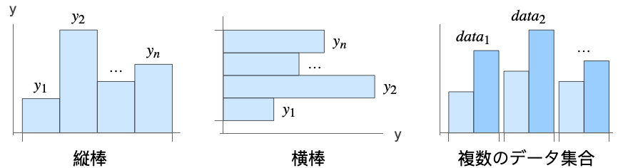
- 棒グラフはデータ集合の値を等幅で長さが値に相当する矩形の棒で示す.デフォルトで,棒は垂直に並べられるが水平の棒を使うこともできる. 棒グラフはデータが比較的小さい場合に使われることが多い.
- BarChartのデータ要素は次の形式で与えることができる.
-
yi 純粋な棒の値 Quantity[yi,unit] 単位の付いた棒の値 wi[yi,…] 値 yi,ラッパー wiの棒 formi->mi メタデータ miを持った棒の形式 Around[xi,ei] 不確かさが eiの値 xi - 上記以外の形式で与えられたデータは欠測値とみなされ,一般に棒グラフの欠落部として表示される.
- BarChartのためのデータ集合は次の形式で与えることができる.
-
{e1,e2,…} ラッパーがある/ない要素のリスト <k1e1,k2e2,…> キーと長さの連想 TimeSeries[…],EventSeries[…],TemporalData[…] 時系列,事象系列,一時データ WeightedData[…],EventData[…] 拡張データ集合 w[{e1,e2,…},…] データ集合全体に適用されたラッパー w[{data1,data1,…},…] すべてのデータ集合に適用されたラッパー - BarChart[objcspec]は,列指定 cspec を用いて,Tabular,TimeSeries,またはEventSeriesオブジェクト obj から値を抽出して棒グラフとして描画する.
- 次は,表形式データのプロットに使用できる列指定 cspec の形式である.
-
col 列 col からのプロット値 {col1,col2,…,coln} 列{col1, …, coln}を値の集合としてプロットする - グラフの要素に次のラッパーを使用することができる.
-
Annotation[e,label] 注釈を与える Button[e,action] 要素がクリックされたときに実行するアクションを定義する Callout[e,label] コールアウトを付けて要素を表示する EventHandler[e,…] 要素の一般的なイベントハンドラを定義する Hyperlink[e,uri] 要素がハイパーリンクとして機能するようにする Labeled[e,…] 要素にラベルを付けて表示する Legended[e,…] グラフの凡例に要素の特徴を含む Mouseover[e,over] 要素がマウスオーバーの形式を示すようにする PopupWindow[e,cont] 要素にポップアップウィンドウを加える StatusArea[e,label] 要素の上にマウスが来たときにステータスエリアに表示する Style[e,opts] 要素を指定したスタイルで示す Tooltip[e,label] 要素に任意のツールチップを加える - BarChartでは,Labeled,Callout,Placedで次の位置が使える.
-
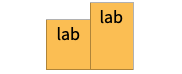
Top 棒の中の天辺位置 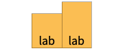
Bottom 房の中の底辺位置 
Above 棒の外の天辺位置 
Below 棒の外の底辺位置 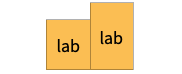
Center 棒の中の中央位置 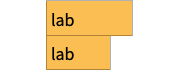
Left 棒の中の左側位置 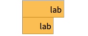
Right 棒の中の右側位置 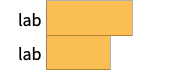
Before 棒の外で棒の左側位置 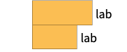
After 棒の外で棒の右側位置 
Axis 棒の原点軸の上 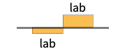
"Outside" 棒の外の周囲の位置 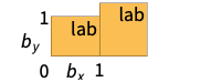
{{bx,by},{lx,ly}} 棒の中のスケールされた位置{bx,by}にあるラベルの中のスケールされた位置{lx,ly} - BarChartにはGraphicsと同じオプションに次の追加・変更を加えたものが使える. [全オプションのリスト]
-
AspectRatio 1/GoldenRatio 縦横比 Axes True 軸を描くかどうか BarOrigin Bottom 棒の始点 BarSpacing Automatic 棒と棒の間隔 ChartElementFunction Automatic 棒の生のグラフィックスをどのように生成するか ChartElements Automatic 各棒に使うグラフィックス ColorFunction Automatic 棒の彩色方法 ColorFunctionScaling True ColorFunctionの引数を正規化するかどうか IntervalMarkers Automatic 不確かさをどのように描画するか IntervalMarkersStyle Automatic 不確かな要素のスタイル Joined False 棒を繋ぐかどうか LabelingFunction Automatic 棒にどのようにラベルを付けるか LabelingSize Automatic コールアウトとラベルの最大サイズ LegendAppearance Automatic 凡例の全体的な外観 PerformanceGoal $PerformanceGoal パフォーマンスのどの面について最適化するか PlotInteractivity $PlotInteractivity インタラクティブな要素を許可するかどうか PlotLabels None 棒のカテゴリラベル PlotLayout Automatic 使用する全体的なレイアウト PlotLegends None データ要素とデータ集合の凡例 PlotStyle Automatic 棒のスタイル PlotTheme $PlotTheme グラフの全体的なテーマ ScalingFunctions None 個々の座標をどのようにスケールするか TargetUnits Automatic グラフ中に表示する単位 - 単一の表示パネルで複数のデータ集合を表示するPlotLayoutの可能な設定には以下がある.
-
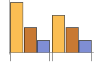
"Grouped" 各データ集合のデータを分離する 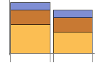
"Stacked" 各データ集合のデータを積み重ねる 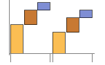
"Stepped" 各データ集合のデータを積み重ねて分離する 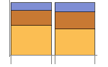
"Percentile" 各データ集合のデータを積み重ねて正規化する 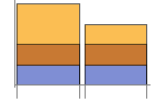
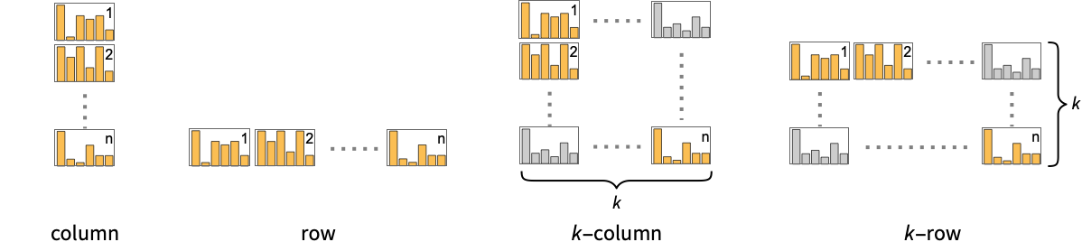
"Overlapped" 各データ集合のデータを重ねる - 次は,個々のデータ集合を別々のパネルで表示するPlotLayoutの可能な設定である.
-
"Column" パネルの列で別々のグラフを使う "Row" パネルの行で別々のグラフを使う {"Column",k},{"Row",k} k 列(または行)を使う {"Column",UpTo[k]},{"Row",UpTo[k]} 最高で k 列(または行)を使う - PlotLegendsの典型的な設定には,次が含まれる.
-
None 凡例なし Automatic 凡例を自動的に決定する {lbl1,lbl2,…} lbl1,lbl2,…を凡例ラベルとして用いる Placed[lspec,…] 凡例の配置を指定する - PlotStylesty は,各曲線に使用するスタイルを指定する.可能な設定には次が含まれる.
-
{sty1,sty2,…} データに対するスタイルの列 <"key"val,…> データの異なるレベルに対するスタイル要素 - 受け入れられるキーは次の通りである.
-
"Base" すべての棒に対する全体的なスタイル "Elements" 各グループの要素 yiに対するスタイルのリスト "Groups" 値 dataiの各グループに対するスタイルのリスト - ColorData["DefaultChartColors"]は,PlotStyleによって使用されるデフォルトの色の並びを与える.
- ChartElementFunctionに渡される引数は,棒の範囲{{xmin,xmax},{ymin,ymax}},データ値 yi,データ集合のネストしたリストにおける各レベルからのメタデータ{m1,m2,…}である.
- ChartElementFunctionの組込み設定のリストはChartElementData["BarChart"]から得られる.
- ColorFunctionに渡される引数は yiである.
- BarChartのオプションおよびその他の構造からのスタイルその他の指定は事実上PlotStyle,ColorFunction,Styleその他のラッパー,ChartElementsとChartElementFunctionの順に適用される.後ろになるほど優先順位は高くなる.
全オプションのリスト
例題
すべて開く すべて閉じる例 (4)
BarChart[{1, 2, 3}]BarChart[{{1, 2, 3}, {1, 3, 2}}]BarChart[{{1, 2, 3}, {1, 3, 2}, {5, 2}}, PlotLabels -> {"a", "b", "c"}]BarChart[{{1, 2, 3}, {1, 3, 2}, {5, 2}}, PlotLegends -> <|"Elements" -> {"a", "b", "c"}|>]BarChart[Range[8], PlotStyle -> {RGBColor[0.24, 0.6, 0.8], RGBColor[0.95, 0.627, 0.1425], RGBColor[0.455, 0.7, 0.21], RGBColor[0.922526, 0.385626, 0.209179], RGBColor[0.578, 0.51, 0.85], RGBColor[0.772079, 0.431554, 0.102387], RGBColor[0.4, 0.64, 1.], RGBColor[1., 0.75, 0.]}]BarChart[{Range[4], Range[5]}, PlotStyle -> {RGBColor[0.455, 0.7, 0.21], RGBColor[0.4, 0.64, 1.]}]BarChart[Range[5], ChartElements -> [image]]スコープ (44)
データとレイアウト (15)
BarChart[{{1, 1, 1}, {2, 2, 2}, {3, 3, 3}}]BarChart[{{1, 2}, {1, 2, 3}, {1, 2, 3, 4}}]実数ではないデータは欠落しているものとみなされ,一般に棒グラフの隙間として示される:
BarChart[{{1, Missing[], 3}, {4, 2, 1 + I, 2}, {foo, 2, 4}}]BarChart[{Quantity[1, "Meters"], Quantity[1, "Meters"], Quantity[2, "Meters"], Quantity[3, "Meters"], Quantity[5, "Meters"], Quantity[8, "Meters"]}, AxesLabel -> Automatic]BarChart[{Quantity[1, "Meters"], Quantity[1, "Meters"], Quantity[2, "Meters"], Quantity[3, "Meters"], Quantity[5, "Meters"], Quantity[8, "Meters"]}, AxesLabel -> Automatic, TargetUnits -> "Feet"]TimeSeries,EventSeries,TemporalDataのタイムスタンプは無視される:
BarChart[TimeSeries[{19, 16, 9, 3, 7, 2, 17}, {"May 24, 1982"}]]BarChart[<|"a" -> 1, "b" -> 2, "c" -> 5, "d" -> 3|>]BarChart[<|"a" -> 1, "b" -> 2, "c" -> 5, "d" -> 3|>, PlotLabels -> Automatic]BarChart[<|"a" -> 1, "b" -> 2, "c" -> 5, "d" -> 3|>, PlotLabels -> Callout[Automatic, Above]]BarChart[<|"a" -> 1, "b" -> 2, "c" -> 5, "d" -> 3|>, PlotStyle -> {Hue[0.61, 0.7, 1], Hue[0.17, 0.4, 0.65], Hue[0.64, 0.5, 0.75], Hue[0.45, 0.4, 0.7]}, PlotLegends -> Automatic]BarChart[<|"group a" -> <|"a" -> 1, "b" -> 2, "c" -> 5, "d" -> 3|>, "group b" -> <|"a" -> 4, "b" -> 1, "c" -> 3, "d" -> 2|>|>, PlotLegends -> Automatic]WeightedDataの重みは無視される:
BarChart[WeightedData[{1, 2, 3, 4, 5}, {0.5, 0.2, 0.1, 0.2, 0.3}]]EventDataの打切りと切断は無視される:
BarChart[EventData[{8, 3, 5, 4, 9}, {0, 1, 1, 0, 0}]]Table[BarChart[{{1, 2, 3}, {1, 3, 2}}, PlotLayout -> l], {l, {"Grouped", "Stepped"}}]Table[BarChart[IconizedObject[«data»], PlotLayout -> l], {l, {"Stacked", "Percentile"}}]Joinedを使ってデータ点間の繋がりを示す:
BarChart[IconizedObject[«data»], PlotLayout -> "Stacked", Joined -> True, BarSpacing -> Medium]PlotLayoutを指定して,グラフの行内にあるデータ集合のリストを表示する:
BarChart[IconizedObject[«data»], PlotLayout -> "Row"]BarChart[IconizedObject[«data»], PlotLayout -> "Column"]BarChart[IconizedObject[«data»], PlotLayout -> {"Row", 2}]Table[BarChart[Range[5], BarOrigin -> o, PlotLabel -> o], {o, {Bottom, Left, Top, Right}}]Table[BarChart[{Range[4], Range[4]}, BarSpacing -> s, PlotLabel -> s, PlotStyle -> <|"Base" -> Opacity[0.8]|>], {s, {Automatic, {0, 1}, {-0.3, 1}}}]BarChart[Table[Around[RandomReal[5], RandomReal[0.5]], 12]]表形式データ (3)
"class"列と"survived"列で数えた表形式データを取得する:
titanic = ResourceData["Sample Tabular Data: Titanic"]AggregateRows[titanic, "count" -> Function[Length[#class]], "class"]BarChart[% -> "count", PlotLabels -> {"1st", "2nd", "3rd"}]乗客のうち,生存したものと死亡したものがそれぞれ何人だったかを表示する:
AggregateRows[titanic, "count" -> Function[Length[#class]], "survived"]BarChart[% -> "count", PlotLabels -> {"survived", "perished"}]pivot = PivotToColumns[AggregateRows[titanic, "count" -> Function[Length[#class]], {"class", "survived"}], "class" -> "count"]BarChart[pivot -> {"1st", "2nd", "3rd"}, PlotLabels -> <|"Groups" -> {"survived", "perished"}, "Elements" -> {"1st", "2nd", "3rd"}|>]BarChart[pivot -> {"1st", "2nd", "3rd"}, PlotLayout -> "Stacked", PlotLabels -> <|"Groups" -> {"survived", "perished"}, "Elements" -> {"1st", "2nd", "3rd"}|>]TimeSeriesまたはEventSeriesのすべての成分の値をプロットする:
BarChart[TimeSeries[TimeEventSeries`TimestampData[Association["UniformlySpacedQ" -> True, "Count" -> 5,
   "Endpoints" -> TabularColumn[Association[
      "Data" -> {2, {{NumericArray[{20551, -2147483648}, "Integer32"], {},
          DataStructure["BitVec ... rColumn[Association[
           "Data" -> {{2, 3, 4, 5, 9}, {}, None}, "ElementType" -> "Integer64"]],
         TabularColumn[Association["Data" -> {{15, 15, 13, 11, 10}, {}, None},
"ElementType" -> "Integer64"]]}}]]]], Association[]]]TimeSeriesまたはEventSeriesの成分の値をプロットする:
ts = TimeSeries[TimeEventSeries`TimestampData[Association["UniformlySpacedQ" -> True, "Count" -> 5,
   "Endpoints" -> TabularColumn[Association[
      "Data" -> {2, {{NumericArray[{20551, -2147483648}, "Integer32"], {},
          DataStructure["BitVec ... rColumn[Association[
           "Data" -> {{2, 3, 4, 5, 9}, {}, None}, "ElementType" -> "Integer64"]],
         TabularColumn[Association["Data" -> {{15, 15, 13, 11, 10}, {}, None},
"ElementType" -> "Integer64"]]}}]]]], Association[]];BarChart[ts -> "fish"]BarChart[ts -> {"cats", "dogs"}]ラッパー (5)
個々のデータ,データ集合,あるいはデータ集合の集合にラッパーを使う:
{BarChart[{{1, Style[2, RGBColor[0.93, 0.27, 0.27]], 3}, {4, 5, 6}}], BarChart[{Style[{1, 2, 3}, RGBColor[0.14, 0.8, 0.14]], {4, 5, 6}}], BarChart[Style[{{1, 2, 3}, {4, 5, 6}}, RGBColor[0.4, 0.6, 1]]]}{BarChart[{{1, Style[2, RGBColor[0.93, 0.27, 0.27]], 3}, {4, 5, 6}}], BarChart[{Style[{1, Style[2, RGBColor[0.93, 0.27, 0.27]], 3}, RGBColor[0.14, 0.8, 0.14]], {4, 5, 6}}], BarChart[Style[{Style[{1, Style[2, RGBColor[0.93, 0.27, 0.27]], 3}, RGBColor[0.14, 0.8, 0.14]], {4, 5, 6}}, RGBColor[0.4, 0.6, 1]]]}BarChart[{1, Tooltip[2, "median"], 3}]BarChart[Table[Tooltip[CountryData[c, "Population"], CountryData[c, "Flag"]], {c, CountryData["G7"]}]]PopupWindowを使って追加的なドリルダウン情報を提供する:
BarChart[{1, PopupWindow[2, DateListPlot[FinancialData["IBM", "Jan. 1, 2004"]]], 3}]Buttonを使って任意のアクションを開始することができる:
BarChart[{1, Button[2, Speak[2]], 3}]スタイルと外観 (8)
BarChart[{1, 2, 3, 4}, PlotStyle -> {RGBColor[0.93, 0.27, 0.27], RGBColor[0.14, 0.8, 0.14], RGBColor[0.4, 0.6, 1], RGBColor[1, 0.75, 0]}]ColorDataから任意の勾配あるいはカラースキームを使う:
{BarChart[{1, 2, 3, 4}, ColorFunction -> "Pastel"], BarChart[{1, 2, 3, 4}, ColorFunction -> ColorData[12], ColorFunctionScaling -> False]}ColorData["Charting"]Table[BarChart[Range[12], ColorFunction -> ColorData[i], ColorFunctionScaling -> False, Axes -> None], {i, RandomSample[ColorData["Charting"], 4]}]ChartBaseStyleを使ってすべてのグラフ要素に初期スタイルを設定することができる:
BarChart[Range[5], PlotStyle -> <|"Base" -> EdgeForm[Dashed]|>]Styleを使ってスタイルを無効にすることができる:
BarChart[{1, 2, Style[3, RGBColor[0.93, 0.27, 0.27]], 4, 5}, PlotStyle -> {RGBColor[0.797253, 0.904982, 0.410498], RGBColor[0.934691, 0.945708, 0.75346], RGBColor[0.769879, 0.92369, 0.977371], RGBColor[1, 0.566415, 0.0386511], RGBColor[1, 1, 0.4]}]{BarChart[{1, 2, 3}, ChartElements -> Graphics[Disk[]]], BarChart[{1, 2, 3}, ChartElements -> ExampleData[{"TestImage", "House"}]]}ChartElementData["BarChart"]Table[BarChart[{1, 2, 3, 4, 5}, ChartElementFunction -> f, PlotStyle -> {RGBColor[0.761959, 0.470832, 0.940597], RGBColor[0.898695, 0.686452, 0.6785475], RGBColor[0.9584254999999999, 0.877884, 0.5906629999999999], RGBColor[0.86116075, 0.930182, 0.758764], RGBColor[0.431296, 0.709773, 0.927077]}], {f, {"FadingRectangle", "GlassRectangle"}}]詳細設定には「パレット」▶「チャートエレメントスキーム」を使う:
BarChart[{1, 2, 3, 4, 5}, ChartElementFunction -> ChartElementDataFunction["SegmentScaleRectangle", "Segments" -> 7, "ColorScheme" -> "SolarColors"]]BarChart[{{16, 8, 4}, {5, 3, 2}}, PlotTheme -> "Detailed"]コントラストがはっきりしているカラースキームとエッジフェイディングの長方形を使う:
BarChart[{{16, 8, 4}, {5, 3, 2}}, PlotTheme -> "Marketing"]ラベルと凡例 (13)
Labeledを使って棒にラベルを加える:
BarChart[{1, Labeled[2, "label"], 3}]Table[BarChart[{1, Labeled[2, "label", p], 3}, PlotLabel -> p, Ticks -> None], {p, {Bottom, Center, Top}}]Table[BarChart[{1, Labeled[2, "label", p], 3}, PlotLabel -> p, Ticks -> None], {p, {Left, Center, Right}}]BarChart[{{1, 2, 3}, {4, 5}}, PlotLabels -> <|"Elements" -> {"c1", "c2", "c3"}|>]BarChart[{{1, 2, 3}, {4, 5}}, PlotLabels -> <|"Groups" -> {"r1", "r2"}|>]BarChart[{{1, 2, 3}, {4, 5}}, PlotLabels -> <|"Elements" -> {"c1", "c2", "c3"}, "Groups" -> {"r1", "r2"}|>]Placedを使ってラベルの置き方を制御し,Labeledと同じ位置を使う:
BarChart[{{1, 2, 3}, {4, 5}}, PlotLabels -> <|"Elements" -> Placed[{"c1", "c2", "c3"}, Center], "Groups" -> Placed[{"r1", "r2"}, Above]|>]Calloutを使って棒にラベルを加える:
BarChart[{1, 2, Callout[3, "label"]}]BarChart[{1, 2, Callout[3, "label", Appearance -> "Balloon"]}]BarChart[Callout[#, Unique["text"]]& /@ RandomReal[{0, 1}, 5]]BarChart[Table[Callout[RandomReal[{0, 1}], Unique["text"]], 2, 8], BarSpacing -> 2, PlotLayout -> "Stacked"]LabelingFunctionを使って棒のラベルの値を与える:
BarChart[{1, 2, 3}, LabelingFunction -> Above]Placedを使って配置とフォーマットを制御する:
labeler[v_, {i_, j_}, {ri_, cj_}] := Placed[Row[{v, ri[[1]], cj[[1]]}, ","], Center]BarChart[{{1, 2, 3}, {4, 5}}, PlotLabels -> <|"Groups" -> {"r1", "r2"}, "Elements" -> {"c1", "c2", "c3"}|>, LabelingFunction -> labeler]LabelingFunctionでCalloutを使ってコールアウトラベルを作る:
BarChart[{5, 2, 3, 9, 2, 7}, LabelingFunction -> (Callout[Style[#, 10 + 5#], Above]&)]BarChart[{{1, 2, 3}, {4, 5}}, PlotLegends -> <|"Elements" -> {"ccc1", "ccc2", "ccc3"}|>, PlotStyle -> <|"Elements" -> {RGBColor[0.761959, 0.470832, 0.940597], RGBColor[0.9584254999999999, 0.877884, 0.5906629999999999], RGBColor[0.431296, 0.709773, 0.927077]}|>]BarChart[{{1, 2, 3}, {4, 5}}, PlotLegends -> {"rr1", "rr2"}, PlotStyle -> <|"Groups" -> "Pastel"|>]Legendedを使って追加的な凡例項目を加える:
BarChart[{{1, Legended[2, "extra"], 3}, {4, 5}}, PlotStyle -> <|"Elements" -> {RGBColor[0.761959, 0.470832, 0.940597], RGBColor[0.9584254999999999, 0.877884, 0.5906629999999999], RGBColor[0.431296, 0.709773, 0.927077]}|>, PlotLegends -> <|"Elements" -> {"aaa", "bbb", "ccc"}|>]Placedを使って凡例の位置を変える:
Table[BarChart[{{1, 2, 3}, {4, 5}}, PlotLegends -> <|"Elements" -> Placed[{"ccc1", "ccc2", "ccc3"}, p]|>, PlotStyle -> <|"Elements" -> {RGBColor[0.761959, 0.470832, 0.940597], RGBColor[0.9584254999999999, 0.877884, 0.5906629999999999], RGBColor[0.431296, 0.709773, 0.927077]}|>], {p, {Below, Above}}]オプション (132)
AspectRatio (3)
デフォルトで,BarChartはグラフの縦横に固定した比を使う:
BarChart[{1, 3, 4, 2, 5, 7}]BarChart[{1, 3, 4, 2, 5, 7}, BarOrigin -> Left]AspectRatio1として縦と横を等しくする:
BarChart[{1, 3, 4, 2, 5, 7}, AspectRatio -> 1]AspectRatioFullにすると,他の構造物の中にピッタリ収まるように縦と横が調整される:
plot = BarChart[{1, 3, 4, 2, 5, 7}, AspectRatio -> Full];{Framed[Pane[plot, {50, 100}]], Framed[Pane[plot, {100, 100}]], Framed[Pane[plot, {100, 50}]]}Axes (3)
BarChart[{1, 3, 4, 2, 5, 7}]BarChart[{1, 3, 4, 2, 5, 7}, Axes -> False]AxesOriginを使って軸の交点を指定する:
BarChart[{1, -3, -4, 2, 5, -7}, Axes -> True, AxesOrigin -> {0, -8}]AxesLabel (4)
BarChart[{1, 3, 4, 2, 5, 7}, Axes -> True]
BarChart[{1, 3, 4, 2, 5, 7}, Axes -> True, AxesLabel -> "data"]BarChart[{1, 3, 4, 2, 5, 7}, Axes -> True, AxesLabel -> {"Groups", "Total"}]BarChart[QuantityArray[{1, 3, 4, 2, 5, 7}, "Meters"], Axes -> True, AxesLabel -> Automatic]AxesOrigin (2)
AxesStyle (4)
BarChart[{1, 3, 4, 2, 5, 7}, AxesStyle -> RGBColor[0.93, 0.27, 0.27]]BarChart[{1, 3, 4, 2, 5, 7}, AxesStyle -> {RGBColor[0.93, 0.27, 0.27], RGBColor[0.4, 0.6, 1]}]BarChart[{1, 3, 4, 2, 5, 7}, AxesStyle -> RGBColor[0.4, 0.6, 1], TicksStyle -> RGBColor[0.93, 0.27, 0.27]]BarChart[{1, 3, 4, 2, 5, 7}, AxesStyle -> GrayLevel[0.62], LabelStyle -> RGBColor[0.93, 0.27, 0.27]]BarOrigin (1)
BarSpacing (5)
BarChart[{{16, 8, 4}, {5, 3, 2}}, BarSpacing -> Automatic]BarChart[{{16, 8, 4}, {5, 3, 2}}, BarSpacing -> None]Table[BarChart[{{16, 8, 4}, {5, 3, 2}}, BarSpacing -> s, PlotLabel -> s], {s, {Tiny, Small, Medium, Large}}]Table[BarChart[{{16, 8, 4}, {5, 3, 2}}, BarSpacing -> s, PlotLabel -> s], {s, {Automatic, 1, -0.3}}]Table[BarChart[{{16, 8, 4}, {5, 3, 2}}, BarSpacing -> s, PlotLabel -> s], {s, {Automatic, {0, 1}, {0, 0.2}}}]ChartElementFunction (6)
ChartElementFunctionの組込み設定のリストを得る:
ChartElementData["BarChart"]詳細設定には「パレット」▶「チャートエレメントスキーム」を使う:
Table[BarChart[{1, 2, 3, 4, 5}, ChartElementFunction -> f, PlotStyle -> {RGBColor[0.761959, 0.470832, 0.940597], RGBColor[0.898695, 0.686452, 0.6785475], RGBColor[0.9584254999999999, 0.877884, 0.5906629999999999], RGBColor[0.86116075, 0.930182, 0.758764], RGBColor[0.431296, 0.709773, 0.927077]}, PlotLabel -> f], {f, {"Rectangle", "ObliqueRectangle"}}]Table[BarChart[{1, 2, 3, 4, 5}, ChartElementFunction -> f, PlotStyle -> {RGBColor[0.761959, 0.470832, 0.940597], RGBColor[0.898695, 0.686452, 0.6785475], RGBColor[0.9584254999999999, 0.877884, 0.5906629999999999], RGBColor[0.86116075, 0.930182, 0.758764], RGBColor[0.431296, 0.709773, 0.927077]}, PlotLabel -> f], {f, {"FadingRectangle", "GlassRectangle"}}]ChartElementFunctionは大域的なスケールを示すのに適している:
Table[BarChart[{1, 2, 3, 4, 5}, ChartElementFunction -> f, PlotLabel -> f], {f, {"GradientScaleRectangle", "SegmentScaleRectangle"}}]カスタマイズされたChartElementFunctionを書く:
f[{{xmin_, xmax_}, {ymin_, ymax_}}, ___] := Rectangle[{xmin, ymin}, {xmax, ymax}]BarChart[{1, 2, 3, 4, 5}, ChartElementFunction -> f]g[{{xmin_, xmax_}, {ymin_, ymax_}}, ___] := Polygon[{{xmin, ymin}, {xmax, ymax}, {xmin, ymax}, {xmax, ymin}}]BarChart[{1, 2, 3, 4, 5}, ChartElementFunction -> g]DataDrilldownBar[{{xmin_, xmax_}, {ymin_, ymax_}}, y_, {data_List}] :=
PopupWindow[Polygon[{{xmin, ymin}, {xmax, ymax}, {xmin, ymax}, {xmax, ymin}}], PieChart[data]]DataDrilldownBar[{{xmin_, xmax_}, {ymin_, ymax_}}, y_, _] :=
Rectangle[{xmin, ymin}, {xmax, ymax}]BarChart[{1 -> Range[5], 2, 3 -> RandomReal[1, 10]}, ChartElementFunction -> DataDrilldownBar]組込み要素関数にはオプションがあるかもしれない.「パレット」▶「チャートエレメントスキーム」を使ってオプションを設定することができる:
ChartElementData["GradientRectangle", "Options"]Table[BarChart[{1, 2, 3}, ChartElementFunction -> ChartElementData["GradientRectangle", "ColorScheme" -> "BeachColors", "GradientOrigin" -> dir]], {dir, {Left, Right, Top, Bottom}}]ChartElements (9)
任意のGraphicsオブジェクトに基づいた絵を使ったグラフを作成する:
BarChart[{1, 2, 3, 4}, ChartElements -> Graphics[Disk[]]]BarChart[{1, 2, 3}, ChartElements -> Graphics3D[Sphere[]]]BarChart[{1, 2, 3}, ChartElements -> ExampleData[{"TestImage", "House"}]]BarChart[{1, 2, 3, 4}, ChartElements -> {[image], All}]Table[BarChart[{1, 2, 3, 4}, ChartElements -> {Graphics[Disk[], AspectRatio -> Full], s}, PlotLabel -> s], {s, {{1 / 2, 1}, {1, 1 / 2}}}]AspectRatio->Fullがないと,もとの縦横比が保存される:
Table[BarChart[{1, 2, 3, 4}, ChartElements -> {Graphics[Disk[]], s}, PlotLabel -> s], {s, {{1 / 2, 1}, {1, 1 / 2}}}]Allを幅あるいは高さに使うと棒がその方向に最大限伸ばされる:
Table[BarChart[{1, 2, 3, 4}, ChartElements -> {[image], s}, PlotLabel -> s], {s, {{1 / 2, All}, {All, 1 / 2}}}]BarChart[{{1, 2, 3}, {4, 5, 6}}, ChartElements -> {[image], [image], [image]}]BarChart[{{1, 2, 3}, {4, 5, 6}}, ChartElements -> {{[image], [image]}, None}]BarChart[{1, 2, 3, 4, 5, 6}, ChartElements -> {[image], [image]}]スタイルはPlotStyle等を通してスタイルセットから継承される:
BarChart[{1, 2, 3, 4, 5, 6}, ChartElements -> [image], PlotStyle -> {RGBColor[0.761959, 0.470832, 0.940597], RGBColor[0.8750956, 0.6580038, 0.746929], RGBColor[0.9440982, 0.7955892, 0.5942686], RGBColor[0.9537862, 0.937389, 0.6180996], RGBColor[0.7952328000000001, 0.8988539999999999, 0.8302508], RGBColor[0.431296, 0.709773, 0.927077]}]グラフィックス中の明示的なスタイルはその他のスタイル設定を無効にする:
BarChart[{1, 2, 3, 4, 5, 6}, ChartElements -> [image], PlotStyle -> {RGBColor[0.761959, 0.470832, 0.940597], RGBColor[0.8750956, 0.6580038, 0.746929], RGBColor[0.9440982, 0.7955892, 0.5942686], RGBColor[0.9537862, 0.937389, 0.6180996], RGBColor[0.7952328000000001, 0.8988539999999999, 0.8302508], RGBColor[0.431296, 0.709773, 0.927077]}]得的なグラフィックスの向きはBarOriginには影響されない:
Table[BarChart[{1, 2, 3}, ChartElements -> [image], BarOrigin -> o], {o, {Bottom, Top, Left, Right}}]g = Graphics3D[{EdgeForm[], Specularity[White, 30], Cylinder[]}, ViewPoint -> {0, -Infinity, 0}, Boxed -> False, Lighting -> "Neutral", PlotRangePadding -> 0];BarChart[Range[5], ChartElements -> {g, All}, PlotStyle -> {RGBColor[0.761959, 0.470832, 0.940597], RGBColor[0.898695, 0.686452, 0.6785475], RGBColor[0.9584254999999999, 0.877884, 0.5906629999999999], RGBColor[0.86116075, 0.930182, 0.758764], RGBColor[0.431296, 0.709773, 0.927077]}]ColorFunction (3)
BarChart[Table[Exp[-t ^ 2], {t, -2, 2, 0.25}], ColorFunction -> Function[{height}, ColorData["Rainbow"][height]]]ColorFunctionScaling->Falseを使ってスケールされていない高さの値を得る:
BarChart[{1, 2, 3}, ColorFunction -> (Switch[#, 1, RGBColor[1, 0.75, 0], 2, RGBColor[0.98, 0.56, 0.17], 3, RGBColor[0.93, 0.27, 0.27]]&), ColorFunctionScaling -> False]ColorFunctionはPlotStyle中のスタイルを無効にする:
BarChart[{1, 2, 3}, PlotStyle -> {RGBColor[0.93, 0.27, 0.27], RGBColor[0.14, 0.8, 0.14], RGBColor[0.4, 0.6, 1]}, ColorFunction -> (Blend[{LightBlue, LightRed}, #]&)]ColorFunctionを使って異なるスタイル効果を組み合せる:
BarChart[Table[Exp[-t ^ 2], {t, -2, 2, 0.25}], ColorFunction -> Function[{height}, Opacity[height]], PlotStyle -> RGBColor[0.8, 0.3, 0.8]]ColorFunctionScaling (2)
BarChart[{1, 2, 3}, ColorFunction -> (Blend[{LightBlue, LightRed}, #]&)]ColorFunctionScaling->Falseを使ってスケールされていない高さの値を得る:
BarChart[{1, 2, 3}, ColorFunction -> (Switch[#, 1, RGBColor[1, 0.75, 0], 2, RGBColor[0.98, 0.56, 0.17], 3, RGBColor[0.93, 0.27, 0.27]]&), ColorFunctionScaling -> False]Frame (4)
BarChartは,デフォルトで,枠は使わない:
BarChart[{20, 5, 10, 35, 60, 75, 140}]BarChart[{20, 5, 10, 35, 60, 75, 140}, Frame -> True]BarChart[{20, 5, 10, 35, 60, 75, 140}, Frame -> {{True, True}, {False, False}}]BarChart[{20, 5, 10, 35, 60, 75, 140}, Frame -> {{True, False}, {False, True}}]FrameLabel (3)
BarChart[{20, 5, 10, 35, 60, 75, 140}, Frame -> True, FrameLabel -> {"label"}]BarChart[{20, 5, 10, 35, 60, 75, 140}, Frame -> True, FrameLabel -> {"Bottom", "Left"}]BarChart[{20, 5, 10, 35, 60, 75, 140}, Frame -> True, FrameLabel -> {{"left", "right"}, {"bottom", "top"}}]FrameStyle (2)
BarChart[{20, 5, 10, 35, 60, 75, 140}, Frame -> True, FrameStyle -> Directive[StandardGray, Thick]]BarChart[{20, 5, 10, 35, 60, 75, 140}, Frame -> True, FrameStyle -> {{Directive[RGBColor[0.14, 0.8, 0.14], Thick], Directive[RGBColor[0.93, 0.27, 0.27]]}, {Directive[GrayLevel[0.62], Thick], Directive[RGBColor[0.4, 0.6, 1]]}}]FrameTicks (8)
BarChart[{20, 5, 10, 35, 60, 75, 140}, Frame -> True]Allを使ってすべての辺に目盛ラベルを含める:
BarChart[{20, 5, 10, 35, 60, 75, 140}, Frame -> True, FrameTicks -> All]BarChart[{20, 5, 10, 35, 60, 75, 140}, Frame -> True, FrameTicks -> {{{60, 75, 140}, Automatic}, {Automatic, Automatic}}]BarChart[{20, 5, 10, 35, 60, 75, 140}, Frame -> True, FrameTicks -> {{{{60, a}, {75, b}, {140, c}}, Automatic}, {Automatic, Automatic}}]BarChart[{20, 5, 10, 35, 60, 75, 140}, Frame -> True, FrameTicks -> {{{{60, a, .6}, {75, b, .8}, {140, c, .9}}, Automatic}, {Automatic, Automatic}}]BarChart[{20, 5, 10, 35, 60, 75, 140}, Frame -> True, FrameTicks -> {{{{60, a, {.6, 0.05}}, {75, b, {.8, .1}}, {140, c, {.9, .15}}}, Automatic}, {Automatic, Automatic}}]BarChart[{20, 5, 10, 35, 60, 75, 140}, Frame -> True, FrameTicks -> {{{{60, a, {.6, 0.05}, Directive[Thick, RGBColor[0.4, 0.6, 1]]}, {75, b, {.8, .1}, Directive[Thick, RGBColor[0.14, 0.8, 0.14]]}, {140, c, {.9, .15}, Directive[Thick, RGBColor[0.93, 0.27, 0.27], Dashed]}}, Automatic}, {Automatic, Automatic}}]minMeanMax[min_, max_] := {{min, min}, {(max + min) / 2, (max + min) / 2}, {max, max}}BarChart[{20, 5, 10, 35, 60, 75, 140}, Frame -> True, FrameTicks -> {{minMeanMax, None}, {Automatic, None}}, PlotRangePadding -> None]FrameTicksStyle (3)
デフォルトで,枠目盛と枠目盛のラベルには枠と同じスタイルが使われる:
BarChart[{20, 5, 10, 35, 60, 75, 140}, Frame -> True, FrameStyle -> Directive[RGBColor[0.93, 0.27, 0.27]]]BarChart[{20, 5, 10, 35, 60, 75, 140}, Frame -> True, FrameTicksStyle -> Directive[RGBColor[0.4, 0.6, 1], Thick]]BarChart[{20, 5, 10, 35, 60, 75, 140}, Frame -> True, FrameTicks -> All, FrameTicksStyle -> {{Directive[RGBColor[0.93, 0.27, 0.27], Thick], RGBColor[0.4, 0.6, 1]}, {Red, Darker@RGBColor[0.14, 0.8, 0.14]}}]ImageSize (7)
Tiny,Small,Medium,Largeのように名前付きのサイズを使う:
{BarChart[{1, 3, 4, 2, 5, 7}, ImageSize -> Tiny], BarChart[{1, 3, 4, 2, 5, 7}, ImageSize -> Small]}{BarChart[{1, 3, 4, 2, 5, 7}, ImageSize -> 150], BarChart[{1, 3, 4, 2, 5, 7}, AspectRatio -> 1.5, ImageSize -> 150]}{BarChart[{1, 3, 4, 2, 5, 7}, ImageSize -> {Automatic, 150}], BarChart[{1, 3, 4, 2, 5, 7}, AspectRatio -> 2, ImageSize -> {Automatic, 150}]}{BarChart[{1, 3, 4, 2, 5, 7}, ImageSize -> UpTo[200]], BarChart[{1, 3, 4, 2, 5, 7}, AspectRatio -> 2, ImageSize -> UpTo[200]]}グラフィックスの幅と高さを指定して,必要なら空白で充填する:
BarChart[{1, 3, 4, 2, 5, 7}, ImageSize -> {200, 200}, Background -> GrayLevel[0.62]]AspectRatioFullとすると使用可能な空間が埋められる:
BarChart[{1, 3, 4, 2, 5, 7}, AspectRatio -> Full, ImageSize -> {200, 200}, Background -> GrayLevel[0.62]]{BarChart[{1, 3, 4, 2, 5, 7}, ImageSize -> {UpTo[150], UpTo[100]}], BarChart[{1, 3, 4, 2, 5, 7}, AspectRatio -> 2, ImageSize -> {UpTo[150], UpTo[150]}]}ImageSizeFullを使ってオブジェクト内の使用可能な空間を埋める:
Framed[Pane[BarChart[{1, 3, 4, 2, 5, 7}, ImageSize -> Full, AspectRatio -> Full, Background -> GrayLevel[0.62]], {200, 100}]]Framed[Pane[BarChart[{1, 3, 4, 2, 5, 7}, AspectRatio -> Full, ImageSize -> {Scaled[0.5], Scaled[0.5]}, Background -> GrayLevel[0.62]], {200, 100}]]IntervalMarkers (2)
IntervalMarkersStyle (2)
BarChart[Table[Around[RandomReal[20], 1], 10]]BarChart[Table[Around[RandomReal[20], 1], 5, 2]]BarChart[Table[Around[RandomReal[20], 1], 10], IntervalMarkersStyle -> RGBColor[0.93, 0.27, 0.27]]Joined (3)
BarChart[{3, 2, 4, 1}, Joined -> False]BarChart[{3, 2, 4, 1}, Joined -> Automatic]BarChart[{3, 2, 4, 1}, Joined -> True]BarChart[{Range[1, 3], Range[6, 8], Range[4, 6]}, Joined -> True, PlotLayout -> "Stacked"]LabelingFunction (8)
TooltipとStatusAreaからの値で自動的なラベル付けを使う:
BarChart[{1, 2, 3}, LabelingFunction -> Automatic]BarChart[{1, 2, 3}, LabelingFunction -> None]Table[BarChart[{1, 2, 3}, LabelingFunction -> p, PlotLabel -> p, Ticks -> None], {p, {Bottom, Center, Top}}]Table[BarChart[{1, 2, 3}, LabelingFunction -> p, PlotLabel -> p, Ticks -> None], {p, {Below, Above}}]Table[BarChart[{1, 2, 3}, LabelingFunction -> p, BarOrigin -> Left, PlotLabel -> p, Ticks -> None], {p, {Before, After}}]Table[BarChart[{1, 2, 3}, LabelingFunction -> p, BarSpacing -> 0.5, Ticks -> None, PlotLabel -> p], {p, {{0, 0}, {1 / 2, 1 / 2}, {1, 1}}}]Calloutを使ってラベルを自動的に置く:
BarChart[RandomReal[{1, 10}, 5], LabelingFunction -> (Callout[Row[{"$", NumberForm[#, {2, 2}]}], Automatic]&)]記号的位置を使ってCalloutラベルを置く:
Table[BarChart[{5, 4, 7}, LabelingFunction -> (Callout[#, p]&)], {p, {Below, Above}}]BarChart[{1, 2, 3}, LabelingFunction -> (Placed[Row[{"$", #}], Above]&)]LabelingSize (4)
BarChart[{1, 1, 2, 3, 5, 8}, PlotLabels -> {"healthfulness", "obstreperous", "spectrogram", "vestige", "coinage", "limey"}]BarChart[{1, 1, 2, 3, 5, 8, 13}, PlotLabels -> {[image], [image], [image], [image], [image], [image], [image]}]BarChart[{1, 1, 2, 3, 5, 8}, PlotLabels -> {"healthfulness", "obstreperous", "spectrogram", "vestige", "coinage", "limey"}, LabelingSize -> 50]BarChart[{1, 1, 2, 3, 5, 8, 13}, PlotLabels -> {[image], [image], [image], [image], [image], [image], [image]}, LabelingSize -> 30]BarChart[{1, 1, 2, 3, 5, 8, 13}, PlotLabels -> Placed[{[image], [image], [image], [image], [image], [image], [image]}, Above], LabelingSize -> Full, ImageSize -> Medium]PerformanceGoal (3)
BarChart[Range[10], PerformanceGoal -> "Quality"]インタラクティブな動作を使用不可にしてパフォーマンスを向上させる:
BarChart[Range[10], PerformanceGoal -> "Speed"]一般に,インタラクティブではないグラフの方がメモリが少なくて済む:
Table[ByteCount@BarChart[Range[10], PerformanceGoal -> p], {p, {"Quality", "Speed"}}]PlotInteractivity (4)
棒の数がそれほど多くないグラフには,自動的にツールチップおよびマウスオーバー効果が付与される:
BarChart[Range[5]]BarChart[Range[5], PlotInteractivity -> False]BarChart[{1, 2, Tooltip[3, "Hello"]}, PlotInteractivity -> False]与えられたインタラクティブ要素を許可し,自動のものは無効にする:
BarChart[{1, 2, Tooltip[3, "Hello"]}, PlotInteractivity -> <|"User" -> True, "System" -> False|>]PlotLabels (9)
BarChart[{1, 2, 3}, PlotLabels -> {"a", "b", "c"}]BarChart[{{1, 2, 3}, {1, 2}}, PlotLabels -> {"a", "b"}]デフォルトで,ラベルはデータ要素またはデータのグループと自動的に関連付けられる:
{BarChart[{1, 2, 3}, PlotLabels -> {"c1", "c2", "c3"}],
BarChart[{{1, 2}, {3, 4}, {5, 6}}, PlotLabels -> {"r1", "r2", "r3"}]}BarChart[{{1, 2}, {3, 4}, {5, 6}}, PlotLabels -> <|"Elements" -> {"c1", "c2"}|>]BarChart[{{1, 2, 3}, {4, 5, 6}}, PlotLabels -> <|"Groups" -> {"r1", "r2"}, "Elements" -> {"c1", "c2", "c3"}|>]データのLabeledラッパーは追加的なラベルを置く:
BarChart[{1, Labeled[2, "label", Center], 3}, PlotLabels -> {"a", "b", "c"}]Placedを使ってラベル配置を制御する:
Table[BarChart[{1, 2, 3}, PlotLabels -> Placed[{"a", "b", "c"}, p], PlotLabel -> p, Ticks -> None], {p, {Bottom, Center, Top}}]Table[BarChart[{1, 2, 3}, PlotLabels -> Placed[{"a", "b", "c"}, p], PlotLabel -> p, Ticks -> None], {p, {Below, Above}}]Table[BarChart[{1, 2, 3}, PlotLabels -> Placed[{"a", "b", "c"}, p], BarOrigin -> Left, PlotLabel -> p, Ticks -> None], {p, {Before, After}}]Table[BarChart[{1, 2, 3}, PlotLabels -> Placed[{"aa", "bb", "cc"}, p], BarSpacing -> 0.5, Ticks -> None, PlotLabel -> p], {p, {{0, 0}, {1 / 2, 1 / 2}, {1, 1}}}]すべてのラベルを右上隅に配置し,ラベル内の座標を変化させる:
Table[BarChart[{1, 2, 3}, PlotLabels -> Placed[Framed /@ {"aa", "bb", "cc"}, {{1, 1}, p}], BarSpacing -> 0.8, Ticks -> None, PlotLabel -> p], {p, {{0, 0}, {1 / 2, 1 / 2}, {1, 1}}}]書式設定を制御するために,Placedの第3引数を用いる:
BarChart[{1, 2, 3}, PlotLabels -> Placed[{"aaa", "bbb", "ccc"}, Center, Rotate[#, 45Degree]&]]BarChart[{1, 2, 3}, PlotLabels -> Placed[{"aaa", "bbb", "ccc"}, Center, Panel[#, FrameMargins -> 0]&]]BarChart[{1, 2, 3}, PlotLabels -> Placed[{"aaa", "bbb", "ccc"}, Center, Hyperlink[#, "http://www.wolfram.com"]&]]BarChart[{1, 2, 3}, PlotLabels -> Placed[{"aaa", "bbb", "ccc"}, Axis, Rotate[#, Pi / 4]&]]BarChart[{{1, 2, 3}, {4, 5, 6}}, PlotLabels -> <|"Groups" -> Placed[{"r1", "r2"}, Above], "Elements" -> Placed[{"c1", "c2", "c3"}, Center]|>]Calloutを使ってラベルと棒を結び付ける:
BarChart[{5, 4, 7}, PlotLabels -> Callout[{"c1", "c2", "c3"}]]BarChart[{{5, 4, 7}, {2, 6, 8}}, PlotLabels -> Callout[{"r1", "r2"}, Automatic]]Placedを使って複数のラベルを配置する:
BarChart[{1, 2, 3}, PlotLabels -> Placed[{{"a", "b", "c"}, {"x", "y", "z"}}, {Top, Bottom}]]PlotLayout (5)
PlotLayoutは,デフォルトで,グループ化される:
BarChart[{{16, 8, 4, 2, 1}, {5, 3, 2, 1, 1}}]BarChart[{{16, 8, 4, 2, 1}, {5, 3, 2, 1, 1}}, PlotLayout -> "Stepped"]BarChart[{{16, 8, 4, 2, 1}, {5, 3, 2, 1, 1}}, PlotLayout -> "Stacked"]BarChart[RandomReal[1, {10, 5}], PlotLayout -> "Stacked"]Joined->Trueと設定して異なるカテゴリの変化を示す:
BarChart[RandomReal[1, {5, 5}], PlotLayout -> "Stacked", Joined -> True, BarSpacing -> 0.5]BarChart[{{1, 2, 3}, {1, 3, 2}, {5, 2, 2}}, ImageSize -> Medium, PlotLayout -> Column]BarChart[{{1, 2, 3}, {1, 3, 2}, {5, 2, 2}}, ImageSize -> Medium, PlotLayout -> Row]BarChart[IconizedObject[«data»], ImageSize -> Medium, PlotLayout -> {"Column", 4}]BarChart[IconizedObject[«data»], ImageSize -> Medium, PlotLayout -> {"Column", UpTo[4]}]PlotLegends (7)
BarChart[{{1, 2, 3}, {1, 2}}, PlotLegends -> <|"Elements" -> {"ccc1", "ccc2", "ccc3"}|>, PlotStyle -> <|"Elements" -> {RGBColor[0.761959, 0.470832, 0.940597], RGBColor[0.9584254999999999, 0.877884, 0.5906629999999999], RGBColor[0.431296, 0.709773, 0.927077]}|>]BarChart[{{1, 2, 3}, {4, 5}}, PlotLegends -> <|"Groups" -> {"rr1", "rr2"}|>, PlotStyle -> <|"Groups" -> {RGBColor[0.761959, 0.470832, 0.940597], RGBColor[0.431296, 0.709773, 0.927077]}|>]Legendedを使って追加的な凡例項目を加える:
BarChart[{{1, Legended[Style[2, RGBColor[0.93, 0.27, 0.27]], "aa"], 3}, {4, 2}}, PlotStyle -> <|"Elements" -> {RGBColor[0.761959, 0.470832, 0.940597], RGBColor[0.9584254999999999, 0.877884, 0.5906629999999999], RGBColor[0.431296, 0.709773, 0.927077]}|>, PlotLegends -> <|"Elements" -> {"ccc1", "ccc2", "ccc3"}|>]Legendedを使っていくつかの凡例項目を指定する:
BarChart[{1, Legended[2, "aa"], 3, 4, Legended[5, "bb"], 6}, PlotStyle -> <|"Elements" -> {RGBColor[0.761959, 0.470832, 0.940597], RGBColor[0.8750956, 0.6580038, 0.746929], RGBColor[0.9440982, 0.7955892, 0.5942686], RGBColor[0.9537862, 0.937389, 0.6180996], RGBColor[0.7952328000000001, 0.8988539999999999, 0.8302508], RGBColor[0.431296, 0.709773, 0.927077]}|>]BarChart[{{1, 2, 3}, {4, 5, 6}}, PlotLegends -> <|"Groups" -> {"Group A", "Group B"}|>, PlotStyle -> <|"Groups" -> {RGBColor[0.761959, 0.470832, 0.940597], RGBColor[0.431296, 0.709773, 0.927077]}|>]BarChart[{{1, 2, 3}, {4, 5, 6}}, PlotLegends -> <|"Groups" -> {"Group A", "Group B", "Group C"}|>, PlotStyle -> <|"Groups" -> {RGBColor[0.761959, 0.470832, 0.940597], RGBColor[0.431296, 0.709773, 0.927077]}|>]BarChart[{{1, 2, 3}, {4, 5, 6}}, PlotLegends -> <|"Groups" -> {"Test A", "Test B"}, "Elements" -> {"John", "Mary", "Bob"}|>, PlotStyle -> <|"Elements" -> {RGBColor[0.761959, 0.470832, 0.940597], RGBColor[0.9584254999999999, 0.877884, 0.5906629999999999], RGBColor[0.431296, 0.709773, 0.927077]}, "Groups" -> {EdgeForm[{Thick, RGBColor[0.93, 0.27, 0.27]}], EdgeForm[{Thick, RGBColor[0.4, 0.6, 1]}]}|>]Placedを使って凡例の配置を制御する:
Table[BarChart[{{1, 2, 3}, {4, 5, 6}}, PlotLegends -> <|"Elements" -> Placed[{"John", "Mary", "Bob"}, pos]|>, PlotStyle -> <|"Elements" -> {RGBColor[0.761959, 0.470832, 0.940597], RGBColor[0.9584254999999999, 0.877884, 0.5906629999999999], RGBColor[0.431296, 0.709773, 0.927077]}|>], {pos, {Below, Above, Before, After}}]PlotStyle (10)
BarChart[{1, 2, 3, 4}, PlotStyle -> {RGBColor[0.93, 0.27, 0.27], RGBColor[0.14, 0.8, 0.14], RGBColor[0.4, 0.6, 1], RGBColor[1, 0.75, 0]}]BarChart[{1, 2, 3}, BarSpacing -> -0.3, PlotStyle -> Directive[Opacity[0.7], EdgeForm[Dashed], RGBColor[0.3655821205642109, 0.582006632236133, 0.0357851567943297]]]BarChart[{{1, 2, 3}, {1, 2}}, PlotStyle -> {RGBColor[0.93, 0.27, 0.27], RGBColor[0.4, 0.6, 1]}]BarChart[{1, 2, 3, 4}, PlotStyle -> <|"Elements" -> {RGBColor[0.93, 0.27, 0.27], RGBColor[0.14, 0.8, 0.14]}|>]BarChart[{{1, 2, 3}, {4, 5, 6}}, PlotStyle -> <|"Elements" -> {RGBColor[0.93, 0.27, 0.27], RGBColor[0.14, 0.8, 0.14], RGBColor[0.4, 0.6, 1]}|>]BarChart[{{1, 2, 3}, {4, 5, 6}}, PlotStyle -> <|"Groups" -> {RGBColor[0.93, 0.27, 0.27], RGBColor[0.14, 0.8, 0.14]}|>]BarChart[{{1, 2, 3}, {4, 5, 6}}, PlotStyle -> <|"Base" -> {EdgeForm[Dashed], Opacity[0.7]}|>]BarChart[{{1, 2, 3}, {4, 5, 6}}, PlotStyle -> <|"Groups" -> {EdgeForm[Dotted], EdgeForm[Dashed]}, "Elements" -> {RGBColor[0.93, 0.27, 0.27], RGBColor[0.14, 0.8, 0.14], RGBColor[0.4, 0.6, 1]}|>]要素スタイルとグループスタイルの両方が指定されている場合,要素スタイルがグループスタイルを上書きすることがある:
BarChart[{{1, 2, 3}, {4, 5, 6}}, PlotStyle -> <|"Elements" -> {RGBColor[0.93, 0.27, 0.27], RGBColor[0.14, 0.8, 0.14], RGBColor[0.4, 0.6, 1]}, "Groups" -> {RGBColor[1, 0.75, 0], RGBColor[0.95, 0.43, 0.96]}|>]BarChart[{1, Style[2, Opacity[0.4]], 3}, PlotStyle -> {RGBColor[0.93, 0.27, 0.27], RGBColor[0.14, 0.8, 0.14], RGBColor[0.4, 0.6, 1]}]BarChart[{1, Style[2, EdgeForm[Dashed]], 3}, PlotStyle -> {RGBColor[0.93, 0.27, 0.27], RGBColor[0.14, 0.8, 0.14], RGBColor[0.4, 0.6, 1]}]StyleはPlotStyleの設定を上書きすることがある:
BarChart[{1, Style[2, RGBColor[1, 0.75, 0]], 3}, PlotStyle -> {RGBColor[0.93, 0.27, 0.27], RGBColor[0.14, 0.8, 0.14], RGBColor[0.4, 0.6, 1]}]ColorFunctionとPlotStyleのスタイルは組み合せることができる:
BarChart[{1, 2, 3}, PlotStyle -> EdgeForm /@ {Dashed, Dotted, DotDashed}, ColorFunction -> (Blend[{RGBColor[0.4, 0.6, 1], RGBColor[0.93, 0.27, 0.27]}, #]&)]ColorFunctionはPlotStyleの設定を上書きすることがある:
BarChart[{1, 2, 3}, PlotStyle -> {RGBColor[0.93, 0.27, 0.27], RGBColor[0.14, 0.8, 0.14], RGBColor[0.4, 0.6, 1]}, ColorFunction -> ColorData["SolarColors"]]ChartElementsはPlotStyleの設定を上書きすることがある:
BarChart[{1, 2, 3}, ChartElements -> [image], PlotStyle -> {RGBColor[0.93, 0.27, 0.27], RGBColor[0.14, 0.8, 0.14], RGBColor[0.4, 0.6, 1]}]PlotTheme (2)
ScalingFunctions (4)
BarChart[{1, 5, 10, 35, 60, 75, 140}]
BarChart[{1, 5, 10, 35, 60, 75, 140}, ScalingFunctions -> "Log"]BarChart[{1, 5, 10, 35, 60, 75, 140}, ScalingFunctions -> {-Log[#]&, Exp[-#]&}]TicksとGridLines内の位置は自動的にスケールされる:
BarChart[{1, 5, 10, 35, 60, 75, 140}, ScalingFunctions -> "Log", Ticks -> {Automatic, 2 ^ Range[10]}, GridLines -> {None, 2 ^ Range[10]}]アプリケーション (11)
BarChart[Labeled[#2, #1, Before]&@@@Take[Reverse@SortBy[Tally@Flatten@Characters@ExampleData[{"Text", "DeclarationOfIndependence"}, "Words"], Last], 20], BarSpacing -> 0, BarOrigin -> Left]rotateLabel[label_] := Style[Rotate[label, Pi / 4], 30, Bold, Opacity[0.2], FontFamily -> "Helvetica"]BarChart[{{6, Labeled[12, Style["★", 28], Top], 11}, {4, 8, 5, 10}}, PlotStyle -> <|"Elements" -> {RGBColor[0.9215686274509803, 0.49411764705882355, 0.43137254901960786], RGBColor[1., 0.7215686274509804, 0.2196078431372549], RGBColor[0.9490196078431372, 0.8627450980392157, 0.43529411764705883], RGBColor[0.6705882352941176, 0.8784313725490196, 0.9372549019607843]}|>, LabelingFunction -> (Placed[#, Above]&), PlotLabels -> <|"Groups" -> Placed[{"Group 1", "Group 2"}, Center, rotateLabel], "Elements" -> {"A", "B", "C", "D"}|>]DynamicModule[{c = Brown},
Dynamic[BarChart[MapThread[MapThread[Style, {#1, #2}]&, {List@@ToColor[c, #]& /@ {RGBColor, Hue, CMYKColor}, {{Red, Green, Blue}, {Brown, Gray, White}, {Cyan, Magenta, Yellow, Black}}}], BarSpacing -> {0.1, 0.5}, PlotLabel :> ColorSlider[Dynamic@c], PlotLabels -> {{"RGB", "HSB", "CMYK"}, None}]]]countries = CountryData["G7"];
data = Table[With[{country = c, v = Round@CountryData[c, "GDPPerCapita"]}, Button[v, Speak[StringJoin[country["Name"], ",$", ToString[v]]]]], {c, countries}];BarChart[data, PlotLabel -> "GDP Per Capita", PlotLabels -> Placed[countries, Below, Rotate[#, Pi / 2.4]&]]data = {60, 70, 130, 60, 105};
labels = {"Administrative", "Selling", "R&D", "Engineering", "Personnel"};BarChart[data, PlotLayout -> "Stepped", BarOrigin -> Left, LabelingFunction -> (Placed[Row[{"$", #}], Center]&), PlotLabels -> labels, AxesLabel -> {"Thousands of expense dollars"}]data = {60, 70, 130, 60, 105};
labels = {"Administrative", "Selling", "R&D", "Engineering", "Personnel"};dropLineBar[{{xmin_, xmax_}, {ymin_, ymax_}}, ___] := {Line[{{0, ymax}, {xmax, ymax}}], Rectangle[{xmin, ymin}, {xmax, ymax}]}percent[v_] := Row[{"(", NumberForm[100N[v / Total[data]], {3, 1}], "%)"}]
labeler[v_, {r_, c_}, ___] := Placed[Column[{Row[{"$", v}], percent[v]}], Center]BarChart[data,
PlotLayout -> "Stepped", PlotLabels -> <|"Elements" -> Placed[labels, After]|>, LabelingFunction -> labeler,
FrameTicks -> {{Automatic, None}, {None, None}},
Frame -> Left,
Axes -> False,
FrameLabel -> {None, "Thousands of expense dollars"}, ChartElementFunction -> dropLineBar,
PlotStyle -> {RGBColor[0.855879, 0.665019, 0.302953], RGBColor[0.780926, 0.753979, 0.604883], RGBColor[0.807065, 0.511589, 0.285222], RGBColor[0.866682, 0.764462, 0.397528], RGBColor[0.735576, 0.755901, 0.876387]}]1月の従業員の休日のガント(Gantt)チャートを作成する:
holidayDateRanges = Flatten[|                                       |
| ------------------------------------- |
| {{17, 24}}                            |
| {{4, 6}, {28, 30}}                    |
| {{3, 8}, {20, 21}}                    |
| {{5, 6}, {8, 12}, {22, 24}, {27, 28}} |
| {{8, 9}, {12, 17}}                    |
| {{11, 29}} |, 1];numberOfDays[dateRanges_List] := Module[{lastDate = 1}, Flatten[Table[
{startEnd[[1]] - lastDate, (lastDate = startEnd[[2]] + 1) - startEnd[[1]]},
{startEnd, SortBy[dateRanges, First]}], 1]]onOffDays = Table[Module[{days = numberOfDays[ranges]}, Append[days, 31 - Total[days]]], {ranges, holidayDateRanges}];BarChart[onOffDays,
PlotLayout -> "Stacked",
BarOrigin -> Left, PlotStyle -> <|"Base" -> EdgeForm[], "Elements" -> {Opacity[0], RGBColor[0.98, 0.56, 0.17]}|>, PlotLabels -> Placed[CharacterRange["A", "F"], Axis], GridLines -> {Range[1, 31], None},
AxesLabel -> {"Employee", "January"}]ExampleDataからのテクスチャの画像を絵画的な棒として使う:
textures = ExampleData[{"Texture", #}]& /@ {"Bark", "Bricks", "Wood", "Bubbles", "Straw", "Gravel"};colors = {Brown, Red, Orange, Green, Yellow, LightBlue};coloredTextures = MapThread[Function[{elem, c}, ImageResize[ImageApply[List@@Blend[{Black, c}, #]&, elem], 50]], {textures, colors}];GraphicsGrid[{coloredTextures}]BarChart[{7, 6, 8, 5, 4, 3}, ChartElements -> coloredTextures, PlotLegends -> Placed[CharacterRange["A", "Z"], Below]]companies = {"C", "AAPL"};
data = Table[FinancialData[c, "Price", {{2006, 11, 1}, {2008, 11, 1}, "Month"}], {c, companies}];
data = Map[Round[24Rescale[QuantityMagnitude[#["Values"]]]]&, data];play[e_, s_] := Button[e, EmitSound[Sound[Table[SoundNote[c, 0.125, s], {c, e}]]]]BarChart[{play[data[[1]], "Piano"], play[data[[2]], "Tuba"]}, PlotLabels -> {companies, None}, PlotStyle -> {RGBColor[0.93, 0.27, 0.27], RGBColor[0.14, 0.8, 0.14]}]companies = {"NYSE:PG", "NYSE:MCD", "NYSE:GS", "NYSE:C", "NASDAQ:AAPL"};
companyNames = FinancialData[#, "Name"]& /@ companies;
data = Transpose[Map[FinancialData[#, {{2000, 10, 1}, {2008, 10, 1}, "Year"}]["Values"]&, companies]];tooltipLabel[price_, {row_, col_}, ___] := Row[{"$", price, " ", companyNames[[col]]}]BarChart[Labeled[#, Total@#, Above]& /@ data,
PlotLayout -> "Stacked",
Joined -> True,
PlotStyle -> <|"Elements" -> {RGBColor[0.70135, 0.093019, 0.00140383], RGBColor[0.289647, 0.222614, 0.484169], RGBColor[0.98677, 0.98793, 0.458686], RGBColor[0.42948, 0.524086, 0.719463]}|>,
PlotLegends -> <|"Elements" -> Placed[companyNames, Below]|>, PlotLabels -> <|"Groups" -> Range[2000, 2008]|>, AxesLabel -> Style["$US", 12, Bold],
BarSpacing -> {0, 0.3},
ImageSize -> 500,
LabelingFunction -> tooltipLabel, PlotLabel -> Style["Portfolio Value (2000-2008)", "Title", 16]]BarChart[{Quantity[1, "Inches"], Quantity[1, "Meters"], Quantity[1, "Feet"], Quantity[1, "Yards"]}, TargetUnits -> {"Centimeters"}, BarOrigin -> Left, PlotStyle -> {RGBColor[0.73, 0.24506099999999992, 0.1971], RGBColor[0.1971, 0.5022473119339774, 0.73], RGBColor[0.5356156238679548, 0.73, 0.1971], RGBColor[0.5712760641980676, 0.1971, 0.73]}, PlotLegends -> {"inch", "meter", "foot", "yard"}, AxesLabel -> Automatic]特性と関係 (6)
BarChart3Dを使って棒グラフを3Dで描画する:
BarChart3D[{1, 2, 3, 4}]BarChartはRectangleChartの特殊ケースである:
{BarChart[{1, 2, 3}], RectangleChart[{{1, 1}, {1, 2}, {1, 3}}]}PieChartとPieChart3Dを使ってデータのリストを扇形として可視化する:
{PieChart[{1, 2, 3, 4}], PieChart3D[{1, 2, 3, 4}]}ListPlotとListLinePlotを使って線グラフを作成する:
{ListPlot[{1, 2, 3, 4}, Filling -> Axis], ListLinePlot[{1, 2, 3, 4}]}Histogramを使ってビンを自動的に計算し,ヒストグラムを描画する:
Histogram[RandomReal[NormalDistribution[0, 1], 200]]PairedBarChartを使って両側棒グラフを作る:
PairedBarChart[{1, 2, 3, 4, 5}, {2, 3, 5, 4, 1}]おもしろい例題 (3)
BarChart[RandomReal[1, {50, 50}], PlotLayout -> "Stacked", Axes -> None, BarSpacing -> {0, 0}, PerformanceGoal -> "Speed", PlotStyle -> <|"Elements" -> "FallColors"|>]BarChart[RandomReal[1, {50, 50}] - 0.5, PlotLayout -> "Stacked", Axes -> None, BarSpacing -> {0, 0}, PerformanceGoal -> "Speed"]BarChart[RandomReal[1, {50, 50}], PlotLayout -> "Percentile", Axes -> None, BarSpacing -> {0, 0}, PerformanceGoal -> "Speed", PlotStyle -> <|"Elements" -> "AvocadoColors"|>]関連リンク
-

 An Elementary Introduction to the Wolfram Language
: Displaying Lists
An Elementary Introduction to the Wolfram Language
: Displaying Lists
-

 An Elementary Introduction to the Wolfram Language
: Real-World Data
An Elementary Introduction to the Wolfram Language
: Real-World Data
-

 An Elementary Introduction to the Wolfram Language
: More Forms of Visualization
An Elementary Introduction to the Wolfram Language
: More Forms of Visualization
-

 An Elementary Introduction to the Wolfram Language
: Associations
An Elementary Introduction to the Wolfram Language
: Associations
-

 An Elementary Introduction to the Wolfram Language
: Datasets
An Elementary Introduction to the Wolfram Language
: Datasets
テキスト
Wolfram Research (2008), BarChart, Wolfram言語関数, https://reference.wolfram.com/language/ref/BarChart.html (2026年に更新).
CMS
Wolfram Language. 2008. "BarChart." Wolfram Language & System Documentation Center. Wolfram Research. Last Modified 2026. https://reference.wolfram.com/language/ref/BarChart.html.
APA
Wolfram Language. (2008). BarChart. Wolfram Language & System Documentation Center. Retrieved from https://reference.wolfram.com/language/ref/BarChart.html